


- Sophisticated Deep Sea Blue-Black Ink Color: Produces a dark, muted navy-blue writing appearance with subtle gray undertones, suitable for professional documents, correspondence, and everyday journaling.
- Smooth-Flowing Water-Based Dye Ink Formula: Designed for fountain pens, providing consistent ink delivery and a comfortable writing experience across different nib sizes.
- Attractive Shading With Occasional Red Sheen: Creates natural variations between medium blue and darker blue-black strokes, with subtle reddish sheen possible on suitable fountain pen paper.
- Premium 50ml Glass Bottle With Filling-Friendly Design: Features Pilot's distinctive faceted glass bottle and recessed bottom, helping users access ink when refilling compatible fountain pens.
- - Versatile Ink for Fine and Broad Fountain Pen Nibs: Suitable for regular handwriting, professional note-taking, journaling, and expressive writing, with color variation depending on nib width and paper quality.

This Deep Blue-Black Ink Has the Balance That Makes Everyday Fountain Pen Writing Enjoyable
The Pilot Iroshizuku Shin-Kai Deep Sea Blue-Black Fountain Pen Ink is designed for writers who want a sophisticated blue ink without the brightness of conventional royal blue. Its muted navy color, smooth-flowing dye formulation, and subtle shading make it suitable for professional correspondence, journaling, and everyday handwriting. For anyone researching the best blue ink for fountain pen use, Shin-Kai is particularly appealing because it combines an understated appearance with the expressive qualities that make fountain pen inks interesting.
Manufactured in Japan by Pilot, Shin-Kai belongs to the company's premium Iroshizuku ink collection. The name translates to Deep Sea, reflecting the dark ocean-inspired color that distinguishes it from brighter blue fountain pen inks. The premium deep sea blue-black fountain pen ink is supplied in a 50ml glass bottle and uses a water-based dye formulation designed for fountain pen filling systems.
One of its strongest advantages is the color itself. Shin-Kai produces a smoky blue-black appearance with subtle gray undertones, making it darker and more restrained than many traditional blue inks. This is particularly useful for people who want professional-looking handwriting without using ordinary black ink for every document.
The ink also offers natural shading, which means the color can appear slightly lighter or darker depending on how much ink is deposited onto the paper. This variation is especially noticeable with broader nibs and fountain pen-friendly paper. The subtle blue-black shading for expressive handwriting provides visual interest without making ordinary writing difficult to read.
The Smooth Ink Flow and Subtle Shading Make a Noticeable Difference
The most important performance characteristic of Pilot Iroshizuku Shin-Kai is its smooth-flowing formulation. Fountain pens rely on capillary action to move ink from the reservoir through the feed and onto the nib. An ink with suitable flow characteristics helps maintain a consistent writing line without requiring excessive pressure.
Shin-Kai is generally regarded as a relatively wet-flowing fountain pen ink, making it particularly appealing for writers who prefer a smooth writing sensation. The smooth flowing blue-black fountain pen formula can help maintain consistent ink delivery in compatible pens, although the final writing experience also depends on the nib, feed, and paper being used.
Consider someone who spends several hours each week taking handwritten notes during meetings. An ink that produces an inconsistent line can interrupt writing and make notes harder to review afterward. Shin-Kai's well-regarded flow characteristics make it a practical choice for people who regularly use fountain pens for longer writing sessions.
The dark blue-black color also works well in professional environments. Bright turquoise or highly saturated blue inks may be attractive for personal journaling, but they are not always appropriate for formal correspondence. Shin-Kai offers a more restrained appearance while remaining distinguishable from standard black ink.
For example, someone writing a handwritten business letter might want a color that looks professional but still has some personality. The professional blue-black ink for everyday correspondence provides that balance through its muted navy appearance. It is dark enough for comfortable reading while retaining visible blue character.
Another important feature is the ink's shading behavior. Shading occurs when different amounts of dye accumulate across individual strokes, creating variations in color intensity. This effect can make handwritten text appear more expressive, particularly when using broader fountain pen nibs.
With Shin-Kai, lighter strokes may appear medium blue-gray, while areas containing more ink can develop a deeper blue-black tone. The difference is generally subtle rather than dramatic. This makes the naturally shading fountain pen ink for journaling suitable for writers who enjoy color variation without wanting an excessively decorative appearance.
Imagine writing a personal journal entry using a medium fountain pen nib. Some letters may contain darker areas where the nib deposits slightly more ink, while other strokes appear lighter. These variations can make the handwriting visually interesting without requiring the writer to change inks or writing techniques.
The ink can also produce a subtle reddish sheen under certain conditions. Sheen is different from shading because it appears as a reflective color on areas where dye has accumulated heavily. With Shin-Kai, a slight red sheen may become visible on highly ink-resistant paper when using a wet or broad nib.
However, this effect should not be expected during every writing session. Fine nibs and absorbent office paper may show little or no visible sheen. The subtle red sheen on premium fountain pen paper is best treated as an occasional visual characteristic rather than the primary reason to purchase the ink.
Paper selection plays an important role in how Shin-Kai performs. Fountain pen-friendly papers such as Rhodia, Clairefontaine, and Tomoe River are designed to handle liquid ink more effectively than many inexpensive office papers. They can help preserve line definition while allowing shading and other ink characteristics to remain visible.
On absorbent paper, liquid ink may spread into the paper fibers, creating feathering around the edges of letters. This can make handwriting appear less precise, especially with broader or wetter nibs. Using quality fountain pen paper for blue ink helps reduce these problems and provides a more consistent writing experience.
For example, someone using a broad nib on inexpensive copier paper may notice wider lines and occasional bleed-through. Switching to a more suitable notebook can improve the appearance of the same ink without changing the fountain pen. This demonstrates why paper quality matters when evaluating fountain pen ink performance.
Shin-Kai has also demonstrated relatively manageable drying times in independent writing tests. One retailer recorded approximately 15 seconds using a medium nib on Rhodia paper, although drying time varies considerably with nib width, paper coating, and ink quantity. The practical drying performance for daily handwriting makes it suitable for ordinary note-taking when reasonable drying time is allowed.
However, writers should avoid assuming that the ink will dry immediately. Broader nibs deposit more liquid, and highly coated paper can keep ink on the surface longer. Closing a notebook too quickly may transfer wet ink onto the opposite page.
Left-handed writers may also need to consider their writing position. People whose hands move across freshly written text can experience smudging with wetter fountain pen inks. Testing Shin-Kai on the paper used most frequently is a sensible way to determine whether the drying behavior suits an individual writing style.
Another useful characteristic is the water-based dye formulation. Unlike heavily pigmented or specialty permanent inks, conventional dye inks are generally easier to flush from fountain pen filling systems. Shin-Kai is not an iron gall ink and does not contain shimmer particles, making it suitable for regular use in many fountain pens.
The water-based dye ink for fountain pen maintenance is particularly convenient for writers who change ink colors regularly. Cleaning usually involves flushing the pen with clean water until the remaining ink has been removed. The exact cleaning procedure depends on whether the pen uses a cartridge converter, piston filling system, or another mechanism.
For example, someone changing from Shin-Kai to a pale blue ink should clean the fountain pen thoroughly before refilling. Residual dark ink can alter the appearance of the new color, particularly during the first several lines of writing. Proper flushing helps prevent unwanted color mixing inside the pen.
The ink is designed for fountain pens and can be used with compatible refillable writing instruments from different manufacturers. However, users should confirm that their pens support bottled fountain pen ink. A cartridge-only pen without a compatible converter may require an additional filling accessory.
The 50ml glass bottle is another feature worth considering. Pilot's Iroshizuku bottles have a distinctive faceted design and a recessed bottom intended to make accessing the remaining ink more convenient. The premium 50ml glass fountain pen ink bottle combines practical filling functionality with an attractive presentation.
The bottle's relatively wide opening can make refilling easier when using a compatible converter or piston-filling fountain pen. Users should still take care when inserting the nib into the ink because contact with the glass can damage delicate writing components. Keeping the bottle on a stable surface also reduces the risk of accidental spills.
A 50ml bottle provides a substantial quantity of ink for regular handwriting. The number of refills depends on the fountain pen's reservoir capacity, but a pen holding approximately 1ml could theoretically be filled around 50 times, excluding ink lost during cleaning and filling. This makes bottled ink a practical option for people who write frequently.
For someone who uses a fountain pen every day, the generous bottled ink capacity for regular writing may offer better long-term convenience than repeatedly purchasing small ink cartridges. It also allows users to refill different compatible fountain pens from the same bottle. However, the initial purchase price may be higher than that of basic bottled writing inks.
Shin-Kai is particularly suitable for journaling because its color remains readable without appearing overly dark. A person writing several pages each evening may appreciate the subtle variation between lighter blue-gray strokes and darker blue-black areas. This gives handwritten entries some visual character while maintaining a consistent overall appearance.
It is also a useful option for professional note-taking. Meeting notes, project outlines, and handwritten correspondence benefit from an ink that provides clear contrast on white or cream paper. The dark blue fountain pen ink for office writing offers a restrained appearance that works well in these situations.
There are some limitations worth considering. Shin-Kai is a dye-based ink and should not be treated as waterproof or document-proof. Although some writing tests report partial resistance to moisture, significant water exposure can cause the dye to spread or wash away.
This matters when writing documents that must remain legible after accidental water exposure. Legal records, archival documents, and important permanent notes may require a specifically certified waterproof or document-resistant ink. Shin-Kai is better suited to general writing, correspondence, and personal records that can be stored under normal conditions.
Another consideration is the relatively muted color. Writers who prefer bright royal blue, vivid turquoise, or highly saturated blue inks may find Shin-Kai too subdued. Its appeal comes from its restrained blue-black appearance rather than intense color saturation.
The ink's relatively wet flow can also be a disadvantage with certain pen and paper combinations. A broad, wet-writing nib on absorbent paper may produce thicker lines than intended. Using a finer nib or better paper can help improve line definition when necessary.
Why We Believe Pilot Iroshizuku Shin-Kai Deserves Our Number One Ranking
We placed Pilot Iroshizuku Shin-Kai at number one among our seven selections because it offers an excellent balance of professional color, smooth ink flow, subtle shading, and everyday practicality. Its deep blue-black appearance makes it suitable for a wide range of writing situations without becoming visually distracting. The premium Japanese formulation and distinctive 50ml bottle further strengthen its appeal.
The main reason for its first-place position is the balanced combination of color and writing performance. Some blue fountain pen inks prioritize intense color, while others emphasize permanence or specialized decorative effects. Shin-Kai offers a more versatile approach by combining a restrained blue-black shade with smooth flow and natural color variation.
Its shading characteristics are particularly appealing for fountain pen enthusiasts. The ink can produce lighter blue-gray strokes alongside darker blue-black areas, depending on the nib and paper. This provides visual interest while keeping the handwriting readable for everyday use.
The occasional reddish sheen is another attractive characteristic. Although it is not guaranteed to appear on every paper, it can provide an additional visual effect when using wet nibs and suitable stationery. The subtle shading and sheen of Shin-Kai ink make it interesting for writers who appreciate the expressive qualities of fountain pens.
Another reason this ink deserves a high ranking is its compatibility with conventional fountain pen maintenance routines. Its water-based dye formulation does not rely on shimmer particles or iron gall chemistry, making ordinary cleaning relatively straightforward. This is particularly useful for people who refill their pens frequently or enjoy experimenting with different ink colors.
The 50ml bottle also provides practical value for regular writers. Its recessed bottom and wide opening support refilling, while the substantial ink quantity reduces the need for frequent replacement purchases. The distinctive glass design adds to the premium presentation without being the only reason to choose the product.
There are disadvantages, particularly its limited water resistance and relatively subdued color. Writers who need permanent document ink should consider a specifically waterproof formulation, while those who prefer bright blue writing may find another shade more appealing. Its wet flow may also require more careful paper selection than a drier fountain pen ink.
Nevertheless, these limitations do not significantly reduce its usefulness for ordinary handwriting. The smooth blue-black ink for everyday fountain pens is particularly well suited to journaling, professional correspondence, note-taking, and personal writing. Its balance of readability and subtle visual variation makes it a practical choice for frequent use.
Overall, we believe Pilot Iroshizuku Shin-Kai Deep Sea Blue-Black deserves its number one ranking among the best blue ink for fountain pen options. Its sophisticated navy color, smooth-flowing dye formulation, attractive shading, and premium 50ml glass bottle provide a strong combination of performance and presentation. For writers who want a dependable blue-black fountain pen ink that feels appropriate for both professional documents and personal journaling, Shin-Kai is an excellent choice worth considering.

- Classic Vibrant Serenity Blue Ink Color: Produces a recognizable medium royal-blue writing appearance suitable for professional correspondence, handwritten notes, journaling, and everyday fountain pen use.
- Smooth-Flowing Water-Based Dye Ink Formula: Designed to provide consistent ink delivery and comfortable handwriting in compatible modern and vintage fountain pens.
- Practical 50ml Faceted Glass Ink Bottle: Features Waterman's distinctive angled bottle design, allowing easier access to remaining ink when the bottle is tilted during refilling.
- Easy-Cleaning Formula for Regular Fountain Pen Maintenance: Uses conventional dye-based ink that generally rinses out with water, making it convenient for frequent refilling and color changes.
- - Attractive Blue Shading With Occasional Copper Sheen: Displays subtle tonal variation across different nib widths, with copper-colored sheen possible on highly ink-resistant fountain pen paper.
This Classic Blue Ink Gets the Everyday Writing Experience Right
The Waterman Serenity Blue Fountain Pen Ink is a practical choice for writers who want a recognizable blue color, reliable ink flow, and straightforward fountain pen maintenance. Previously sold as Florida Blue, this ink has become a familiar option among fountain pen enthusiasts because of its balanced writing characteristics and traditional medium-blue appearance. For anyone researching the best blue ink for fountain pen use, Serenity Blue deserves attention because it focuses on consistent everyday performance rather than unusual decorative effects.
Manufactured under the Waterman brand, Serenity Blue is supplied in a 50ml faceted glass bottle with a screw-top closure. The ink uses a conventional water-based dye formulation and is designed for use with compatible fountain pen filling systems. Its classic medium blue fountain pen ink produces a brighter appearance than many blue-black alternatives while remaining suitable for professional correspondence and everyday handwriting.
One of the strongest advantages is the familiar royal-blue color. Serenity Blue provides a clear, readable writing line without appearing excessively dark or unusually saturated. This makes it useful for office notes, personal letters, journals, and other situations where blue ink is preferred over black.
The ink is also known for its relatively straightforward cleaning characteristics. Because it does not rely on shimmer particles or heavily pigmented specialty formulations, routine maintenance is generally less complicated than with some decorative fountain pen inks. This is particularly appealing to beginners who are still learning how to refill and clean their pens.
The Smooth Flow and Practical Bottle Design Make a Real Difference
The most important performance characteristic of Waterman Serenity Blue is its smooth-flowing formulation. Fountain pens depend on capillary action to move liquid ink from the reservoir through the feed and onto the nib. The smooth flowing blue fountain pen formula is designed to support consistent ink delivery during ordinary handwriting.
Consider someone who writes several pages of meeting notes every morning. An ink that frequently skips or produces inconsistent lines can interrupt the writing process and make notes harder to read. Serenity Blue is widely appreciated for dependable flow in properly functioning fountain pens, although the final result also depends on nib condition, feed design, and paper quality.
The ink's medium-blue color is another practical advantage. Some blue-black inks can appear almost black when used with fine nibs, while very pale blue inks may lack sufficient contrast for comfortable reading. Serenity Blue occupies a useful middle ground, producing clearly blue handwriting without sacrificing everyday legibility.
For example, someone preparing handwritten correspondence might want a color that looks professional but remains distinguishable from standard black ink. The vibrant royal blue ink for professional writing provides a traditional appearance that works well for personal letters, business notes, and general correspondence.
The color can also display natural shading. Shading occurs when different amounts of dye accumulate across individual pen strokes, creating variations between lighter and darker areas. Serenity Blue generally offers modest shading, particularly when used with broader nibs and suitable fountain pen paper.
Imagine writing a journal entry with a medium or broad fountain pen nib. Certain parts of the letters may appear slightly darker where more ink settles, while other strokes retain a brighter blue appearance. This subtle blue ink shading for expressive handwriting provides visual interest without making the text difficult to read.
Serenity Blue can also produce a copper-colored sheen under particular writing conditions. Sheen appears when dye accumulates heavily on the paper surface and reflects light differently from the underlying ink color. This effect is most noticeable on highly ink-resistant paper and with wetter nibs that deposit more ink.
However, sheen should not be expected on every page. Fine nibs and absorbent office paper may show little or no visible reflective effect. The occasional copper sheen on fountain pen paper is better considered an additional characteristic rather than the main reason to purchase this ink.
Paper selection plays an important role in how Serenity Blue performs. Fountain pen-friendly papers such as Rhodia, Clairefontaine, and Tomoe River can help preserve line definition while allowing the ink's natural color variation to remain visible. Ordinary copier paper may absorb ink more quickly, sometimes producing feathering or wider lines.
For example, a writer using a broad nib on inexpensive office paper may notice that the letters appear thicker than intended. This happens when liquid ink spreads into the paper fibers rather than remaining within the original writing line. Using quality paper for blue fountain pen ink can help reduce these problems and improve the appearance of handwritten text.
Serenity Blue is also suitable for different fountain pen nib widths. Fine nibs generally produce narrower, more controlled writing lines, while medium and broad nibs deposit more ink and may reveal additional shading. The ink's color can therefore appear slightly different depending on the writing instrument.
A student taking lecture notes might prefer an extra-fine or fine nib because it allows more information to fit on each page. Someone writing personal letters may prefer a medium nib for a smoother, more expressive appearance. The versatile blue ink for fine and broad nibs accommodates these different writing preferences.
Drying time is another important consideration. Independent tests have reported different drying results for Serenity Blue, ranging from a few seconds to approximately 20 seconds under different conditions. These differences reflect variations in nib width, paper absorbency, ink quantity, and testing methods.
For everyday writing, users should allow sufficient drying time before touching freshly written text or closing a notebook. This is particularly important when using broad nibs on coated paper. The practical drying behavior for everyday note taking should be evaluated with the specific pen and notebook used most frequently.
Left-handed writers may need to pay additional attention to drying performance. People whose hands move across freshly written lines can experience smudging when using wetter fountain pen inks. Testing Serenity Blue on a familiar notebook is a sensible way to determine whether its drying characteristics suit an individual writing style.
Another major advantage is the ink's reputation for compatibility with many conventional fountain pens. Waterman specifically identifies it as suitable for its own fountain pen range, while experienced pen retailers frequently recommend Serenity Blue for both modern and vintage writing instruments. Its traditional dye ink formulation for fountain pens is particularly appealing to users who prefer straightforward maintenance.
However, compatibility should not be interpreted as a guarantee that every fountain pen will perform identically. Different feed materials, nib designs, filling systems, and previous maintenance conditions can influence ink behavior. Users should follow their pen manufacturer's recommendations before introducing any new bottled ink.
Vintage fountain pen owners may find Serenity Blue especially interesting. Older pens sometimes contain filling sacs or internal materials that require more careful ink selection than modern cartridge-converter models. The ink has a long-standing reputation among pen specialists as a relatively uncomplicated option for vintage pens, although individual pen condition still matters.
Cleaning is generally straightforward because Serenity Blue is a conventional dye-based ink. When changing colors, users can flush compatible fountain pen components with clean water until the remaining ink has been removed. The easy cleaning blue ink for regular pen maintenance is useful for people who enjoy switching between different bottled inks.
For example, someone changing from Serenity Blue to a pale turquoise ink should clean the converter and feed thoroughly before refilling. Residual blue dye can alter the appearance of the new color, particularly during the first several lines of writing. Proper flushing helps prevent unwanted color mixing inside the pen.
The 50ml bottle is another distinctive feature. Waterman uses a faceted glass design that can be tilted onto an angled side as the ink level decreases. This practical faceted glass bottle for easy refilling helps users reach the remaining ink more conveniently than they might with a conventional flat-bottomed bottle.
Consider someone who has used most of a bottle and needs to refill a piston fountain pen. When the ink level becomes too low for the nib to remain submerged in an upright bottle, filling can become difficult. The Waterman bottle's angled design provides an alternative position that helps concentrate the remaining ink.
The screw-top closure also helps keep the ink protected between uses. Users should close the bottle securely after refilling and store it upright on a stable surface. Avoiding unnecessary exposure to sunlight and excessive heat can help preserve the ink during storage.
A 50ml bottle provides a substantial amount of ink for regular handwriting. A fountain pen with a reservoir holding approximately 1ml could theoretically receive around 50 full refills, excluding losses during filling and cleaning. This generous bottled ink supply for frequent writers makes Serenity Blue a practical alternative to repeatedly purchasing small ink cartridges.
The actual number of refills will depend on the fountain pen's capacity. Some cartridge converters hold considerably less than 1ml, while larger piston or vacuum-filling pens may hold more. Users should also remember that a small amount of ink can remain inaccessible as the bottle becomes nearly empty.
Serenity Blue is particularly useful for journaling. Its medium-blue color provides comfortable contrast on white and cream paper, while subtle shading adds variation to longer handwritten entries. The ink remains recognizable as a traditional blue rather than appearing nearly black.
It is also suitable for professional note-taking and correspondence. Meeting notes, project outlines, and handwritten letters benefit from a consistent color that is easy to distinguish from printed black text. The reliable blue writing ink for office documents provides a familiar appearance without requiring an unusually specialized formulation.
There are some limitations worth considering. Serenity Blue is not a waterproof or document-proof ink, and significant water exposure can cause the dye to spread or wash away. Writers preparing important archival records should consider a specifically certified permanent ink instead.
For example, a handwritten address on an envelope may become difficult to read if exposed to heavy rain. Similarly, notes stored near liquids could be damaged by accidental spills. The water-soluble dye ink for everyday writing is best suited to documents that do not require guaranteed water resistance.
Another consideration is long-term exposure to strong sunlight. Conventional dye inks can fade over time when displayed under unfavorable conditions. Artwork or handwritten documents intended for permanent exhibition may require a more lightfast formulation and appropriate protective storage.
The color may also be less appealing to writers who prefer very dark navy or blue-black inks. Compared with Pilot Iroshizuku Shin-Kai, Serenity Blue has a brighter, more traditional royal-blue appearance. The best choice depends on whether the writer values a vivid blue color or a more restrained professional shade.
Why We Ranked Waterman Serenity Blue Second Instead of First
We placed Waterman Serenity Blue at number two among our seven selections because it offers a strong combination of traditional blue color, smooth writing performance, convenient cleaning, and practical bottle design. Its medium-blue appearance makes it suitable for a wide range of writing situations, from everyday notes to personal correspondence. The 50ml faceted glass bottle also provides useful functionality for regular fountain pen users.
The main reason it did not receive our number one ranking is our preference for the more restrained color and subtle tonal complexity of Pilot Iroshizuku Shin-Kai. Shin-Kai offers a darker blue-black appearance with gray undertones, making it particularly appealing for professional correspondence and understated journaling. Waterman Serenity Blue instead provides a brighter, more traditional blue writing experience.
However, this difference is largely a matter of personal preference rather than a fundamental performance disadvantage. Writers who prefer a recognizable royal-blue color may actually find Serenity Blue more appealing. Its classic blue fountain pen ink for everyday use provides strong readability without the darker appearance of blue-black alternatives.
Another reason Serenity Blue deserves a high ranking is its reputation for uncomplicated fountain pen maintenance. Its conventional dye formulation generally rinses out easily, making it suitable for people who refill their pens frequently. This can be particularly valuable for beginners who are still learning how to clean and maintain their writing instruments.
The ink's compatibility reputation is another important strength. Fountain pen specialists frequently recommend Waterman inks for a wide variety of writing instruments, including many vintage models. Although individual pen condition and manufacturer recommendations should always be considered, this reputation makes Serenity Blue a reassuring choice for regular use.
The distinctive bottle design also contributes to its practical value. Its angled sides allow users to tilt the bottle as the ink level decreases, making refilling more convenient. The 50ml faceted bottle with practical filling design provides a useful advantage that extends beyond the ink's writing characteristics.
Serenity Blue also offers subtle shading and occasional copper-colored sheen on suitable paper. These effects provide visual interest for fountain pen enthusiasts without dominating the writing experience. However, the ink remains primarily focused on conventional blue handwriting rather than dramatic decorative effects.
There are disadvantages to consider, particularly its limited water resistance and potential fading under prolonged sunlight exposure. Writers who need permanent archival records or waterproof writing should choose an ink specifically designed for those purposes. Its relatively bright color may also be less suitable for people who prefer dark blue-black handwriting.
Nevertheless, these limitations do not significantly reduce its value for ordinary writing. The smooth and dependable blue fountain pen ink is particularly well suited to students, office workers, journal enthusiasts, and people who enjoy handwritten correspondence. Its familiar color and manageable maintenance requirements make it accessible to both beginners and experienced fountain pen users.
Overall, we believe Waterman Serenity Blue deserves its number two ranking among the best blue ink for fountain pen options. Although Pilot Iroshizuku Shin-Kai remains our preferred choice for its sophisticated blue-black color and subtle shading, Waterman offers an excellent alternative with a brighter royal-blue appearance, smooth ink flow, easy cleaning, and a practical 50ml bottle. For writers who want a reliable, traditional blue fountain pen ink that performs well in everyday use, Serenity Blue is an excellent choice worth considering.

- Sophisticated Blue-Black Ink for Professional Writing: Produces a dark, muted blue writing appearance suitable for office correspondence, handwritten documents, academic notes, and everyday journaling.
- Smooth-Flowing Water-Based Fountain Pen Ink Formula: Designed to provide consistent ink delivery through compatible fountain pens, supporting comfortable handwriting across fine, medium, and broad nibs.
- Natural Shading With Subtle Blue-Gray Undertones: Creates variations between deeper blue-black and lighter blue-gray strokes, with the final appearance depending on nib width and paper quality.
- Practical 50ml Faceted Glass Bottle Design: Features Waterman's distinctive angled bottle construction, allowing easier access to remaining ink when refilling compatible fountain pens.
- - Convenient Cleaning for Modern and Vintage Pens: Uses conventional dye-based ink that generally rinses out with water, making routine maintenance and ink color changes more manageable.
This Blue-Black Ink Has a More Professional Look Than Ordinary Blue
Waterman Mysterious Blue Fountain Pen Ink is designed for writers who want a darker, more restrained alternative to conventional royal-blue ink. Its blue-black color, smooth-flowing dye formulation, and practical 50ml glass bottle make it suitable for professional correspondence, everyday handwriting, and personal journaling. For anyone researching the best blue ink for fountain pen use, Mysterious Blue is particularly interesting because it combines the readability of dark ink with the subtle color variation associated with traditional blue-black formulations.
Manufactured in France, Waterman Mysterious Blue belongs to the company's established collection of bottled fountain pen inks. It uses a water-based dye formulation and is supplied in a distinctive faceted glass bottle with a screw-top closure. The classic blue-black fountain pen ink formula is designed for compatible fountain pens and provides a more understated writing appearance than brighter blue alternatives.
One of its strongest features is the color itself. Mysterious Blue produces a muted blue-black appearance that can lean toward dark navy or blue-gray depending on the fountain pen and paper being used. This makes it particularly suitable for people who want professional-looking handwriting without using ordinary black ink for every document.
The ink also benefits from Waterman's reputation for conventional, easy-to-maintain fountain pen formulations. Unlike decorative inks containing shimmer particles, Mysterious Blue uses a straightforward dye-based composition that generally rinses out with clean water. This is useful for writers who refill their fountain pens frequently or enjoy changing colors without complicated cleaning procedures.
The Smooth Flow and Blue-Gray Shading Are Especially Useful for Everyday Writing
The most important performance characteristic of Waterman Mysterious Blue is its smooth ink delivery. Fountain pens rely on capillary action to move ink from the reservoir through the feed and onto the nib. The smooth flowing blue-black fountain pen ink is designed to support consistent writing without requiring excessive pressure.
Consider someone who spends several hours each week taking handwritten meeting notes. An ink that skips frequently or produces uneven lines can interrupt the writing process and make important information harder to review. Mysterious Blue is a practical option for writers who prefer a conventional liquid ink formulation with a comfortable writing character.
However, ink flow depends on more than the formulation alone. Nib alignment, feed condition, filling system, and paper quality all influence how a fountain pen performs. A properly maintained pen will generally produce more consistent results than one containing dried ink or a partially obstructed feed.
The blue-black color is particularly useful in professional environments. Bright turquoise or highly saturated royal-blue inks may be attractive for personal writing, but they are not always appropriate for formal correspondence. The professional dark blue ink for everyday documents provides a more restrained appearance while remaining distinguishable from standard black ink.
For example, someone preparing a handwritten business letter might want an ink that looks professional without appearing identical to printed black text. Mysterious Blue provides a dark writing line with a subtle blue character. This can make handwritten correspondence appear distinctive while preserving comfortable readability.
Another interesting characteristic is the ink's natural shading. Shading occurs when different amounts of dye accumulate across individual strokes, producing variations between lighter and darker areas. With Mysterious Blue, the effect can create a combination of dark blue-black and softer blue-gray tones.
Imagine writing a personal journal entry using a medium fountain pen nib. Some parts of the letters may appear darker where additional ink settles, while other strokes retain a lighter blue-gray appearance. The natural blue-gray shading for expressive handwriting adds visual interest without making the writing difficult to read.
Broader nibs generally make shading easier to observe because they deposit more ink onto the paper. Fine nibs may produce a more uniform dark blue line, particularly on absorbent writing surfaces. This makes the ink suitable for different writing preferences, although the final appearance depends on the pen and paper combination.
Paper selection is especially important when using fountain pen ink. Highly absorbent paper can cause liquid ink to spread into the fibers, creating feathering around the edges of letters. This can reduce line definition and make handwriting appear less precise.
For example, someone using a broad nib on inexpensive copier paper may notice that the letters appear wider than intended. Switching to fountain pen-friendly paper can help preserve the original line width and reveal more of the ink's shading. The consistent blue-black writing on quality paper is particularly useful for journaling and handwritten correspondence.
Rhodia, Clairefontaine, and Tomoe River are examples of papers commonly used by fountain pen enthusiasts. Their different surface characteristics can influence shading, feathering, bleed-through, and drying time. Testing Mysterious Blue on several paper types is a practical way to determine which combination works best.
Drying time is another consideration. Water-based fountain pen inks remain wet briefly after application, and the drying period depends on nib width, paper coating, and ink quantity. A broad nib on highly ink-resistant paper may require more drying time than a fine nib on ordinary writing paper.
Consider someone taking handwritten notes during a meeting. Turning pages immediately after writing can cause ink to transfer if the previous lines have not dried. The practical drying behavior for daily fountain pen writing should therefore be evaluated with the notebook and writing instrument used most frequently.
Left-handed writers may also need to consider their writing position. People whose hands move across freshly written text can experience smudging when using wetter fountain pen inks. Allowing additional drying time or selecting a more suitable paper can help reduce this problem.
The ink's color can also vary depending on the writing instrument. A fine nib may produce a darker-looking, relatively uniform line, while a medium or broad nib can reveal more blue-gray variation. This makes Mysterious Blue an interesting option for writers who own several fountain pens with different nib sizes.
For example, someone using a fine nib for office notes might appreciate the ink's dark, readable appearance. The same ink in a broad nib could provide more noticeable shading for handwritten letters or journal entries. The versatile blue-black ink for different fountain pen nibs allows users to explore these differences without purchasing another color.
Another important feature is the conventional water-based dye formulation. Unlike shimmer inks containing suspended decorative particles, Mysterious Blue does not rely on glitter or metallic additives. This generally makes routine cleaning more straightforward than with inks that contain particulate materials.
The easy cleaning dye ink for fountain pen maintenance is particularly useful for writers who change ink colors regularly. Cleaning a compatible fountain pen usually involves flushing the converter, nib, and feed with clean water until the remaining dye has been removed. Users should follow the cleaning recommendations provided by their pen manufacturer.
For example, someone switching from Mysterious Blue to a pale turquoise ink should clean the fountain pen thoroughly before refilling. Residual dark dye can alter the appearance of the new color, particularly during the first several lines of writing. Proper flushing helps prevent unwanted color mixing inside the pen.
It is also advisable to avoid mixing different bottled inks directly unless compatibility has been established. Even inks from reputable manufacturers can contain different dyes and additives. Cleaning the pen between color changes is generally safer than adding a new formulation to a reservoir containing substantial amounts of another ink.
Waterman Mysterious Blue is designed for Waterman fountain pens and can also be used in many other compatible refillable writing instruments. However, users should confirm that their pen supports bottled ink before purchasing. Cartridge-only pens may require a suitable converter or another approved filling method.
The ink is also frequently considered by vintage fountain pen enthusiasts because of Waterman's reputation for conventional dye-based formulations. Older pens may contain filling sacs, seals, and other materials that require careful ink selection. The traditional fountain pen ink for vintage writing instruments can be worth considering, although individual pen condition and material compatibility remain important.
The 50ml glass bottle is another practical advantage. Waterman's distinctive faceted design allows the bottle to be tilted onto an angled side when the ink level becomes low. This helps concentrate the remaining ink and can make refilling easier than with some conventional flat-bottomed bottles.
Imagine someone who has used most of a bottle and needs to refill a piston fountain pen. When the remaining ink becomes too shallow to cover the nib, filling can become difficult. The faceted glass ink bottle for convenient refilling provides an alternative position that makes the remaining ink more accessible.
The bottle also features a screw-top closure intended for regular opening and closing. Users should place it on a stable surface before refilling and close the cap securely afterward. Avoiding unnecessary contact between the nib and glass can also help protect delicate fountain pen components.
A 50ml bottle provides a substantial quantity of ink for regular handwriting. A fountain pen with a reservoir holding approximately 1ml could theoretically receive around 50 full refills, excluding ink lost during filling and cleaning. The generous 50ml bottled ink supply for frequent writers makes Mysterious Blue a practical alternative to repeatedly purchasing small cartridges.
The actual number of refills depends on the fountain pen's filling system. Small cartridge converters may hold less than 1ml, while larger piston or vacuum-filling pens can hold considerably more. A small amount of ink may also remain inaccessible near the end of the bottle.
Mysterious Blue is particularly useful for professional note-taking. Its dark blue-black appearance provides strong contrast on white and cream paper without appearing excessively bright. This makes it suitable for meeting notes, handwritten project outlines, and everyday correspondence.
Personal journaling is another relevant application. The ink's muted blue color and natural shading can provide subtle variation across longer handwritten entries. The dark blue fountain pen ink for journaling offers an understated appearance that works well for writers who prefer traditional stationery.
There are some limitations worth considering. Mysterious Blue is a conventional dye-based ink and should not be treated as waterproof or document-proof. Significant water exposure can cause the dye to spread or wash away, potentially damaging handwritten information.
This matters when preparing documents that must remain legible after accidental water exposure. Legal records, archival documents, and other important permanent writing may require a specifically certified document-resistant ink. Mysterious Blue is better suited to ordinary handwriting and correspondence stored under normal conditions.
Another consideration is the ink's muted color. Writers who prefer bright royal blue, vivid turquoise, or highly saturated azure inks may find Mysterious Blue too subdued. Its appeal comes from its restrained blue-black appearance rather than intense color saturation.
The exact shade may also change slightly depending on paper and nib characteristics. Writers expecting a completely uniform navy color may notice more blue-gray variation than anticipated. Testing a small ink sample before filling a favorite fountain pen can help establish whether the color matches personal preferences.
Why We Believe Waterman Mysterious Blue Deserves Our Number Three Ranking
We placed Waterman Mysterious Blue at number three among our seven selections because it offers a practical balance of professional color, smooth writing performance, and straightforward maintenance. Its dark blue-black appearance makes it suitable for everyday handwriting, while the 50ml faceted glass bottle provides convenient refilling. These characteristics make it a strong option for writers who prefer traditional fountain pen inks.
Our first-ranked Pilot Iroshizuku Shin-Kai offers a similarly restrained blue-black appearance, but with a different color character and more noticeable gray undertones. Shin-Kai is particularly appealing for writers who appreciate subtle shading and a premium Japanese ink presentation. Mysterious Blue provides a more traditional Waterman alternative with a familiar bottle design.
Our second-ranked Waterman Serenity Blue offers a brighter royal-blue color. That formulation may be more appealing to writers who want a clearly recognizable blue appearance for everyday notes and correspondence. Mysterious Blue instead emphasizes professional blue-black handwriting with subtle shading, making it more suitable for people who prefer darker ink.
One of its strongest advantages is its conventional dye formulation. Fountain pen users who regularly clean and refill their writing instruments may appreciate an ink that generally rinses out with water. The manageable maintenance requirements for everyday fountain pens are particularly useful for beginners and writers who change colors frequently.
The faceted bottle design also contributes to its practical value. Its angled sides make it easier to access remaining ink as the bottle empties, while the screw-top closure provides convenient storage. This is a useful feature for people who refill their pens regularly rather than relying on disposable cartridges.
Another reason Mysterious Blue deserves a high ranking is its versatility across different writing situations. The dark color works well for office notes, handwritten correspondence, and personal journaling. Its natural shading also provides some visual interest without making the ink appear excessively decorative.
There are disadvantages to consider, particularly its limited water resistance and relatively subdued color. Writers who need permanent archival records should consider a certified document-resistant ink, while those who prefer vivid blue handwriting may find Serenity Blue or Pilot Kon-Peki more appealing. These differences are largely related to intended use and personal preference.
The traditional blue-black fountain pen writing experience remains one of Mysterious Blue's greatest strengths. It provides a recognizable dark writing line while retaining enough blue character to distinguish it from ordinary black ink. This balance makes it particularly useful for people who want one ink for several everyday writing tasks.
Its 50ml capacity is another practical advantage. Regular fountain pen users can refill compatible writing instruments repeatedly without purchasing separate cartridges. The bottle's design also helps reduce the inconvenience of accessing the final portion of the ink.
Overall, we believe Waterman Mysterious Blue deserves its number three ranking among the best blue ink for fountain pen options. Although Pilot Iroshizuku Shin-Kai offers a more distinctive blue-black character and Waterman Serenity Blue provides a brighter traditional blue, Mysterious Blue delivers an appealing combination of restrained color, smooth dye-based writing, convenient cleaning, and practical bottle design. For writers who want a dependable dark blue fountain pen ink suitable for professional notes, correspondence, and everyday journaling, it remains an excellent choice worth considering.

- Rich Purple Ink for Expressive Handwriting: Produces a distinctive violet writing color suitable for personal correspondence, creative journaling, handwritten notes, and decorative writing.
- Smooth-Flowing Water-Based Dye Ink Formula: Designed to deliver consistent ink through compatible fountain pens while supporting comfortable handwriting during regular writing sessions.
- Premium 50ml Faceted Glass Ink Bottle: Features Waterman's distinctive angled bottle design, allowing users to tilt the bottle for easier refilling as the ink level decreases.
- Convenient Cleaning for Regular Fountain Pen Maintenance: Uses a conventional water-based dye formulation that generally rinses out with clean water during routine pen maintenance.
- - Compatible With Waterman Fountain Pen Filling Systems: Designed for Waterman fountain pens and suitable for other compatible fountain pens that accept bottled writing ink.
This Waterman Ink Offers Smooth Writing, but Its Purple Color Is Worth Noticing
The Waterman Tender Purple Fountain Pen Ink is designed for writers who appreciate smooth ink flow, distinctive handwriting colors, and traditional bottled fountain pen ink. Its rich violet appearance makes it particularly suitable for personal correspondence, creative journaling, and handwritten notes where a conventional blue or black ink is not required. For anyone researching the best blue ink for fountain pen use, however, there is an important distinction: this particular Waterman formulation is purple rather than blue.
Manufactured in France, Tender Purple belongs to Waterman's established collection of bottled fountain pen inks. It is supplied in a 50ml faceted glass bottle and uses a water-based dye formulation intended for compatible fountain pen filling systems. The smooth flowing Waterman fountain pen ink formula is designed to provide comfortable writing while producing a clearly recognizable purple line.
One of the strongest advantages is the color's combination of vibrancy and readability. Tender Purple produces a saturated violet appearance that stands apart from conventional office inks without becoming excessively pale. This makes it useful for handwritten letters, personal journals, study notes, and creative projects where a more distinctive color is appropriate.
The ink also benefits from Waterman's traditional approach to fountain pen maintenance. Its conventional dye-based formulation generally rinses out with clean water, making it convenient for writers who change ink colors regularly. This is particularly useful for beginners who are still becoming familiar with fountain pen cleaning and refilling procedures.
The Ink Flow and Practical Glass Bottle Make Everyday Writing Easier
The most important performance characteristic of Waterman Tender Purple is its smooth ink delivery. Fountain pens depend on capillary action to move liquid ink from the reservoir through the feed and onto the nib. The consistent water-based fountain pen ink flow is intended to support uninterrupted handwriting without requiring excessive writing pressure.
Consider someone who writes several pages in a personal journal every evening. An ink that skips frequently or produces inconsistent lines can interrupt the writing process and make longer sessions less comfortable. Tender Purple's conventional formulation makes it a practical choice for writers who prefer a familiar fountain pen writing experience.
The purple color is particularly useful for distinguishing different types of handwritten information. A student might use blue ink for ordinary lecture notes and purple ink for additional explanations, important concepts, or personal observations. The distinctive violet ink for organized handwritten notes can make different sections easier to identify when reviewing a notebook.
For example, someone studying a foreign language could write vocabulary words in blue and use Tender Purple for example sentences or grammatical explanations. This creates a visual distinction without requiring highlighters or multiple writing instruments on the same line. The color remains dark enough to be readable on suitable white or cream paper.
The ink's saturated appearance also makes it useful for personal correspondence. Handwritten letters often benefit from a color that feels more individual than standard black or blue. Tender Purple provides a recognizable violet shade that can be used for greeting cards, thank-you notes, and informal correspondence.
However, its suitability for formal documents depends on the requirements of the organization receiving them. Some forms and official records specifically require black or blue ink. The rich purple fountain pen ink for correspondence is therefore better suited to situations where alternative writing colors are permitted.
Paper selection is another important consideration. Fountain pen ink behaves differently depending on the absorbency, coating, and texture of the writing surface. High-quality fountain pen paper can help preserve line definition while allowing the ink's natural color characteristics to remain visible.
For example, someone using a medium nib on inexpensive copier paper may notice feathering around the edges of letters. This occurs when liquid ink spreads into the paper fibers rather than remaining within the original writing line. The proper paper selection for fountain pen writing can help reduce this problem and improve the appearance of handwritten text.
Fountain pen-friendly papers such as Rhodia and Clairefontaine are useful starting points for writers who want controlled ink behavior. These papers generally resist excessive feathering and allow ink to remain closer to the surface. However, the final result still depends on the nib, ink quantity, and writing pressure.
Tender Purple can also display variations in color intensity depending on the writing instrument. A fine nib generally deposits less ink and produces a narrower line, while a broad nib may create darker areas where additional dye accumulates. This natural ink shading across different fountain pen nibs can provide subtle visual interest in handwritten text.
Imagine writing a personal letter with a broad fountain pen nib. Some parts of the letters may appear more saturated because additional ink settles into the paper. These variations can make handwriting more expressive without requiring a special calligraphy ink.
However, writers should not expect dramatic shading from every pen and paper combination. Fine nibs and highly absorbent paper may produce a relatively uniform appearance. Testing the ink with the intended writing materials is the most reliable way to evaluate its visual characteristics.
Another practical consideration is drying time. Water-based fountain pen inks remain wet briefly after application, and the drying period varies according to paper absorbency, nib width, and ink quantity. The everyday drying behavior of dye-based fountain pen ink should be considered when writing quickly or using notebooks with coated pages.
For example, someone taking notes during a meeting may need to turn pages immediately after finishing a paragraph. If the ink has not dried completely, it may transfer onto the opposite page. Allowing a short drying period or using more absorbent fountain pen-friendly paper can help reduce this problem.
Left-handed writers may also need to consider how their hands move across freshly written text. Some writing positions bring the hand into contact with wet ink, increasing the possibility of smudging. Testing Tender Purple with a familiar notebook can help determine whether its drying characteristics suit an individual writing style.
The 50ml glass bottle is another distinctive feature of the Waterman ink range. Its faceted design allows the bottle to be tilted onto an angled side when the ink level becomes low. This practical faceted glass bottle for fountain pen refilling can make accessing the remaining ink more convenient than with a conventional flat-bottomed bottle.
Consider someone who has used most of a bottle and needs to refill a piston-filling fountain pen. When the remaining ink becomes too shallow to cover the nib in an upright bottle, filling can become difficult. Tilting the Waterman bottle helps concentrate the remaining ink in a more accessible area.
The bottle also includes a screw-top closure designed for regular opening and closing. Users should keep the bottle upright on a stable surface during refilling and close it securely afterward. This reduces the risk of accidental spills and unnecessary exposure to dust or other contaminants.
A 50ml bottle provides a substantial supply for regular handwriting. A fountain pen holding approximately 1ml could theoretically receive around 50 refills, excluding ink lost during filling and cleaning. The generous 50ml bottled ink capacity for regular writers makes it a practical alternative to repeatedly purchasing small ink cartridges.
The actual number of refills depends on the fountain pen's reservoir capacity. Some converters hold less than 1ml, while larger piston or vacuum-filling pens may hold considerably more. A small amount of ink may also remain inaccessible near the end of the bottle.
Waterman Tender Purple is designed for Waterman fountain pens and can also be used with other compatible pens that accept bottled fountain pen ink. However, users should confirm that their writing instrument supports bottled ink before purchasing. Cartridge-only pens may require a compatible converter or another approved filling method.
The compatibility with conventional fountain pen filling systems is particularly useful for people who own several refillable pens. One bottle can supply different compatible writing instruments without requiring separate proprietary cartridges. This makes bottled ink convenient for writers who frequently alternate between fine, medium, and broad nibs.
Another advantage is the relatively straightforward cleaning process. Conventional water-based dye inks generally flush out of fountain pen feeds and converters with clean water. This is useful when changing colors or performing routine maintenance.
For example, someone switching from Tender Purple to a pale blue ink should clean the pen thoroughly before refilling. Residual purple dye can alter the appearance of the new color, particularly during the first several lines of writing. The easy cleaning dye ink for fountain pen maintenance helps make these color changes more manageable.
Users should avoid mixing different bottled inks directly unless compatibility has been established. Even inks from reputable manufacturers can contain different dyes and additives that may behave unpredictably when combined. Cleaning the pen between colors is a safer approach than introducing a new ink into a reservoir containing substantial amounts of the previous formulation.
The ink is also suitable for creative writing and journaling. Its violet color can provide a distinctive appearance for handwritten reflections, poetry, personal letters, and decorative notebook headings. This makes it appealing to people who enjoy using different fountain pen inks to distinguish their writing projects.
There are some limitations worth considering. Tender Purple is not a waterproof or document-proof formulation, and significant water exposure can cause conventional dye ink to spread or wash away. Writers preparing permanent archival records should consider an ink specifically certified for water resistance and document preservation.
The most important limitation in this comparison is its color. Tender Purple is a violet ink rather than a blue or blue-black formulation. Anyone specifically looking for the best blue ink for fountain pen use should consider Waterman Serenity Blue, Waterman Mysterious Blue, or another verified blue ink instead.
Another consideration is that purple may not be appropriate for every professional setting. Some workplaces and official forms require specific ink colors, particularly black or blue. Tender Purple is best used where personal color preferences are permitted and permanent document requirements are not a concern.
Why We Placed Waterman Tender Purple Third in Our Comparison
We placed Waterman Tender Purple at number three in the requested seven-product comparison because it offers several characteristics associated with a dependable bottled fountain pen ink. Its smooth-flowing formulation, practical 50ml glass bottle, and straightforward maintenance make it appealing for regular handwriting. However, its purple color means it does not directly satisfy the main requirement of a blue ink comparison.
Our first-ranked Pilot Iroshizuku Shin-Kai provides a sophisticated blue-black appearance with subtle gray undertones and attractive shading. That makes it particularly suitable for professional correspondence, journaling, and everyday writing where a darker blue color is preferred. Tender Purple offers a more expressive violet alternative rather than competing directly within the same color category.
Our second-ranked Waterman Serenity Blue also provides a more relevant option for readers specifically seeking blue ink. Its traditional royal-blue appearance, smooth flow, and practical faceted bottle make it suitable for everyday fountain pen use. The traditional blue writing characteristics of Serenity Blue are more closely aligned with the primary keyword than Tender Purple's violet formulation.
Nevertheless, Tender Purple shares several practical advantages with other Waterman bottled inks. Its 50ml capacity provides a substantial supply for regular writing, while the faceted bottle supports easier refilling as the ink level decreases. These features remain useful regardless of the selected ink color.
The conventional dye-based formulation is another positive characteristic. Writers who frequently change inks may appreciate a product that generally cleans out with water during routine maintenance. The smooth writing and manageable fountain pen maintenance make Tender Purple suitable for both newer fountain pen users and experienced enthusiasts.
Its distinctive color also offers a practical advantage for people who use multiple inks to organize handwritten information. Purple can be useful for highlighting categories, adding personal notes, or distinguishing different sections of a journal. This gives the ink a clear purpose even though it does not belong in a strictly blue-only selection.
The main disadvantage is therefore not necessarily its writing performance, but its mismatch with the intended color category. A reader purchasing this specific ASIN should expect purple ink rather than blue. This distinction matters because the product's name, model number, and manufacturer specifications consistently identify it as Tender Purple.
For a comparison focused exclusively on blue fountain pen inks, Waterman's Mysterious Blue or Inspired Blue would be more appropriate alternatives. Those products provide different blue shades while retaining the general Waterman bottled ink design. Tender Purple is better evaluated as a separate option for writers interested in violet handwriting.
Despite this limitation, the premium Waterman bottled ink writing experience remains appealing. The combination of a recognizable color, conventional fountain pen compatibility, and practical bottle design makes the product useful for personal correspondence and creative writing.
Overall, Waterman Tender Purple is a worthwhile fountain pen ink, although its third-place position in this particular comparison should be treated as a provisional placement rather than a blue-ink recommendation. Its smooth-flowing dye formulation, distinctive violet color, and convenient 50ml faceted glass bottle provide practical value for everyday writing. For fountain pen enthusiasts who enjoy expressive purple inks, it remains an attractive choice, while readers specifically seeking blue should select a verified blue formulation.
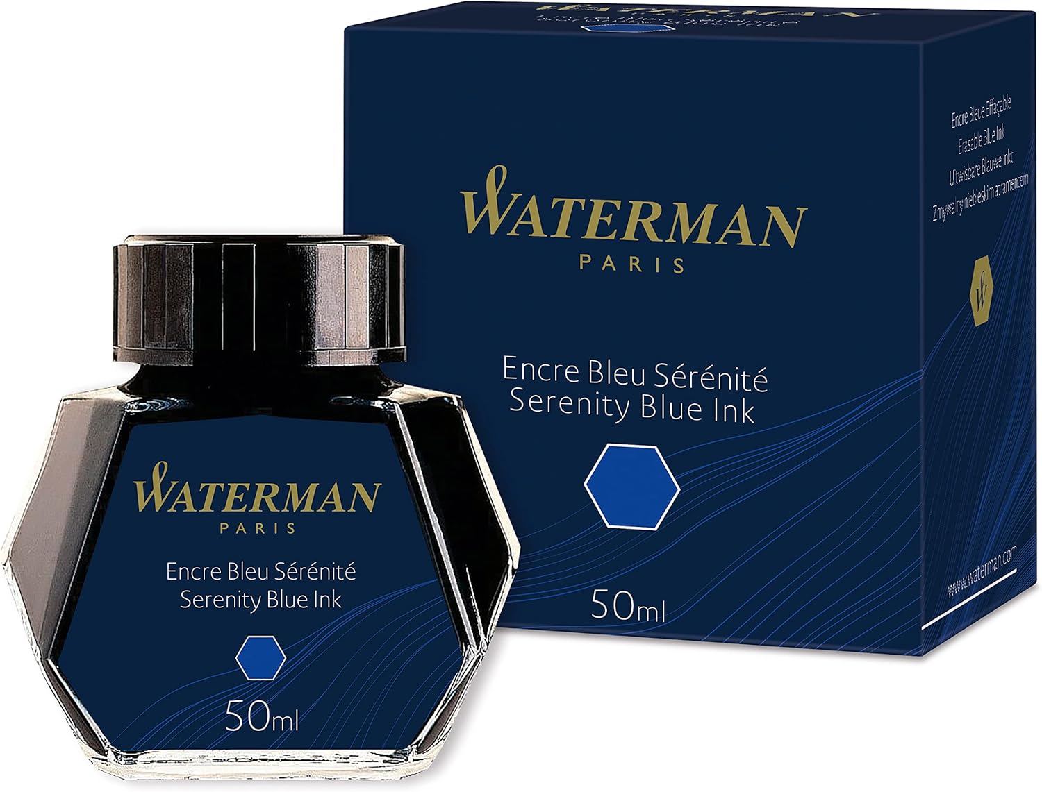
- Classic Royal Blue Ink for Professional Handwriting: Produces a recognizable medium-blue writing color suitable for office correspondence, academic notes, journaling, and everyday fountain pen use.
- Smooth-Flowing Water-Based Dye Ink Formula: Designed to deliver consistent ink flow through compatible fountain pens, supporting comfortable writing with fine, medium, and broad nibs.
- Practical 50ml Faceted Glass Ink Bottle: Features an angled glass design that allows the bottle to be tilted for easier filling when the remaining ink level becomes low.
- Straightforward Cleaning for Regular Fountain Pen Maintenance: Uses conventional water-soluble dye ink that generally flushes out with clean water, making color changes and routine maintenance more convenient.
- - Versatile Ink for Modern and Vintage Fountain Pens: Suitable for Waterman fountain pens and many other compatible refillable writing instruments, with performance depending on individual pen and paper combinations.
This Waterman Blue Ink Is a Dependable Choice for Everyday Fountain Pen Writing
The Waterman Serenity Blue Fountain Pen Ink, model S0110720, is designed for writers who want a traditional royal-blue color with smooth ink flow and straightforward fountain pen maintenance. Previously marketed as Florida Blue, this formulation remains a familiar choice for handwritten correspondence, professional notes, and personal journaling. For anyone researching the best blue ink for fountain pen use, its combination of readable color and conventional dye-based chemistry makes it a practical option.
Manufactured in France, the ink comes in a 50ml faceted glass bottle with a screw-top closure. Its water-based dye formulation is intended for Waterman fountain pens and other compatible refillable writing instruments. The classic royal blue fountain pen ink produces a medium-blue appearance that is brighter than most blue-black inks without becoming unusually pale.
One important detail is that model S0110720 is the same Waterman Serenity Blue formulation reviewed in our second-ranked selection. The different Amazon listings should not be interpreted as separate ink colors or different writing formulas. Buyers comparing these listings should pay attention to price, seller reliability, packaging condition, and availability rather than expecting a difference in ink performance.
The ink's greatest advantage is its straightforward writing character. It offers a recognizable blue shade suitable for regular handwriting while avoiding the maintenance considerations associated with shimmer inks and some specialized permanent formulations. This makes it particularly appealing to writers who use their fountain pens frequently rather than only for occasional decorative projects.
The Smooth Ink Flow and Easy Refilling Are What Make This Bottle Worth Considering
Waterman Serenity Blue uses a conventional liquid dye formulation designed to move through a fountain pen's feed and nib. Fountain pens rely on capillary action to deliver ink, so the relationship between ink flow, nib design, and paper absorbency directly affects the writing experience. The smooth flowing blue ink for fountain pens is intended to support consistent handwriting without requiring excessive pressure.
Consider someone who writes several pages of notes during meetings every morning. An ink that produces frequent interruptions can make writing less comfortable and leave gaps in important information. Serenity Blue has an established reputation for dependable flow in properly maintained fountain pens, making it suitable for this kind of regular use.
The color is another practical strength. Serenity Blue produces a recognizable medium royal-blue appearance that remains easy to distinguish from black printed text. This can be useful when adding handwritten comments to documents, completing study notes, or preparing personal correspondence.
For example, a university student reviewing printed lecture materials might use Serenity Blue to add explanations in the margins. The blue writing remains visually separate from the black printed content, making annotations easier to identify. The readable medium blue ink for handwritten notes provides contrast without requiring an unusually bright or decorative color.
The ink can also display some natural shading depending on the pen and paper combination. Shading occurs when different amounts of dye accumulate within individual strokes, producing lighter and darker areas. With Serenity Blue, this effect is generally modest, although broader nibs and suitable paper may make the variation more noticeable.
Someone writing a personal letter with a medium nib may notice slightly darker blue areas where additional ink settles. These variations can give the handwriting a more individual appearance without reducing readability. The subtle blue shading for expressive fountain pen writing is a useful characteristic for people who appreciate the appearance of liquid ink.
Paper quality plays an important role in the final result. Fountain pen inks can spread into the fibers of absorbent paper, producing feathering around the edges of letters. This becomes particularly noticeable when using broad nibs or pens that deliver larger amounts of ink.
For example, someone using an inexpensive office notebook may notice that certain letters appear wider than intended. Switching to fountain pen-friendly paper can help preserve line definition and reduce unwanted spreading. The consistent blue ink performance on quality paper is particularly valuable when handwriting needs to remain neat and readable.
Rhodia, Clairefontaine, and other papers designed for fountain pen writing are useful options for evaluating ink behavior. These papers can reduce feathering while allowing the natural appearance of the ink to remain visible. However, drying times may be longer on highly ink-resistant surfaces because the liquid remains near the paper surface.
Drying time is therefore worth considering. A fine nib generally deposits less ink than a broad nib, which can affect how quickly the writing becomes safe to touch. The practical drying characteristics for everyday handwriting should be evaluated using the actual notebook and fountain pen rather than relying on one universal drying-time estimate.
Imagine someone writing quickly during a meeting and immediately turning the page. If the ink has not dried, part of the writing may transfer onto the opposite sheet. Allowing a brief drying period or choosing a more absorbent paper can help reduce this problem.
Left-handed writers may also need to pay attention to smudging. Certain writing positions cause the hand to move across freshly written text, increasing the possibility of ink transfer. Testing Serenity Blue on the intended writing paper is a sensible way to determine whether its drying behavior suits an individual writing style.
Another useful characteristic is the ink's compatibility with conventional fountain pen maintenance. Waterman Serenity Blue is a dye-based formulation without shimmer particles, making it relatively straightforward to flush from compatible pens. The easy cleaning fountain pen ink for regular maintenance is particularly convenient for writers who change colors frequently.
For example, someone switching from Serenity Blue to a pale green ink should clean the converter and feed before refilling. Residual blue dye can influence the appearance of the new color, particularly during the first several lines of writing. Flushing the pen with clean water helps prevent unwanted color mixing.
Waterman identifies this bottled ink as compatible with its fountain pen range. It is also commonly used in other compatible fountain pens, although users should confirm that their writing instrument accepts bottled ink. Cartridge-only pens may require a suitable converter before they can be filled directly from the bottle.
The versatile bottled ink for refillable fountain pens is useful for writers who own several pens with different nib widths. A fine nib may produce narrower, more controlled handwriting, while a broad nib can reveal additional color variation. The same bottle can be used across compatible pens without purchasing separate ink cartridges for each writing instrument.
Vintage fountain pen enthusiasts may also appreciate Serenity Blue's conventional formulation. Older pens can contain filling sacs, seals, and other components that require careful ink selection. Although Waterman blue inks are frequently recommended by pen specialists, the condition and material compatibility of an individual vintage pen should still be considered.
The 50ml bottle is another important feature. Waterman's distinctive faceted glass design allows the bottle to be tilted onto an angled side when the ink level becomes low. This practical angled glass bottle for easy refilling helps users access remaining ink more conveniently than with some conventional flat-bottomed bottles.
Consider someone who has used most of a bottle and needs to refill a piston fountain pen. When the remaining ink is too shallow to cover the nib, filling can become difficult. Tilting the Waterman bottle allows the ink to collect toward one side, providing a more accessible area for refilling.
The screw-top closure is also practical for regular use. Users should place the bottle on a stable surface, avoid touching the glass with excessive nib pressure, and close the cap securely after filling. These simple precautions help reduce the likelihood of spills and accidental contamination.
A 50ml bottle provides a substantial amount of ink for everyday writing. A fountain pen with a reservoir holding approximately 1ml could theoretically receive around 50 full refills, excluding ink lost during cleaning and filling. The generous 50ml ink supply for frequent writers makes bottled ink convenient for people who regularly write several pages per day.
The actual number of refills depends on the filling system. Smaller converters may hold considerably less than 1ml, while larger piston and vacuum-filling pens can hold more. A small amount of ink may also remain difficult to access near the end of the bottle.
Serenity Blue is particularly suitable for personal journaling. Its medium-blue appearance provides comfortable contrast on white and cream paper, while subtle variations in ink density can add visual interest. The color remains traditional enough for regular use without appearing identical to black ink.
Professional correspondence is another relevant application. Handwritten letters, meeting notes, and internal documents can benefit from a recognizable blue writing color. The traditional blue ink for professional correspondence provides a familiar appearance, although official documents may impose their own requirements concerning ink color and permanence.
There are some limitations worth considering. Serenity Blue is not marketed as a waterproof or document-proof ink, and significant water exposure can cause the dye to spread or wash away. Writers preparing important archival records should consider a specifically certified permanent fountain pen ink.
Another consideration is the color's relatively conventional appearance. Writers looking for dramatic sheen, shimmer particles, or unusual blue-green tones may find Serenity Blue too restrained. Its main appeal comes from dependable everyday writing rather than specialized decorative effects.
The ink also does not provide the dark navy appearance of blue-black formulations. Someone who prefers a nearly black writing line may find Pilot Iroshizuku Shin-Kai more suitable. Serenity Blue instead emphasizes a brighter, recognizable royal-blue color.
Why We Ranked This Waterman Serenity Blue Listing Fourth
We placed this Waterman Serenity Blue listing at number four in our seven-product comparison because it provides a dependable traditional blue ink, but duplicates the formulation already represented by our second-ranked Waterman selection. Both listings identify model S0110720 and the same 50ml Serenity Blue bottle. The ranking difference therefore reflects the comparison structure rather than a demonstrated difference in ink quality.
Our first-ranked Pilot Iroshizuku Shin-Kai offers a darker blue-black appearance with subtle gray undertones and distinctive shading. That color may be more appealing to writers who prefer restrained professional handwriting. Serenity Blue provides a brighter alternative for people who want a clearly recognizable blue.
The Waterman Serenity Blue product ranked second shares the same core specifications as this fourth-ranked listing. Buyers should not expect different ink flow, shading, or color merely because the Amazon ASIN differs. The identical Serenity Blue fountain pen ink formulation means that seller reliability, price, and availability are more useful factors when choosing between the two listings.
Our third-ranked Waterman Tender Purple listing also requires a distinction because its model number identifies a purple ink rather than a blue formulation. Serenity Blue is more directly relevant to the primary keyword, even though it appears fourth in the requested comparison order. This makes it important to evaluate the actual product specifications rather than relying exclusively on numerical placement.
One of Serenity Blue's strongest advantages is its reputation for straightforward fountain pen maintenance. Its conventional water-based dye formulation generally rinses out with clean water, making it convenient for writers who refill their pens frequently. The manageable cleaning routine for everyday fountain pens is especially appealing to beginners.
The 50ml faceted bottle also contributes to its practical value. Its angled design allows easier access to remaining ink as the bottle empties, while the screw-top closure supports convenient storage. These features are useful regardless of which Amazon listing supplies the product.
Its medium-blue color is another reason it remains a strong option. Writers who prefer traditional royal-blue handwriting may find Serenity Blue more appealing than darker blue-black or highly saturated specialty inks. The balanced royal blue color for regular writing works well for correspondence, study notes, and personal journals.
There are disadvantages to consider, particularly the absence of certified waterproof performance and the relatively conventional color. Writers who require permanent records should choose an appropriate document-resistant ink, while those interested in dramatic shading or sheen may prefer more specialized formulations.
Nevertheless, these limitations do not significantly reduce its usefulness for ordinary writing. The ink offers a familiar blue appearance, smooth flow, convenient cleaning, and a practical bottle design. These characteristics make it suitable for both new fountain pen users and experienced writers.
Overall, we believe the Waterman Serenity Blue S0110720 Fountain Pen Ink deserves consideration among the best blue ink for fountain pen options, even though this particular listing occupies fourth place in our comparison. Its smooth-flowing dye formula, recognizable royal-blue color, and convenient 50ml glass bottle provide dependable everyday functionality. For writers who want a traditional blue fountain pen ink without complicated maintenance requirements, Serenity Blue remains an excellent choice.
- Vibrant Morning Glory Blue With Violet Undertones: Produces a saturated blue writing color with subtle purple influences, suitable for personal correspondence, journaling, and expressive everyday handwriting.
- Smooth-Flowing Japanese Water-Based Dye Ink: Designed for compatible fountain pens, offering reliable ink delivery and a comfortable writing experience across different nib sizes.
- Attractive Natural Shading on Fountain Pen Paper: Creates variations between brighter blue and deeper violet-blue strokes, particularly when used with medium or broad nibs.
- Premium 50ml Glass Bottle With Recessed Filling Well: Features Pilot's distinctive glass bottle design, making it easier to access the remaining ink when refilling compatible fountain pens.
- - Versatile Ink for Everyday Writing and Journaling: Suitable for handwritten notes, personal letters, creative writing, and fountain pen collections, with color appearance varying according to paper and nib selection.
This Morning Glory Blue Ink Has a Rich Color That Makes Everyday Writing More Interesting
The Pilot Iroshizuku Asa-Gao Morning Glory Fountain Pen Ink is designed for writers who appreciate a saturated blue color with a subtle violet influence. Its smooth-flowing water-based dye formulation and natural shading make it suitable for journaling, handwritten correspondence, and everyday fountain pen writing. For anyone researching the best blue ink for fountain pen use, Asa-Gao offers an attractive alternative to traditional royal-blue and darker blue-black formulations.
Manufactured in Japan by Pilot, Asa-Gao belongs to the premium Iroshizuku collection, a series of fountain pen inks inspired by Japanese nature and landscapes. The name Asa-Gao translates to Morning Glory, referencing the blue-purple flowers that inspired its distinctive appearance. The premium Morning Glory blue fountain pen ink comes in a 50ml glass bottle and uses a water-based dye formulation designed for compatible fountain pens.
One of its strongest features is the color itself. Asa-Gao produces a vivid blue writing line with subtle violet undertones that distinguish it from more conventional office blue inks. This makes it particularly appealing for people who want their handwriting to remain readable while displaying a more expressive color.
The ink is also appreciated for its smooth flow and natural shading characteristics. Depending on the fountain pen nib and paper, individual strokes may appear brighter blue in some areas and deeper blue-purple in others. These variations provide visual interest without requiring specialized writing techniques.
The Smooth Flow and Blue-Violet Shading Make This Ink Particularly Appealing
The most important performance characteristic of Pilot Iroshizuku Asa-Gao is its fluid writing behavior. Fountain pens depend on capillary action to transport ink from the reservoir through the feed and onto the writing surface. The smooth flowing Japanese fountain pen ink formula is designed to support consistent ink delivery during ordinary handwriting.
Consider someone who writes several pages in a personal journal every evening. An ink that frequently skips or produces inconsistent lines can interrupt the writing process and make longer writing sessions less comfortable. Asa-Gao's well-regarded flow characteristics make it an appealing option for writers who prefer a smooth and relatively wet writing experience.
However, ink performance depends on more than the formulation alone. Nib alignment, feed design, paper texture, and the condition of the fountain pen all influence the writing experience. A properly maintained fountain pen generally produces more consistent results than one containing dried ink or a partially obstructed feed.
Asa-Gao's distinctive blue color is another important advantage. Compared with traditional blue-black inks, it offers a brighter appearance that remains recognizable even when used with finer nibs. The vibrant blue fountain pen ink for everyday writing provides comfortable contrast on white and cream paper while retaining its subtle violet character.
For example, someone preparing handwritten thank-you letters may prefer a color that looks attractive without becoming excessively decorative. Asa-Gao provides a saturated blue that works well for personal correspondence and informal professional notes. Its color also helps distinguish handwritten annotations from black printed text.
The ink's natural shading is particularly appealing to fountain pen enthusiasts. Shading occurs when different amounts of dye accumulate across individual strokes, producing variations in color intensity. With Asa-Gao, lighter sections can appear bright blue while areas containing more ink develop deeper blue-violet tones.
Imagine writing a personal letter using a medium fountain pen nib. Some parts of the letters may appear darker where additional ink settles, while other strokes retain a brighter blue appearance. The natural blue-violet shading for expressive handwriting creates visual variation without requiring the writer to deliberately change pressure.
Broader nibs generally make shading easier to observe because they deposit more ink onto the paper. Fine nibs may produce a more uniform appearance, particularly when used on absorbent writing paper. This makes Asa-Gao suitable for different writing preferences, although the final color variation will depend on the pen and paper combination.
Paper selection is particularly important when using a saturated fountain pen ink. Highly absorbent paper can cause liquid ink to spread into the fibers, producing feathering around the edges of letters. This becomes especially noticeable with broad nibs or fountain pens that deliver larger amounts of ink.
For example, someone using a wet medium nib on inexpensive copier paper may notice that individual letters appear wider than intended. Switching to fountain pen-friendly paper can help preserve line definition and make the ink's natural shading easier to observe. The consistent blue ink performance on quality fountain pen paper is particularly valuable for journaling and handwritten correspondence.
Rhodia, Clairefontaine, and Tomoe River are examples of papers commonly used by fountain pen enthusiasts. Their different surface characteristics influence shading, feathering, bleed-through, and drying time. Testing Asa-Gao on several paper types can help identify the combination that best suits an individual writing style.
Drying time is another consideration. Asa-Gao is a water-based dye ink, and the time required for writing to dry depends on nib width, paper coating, and the amount of ink deposited. A broad nib on highly ink-resistant paper may require more drying time than a fine nib on absorbent paper.
Consider someone taking handwritten notes during a meeting. Turning pages immediately after writing can cause ink to transfer if the previous lines remain wet. The practical drying behavior of blue fountain pen ink should therefore be evaluated using the notebook and writing instrument used most frequently.
Left-handed writers may also need to consider their writing position. People whose hands move across freshly written text can experience smudging when using wetter fountain pen inks. Allowing additional drying time or choosing a more suitable paper can help reduce this problem.
Another important feature is the ink's conventional water-based dye formulation. Unlike shimmer inks containing suspended decorative particles, Asa-Gao does not rely on glitter or particulate effects. This generally makes routine cleaning more straightforward than with fountain pen inks containing shimmer additives.
The water-based dye ink for regular fountain pen maintenance is particularly useful for writers who change colors frequently. Cleaning a compatible fountain pen usually involves flushing the converter, nib, and feed with clean water until the remaining dye has been removed. Users should follow their fountain pen manufacturer's maintenance recommendations.
For example, someone switching from Asa-Gao to a pale gray ink should clean the pen thoroughly before refilling. Residual blue dye can alter the appearance of the new color, particularly during the first several lines of writing. Proper flushing helps prevent unwanted color mixing inside the fountain pen.
It is also advisable to avoid mixing different bottled inks directly unless their compatibility has been established. Even inks from reputable manufacturers can contain different additives and dye combinations. Cleaning the fountain pen between color changes is a more reliable approach than adding a new formulation to a reservoir containing substantial amounts of another ink.
The 50ml glass bottle is another important advantage. Pilot's Iroshizuku bottles feature an elegant design with a recessed area at the bottom that helps concentrate the remaining ink. The premium glass bottle with recessed filling well makes refilling more convenient as the ink level decreases.
Imagine someone who has used most of a bottle and needs to refill a piston-filling fountain pen. When the remaining ink becomes too shallow to cover the nib, filling can become difficult. The recessed bottom helps provide access to the remaining ink without requiring excessive tilting.
The bottle also has a substantial base designed to remain stable during normal use. Nevertheless, it should always be placed on a flat surface before opening. Users should avoid pressing the fountain pen nib against the glass during filling because excessive contact can damage delicate writing components.
A 50ml bottle provides a substantial quantity of ink for regular handwriting. A fountain pen with a reservoir holding approximately 1ml could theoretically receive around 50 refills, excluding ink lost during cleaning and filling. The generous bottled ink capacity for frequent writers makes Asa-Gao a practical option for people who regularly use refillable fountain pens.
The actual number of refills depends on the fountain pen's filling system. Small cartridge converters may hold less than 1ml, while larger piston and vacuum-filling pens can hold considerably more. Users should also account for small amounts of ink that may remain inaccessible near the end of the bottle.
Asa-Gao is particularly appealing for creative journaling. Its saturated blue color provides strong contrast on white and cream paper, while natural shading adds subtle variation to longer handwritten entries. The violet undertones give the ink a distinctive appearance without making it difficult to read.
Professional note-taking is another possible application. Although Asa-Gao has a more expressive color than traditional blue-black inks, it remains recognizably blue and suitable for many ordinary office tasks. The rich blue ink for handwritten notes and correspondence can help distinguish personal annotations from printed documents.
There are some limitations worth considering. Asa-Gao is not marketed as a waterproof or document-proof ink, and significant water exposure can cause the dye to spread or wash away. Writers preparing permanent records should consider a specifically certified water-resistant fountain pen ink instead.
The relatively wet flow may also be less suitable for certain nib and paper combinations. A broad, wet-writing pen on inexpensive paper may produce feathering or bleed-through. Using a finer nib or higher-quality paper can help improve line definition when necessary.
Another consideration is the ink's subtle purple influence. Writers who prefer a strictly neutral royal blue or a darker navy appearance may find Asa-Gao less suitable for their personal preferences. Its strongest appeal is the combination of vivid blue saturation and violet undertones rather than an understated blue-black appearance.
Why We Ranked Pilot Iroshizuku Asa-Gao Sixth Instead of Higher
We placed Pilot Iroshizuku Asa-Gao at number six among our seven selections because it offers excellent color saturation, smooth ink flow, and attractive shading, but its blue-violet appearance may be less versatile for conservative professional writing. Its premium Japanese formulation and distinctive 50ml glass bottle provide substantial practical value. However, our comparison places greater emphasis on inks that offer a more traditional or restrained blue appearance for everyday use.
Our first-ranked Pilot Iroshizuku Shin-Kai offers a darker blue-black color with subtle gray undertones. That formulation is particularly appealing for professional correspondence and everyday handwriting where a subdued appearance is preferred. Asa-Gao instead provides vibrant blue ink with distinctive violet undertones, making it especially attractive for personal journaling and creative writing.
Our second-ranked Waterman Serenity Blue offers a more traditional royal-blue appearance. Its conventional dye formulation and practical bottle design make it a straightforward choice for regular fountain pen use. Asa-Gao provides a more distinctive color character, although individual preferences will determine which shade is more appealing.
The Waterman Serenity Blue listing ranked fourth contains the same formulation as our second-ranked Waterman selection. Its separate placement reflects the requested comparison order rather than a meaningful difference in ink performance. Asa-Gao offers a genuinely different color option through its saturated blue-violet appearance.
Our third-ranked Waterman Tender Purple is also worth distinguishing because that product is purple rather than blue. Asa-Gao is more directly relevant to the primary keyword, even though its violet undertones give it a slightly purple-influenced appearance. Its sixth-place position should therefore be understood as a preference-based ranking rather than proof of inferior writing performance.
Our fifth-ranked Pilot Iroshizuku Kon-Peki provides another interesting comparison. Kon-Peki has a bright azure-blue appearance, while Asa-Gao generally displays a deeper blue with a more noticeable violet influence. Writers who prefer a cleaner azure color may favor Kon-Peki, while those who enjoy blue-purple shading may find Asa-Gao more appealing.
One of Asa-Gao's strongest advantages is the combination of smooth flow and expressive blue shading. Its dye formulation is well regarded among fountain pen enthusiasts, while the saturated color remains clearly visible across different nib widths. This makes it particularly appealing for writers who want an interesting everyday ink.
The natural shading is another reason the ink deserves consideration. Broader nibs and suitable paper can reveal variations between brighter blue and deeper blue-violet areas. These effects provide visual interest without requiring shimmer particles or specialized writing equipment.
The premium bottle design also contributes to the overall value. Its 50ml capacity provides a substantial ink supply, while the recessed bottom helps users access the remaining ink during refilling. The practical Japanese fountain pen ink bottle design combines useful functionality with an attractive presentation.
There are disadvantages to consider, particularly the lack of certified waterproof performance and the possibility of feathering on absorbent paper. Writers who require permanent records should choose an appropriate document-resistant ink. Those who prefer darker, more conservative handwriting may also find Shin-Kai or another blue-black formulation more suitable.
Nevertheless, these limitations do not significantly reduce Asa-Gao's appeal for ordinary handwriting and creative projects. Its saturated blue color, smooth flow, and natural shading make it particularly enjoyable for personal correspondence, journaling, and decorative writing. The ink offers a different visual experience from traditional blue formulations without becoming impractical for everyday use.
Overall, we believe Pilot Iroshizuku Asa-Gao deserves its sixth-place ranking among the best blue ink for fountain pen options within this comparison. Although its blue-violet appearance may be less restrained than our top-ranked Shin-Kai, its smooth-flowing Japanese dye formula, attractive shading, and premium 50ml glass bottle provide excellent functionality. For fountain pen enthusiasts who want a rich blue ink with subtle purple character and dependable everyday writing performance, Asa-Gao remains an excellent choice worth considering.

- Rich Deep Blue Ink for Professional Handwriting: Produces a dark, saturated blue writing appearance that approaches blue-black, making it suitable for business correspondence, academic notes, and personal journaling.
- Smooth-Flowing Water-Based Dye Ink Formula: Uses finely filtered fountain pen ink designed for consistent writing performance in compatible fountain pens, roller pens, and glass dip pens.
- Traditional 30ml Glass Bottle With Integrated Pen Rest: Features Jacques Herbin's recognizable rectangular glass bottle design with a convenient molded pen rest for use during writing sessions.
- Neutral pH and Convenient Fountain Pen Cleaning: Features a pH-neutral, non-toxic dye formulation designed for everyday writing and generally straightforward cleaning with water.
- - Versatile Deep Blue Ink for Different Writing Styles: Suitable for fine, medium, and broad fountain pen nibs, with a dark color that remains readable across professional documents and personal stationery.
This Deep Blue Ink Offers a More Traditional Writing Experience Than Brighter Fountain Pen Colors
The Jacques Herbin Bleu des Profondeurs Fountain Pen Ink is designed for writers who prefer a dark, saturated blue without moving completely into black ink. Its deep navy appearance, conventional water-based dye formulation, and traditional glass bottle make it suitable for professional correspondence, everyday handwriting, and personal journaling. For anyone researching the best blue ink for fountain pen use, this French-made ink deserves consideration because it emphasizes readability, smooth flow, and straightforward maintenance.
Bleu des Profondeurs belongs to Jacques Herbin's La Perle des Encres collection, a range developed for everyday writing with fountain pens and other compatible writing instruments. The ink comes in a 30ml rectangular glass bottle featuring an integrated pen rest. Its rich deep blue fountain pen ink formula produces a dark writing appearance that sits between conventional navy blue and black.
One of the strongest features is the color itself. Jacques Herbin describes Bleu des Profondeurs as a shade positioned between its Bleu Nuit and Perle Noire inks, giving it a particularly dark blue character. This makes it useful for people who want professional-looking handwriting while retaining a recognizable blue tone.
The ink also uses a finely filtered, water-based dye formulation intended for regular fountain pen use. Jacques Herbin emphasizes smooth writing and compatibility with fountain pens, roller pens, and glass dip pens. These characteristics make the ink appealing to writers who prefer conventional formulations rather than heavily pigmented or decorative shimmer inks.
The Deep Blue Color and Smooth Ink Flow Make It Particularly Useful for Everyday Writing
The most important characteristic of Bleu des Profondeurs is its dark blue color. Unlike bright royal-blue inks that immediately attract attention, this formulation produces a more restrained writing line. The dark navy blue ink for professional correspondence is particularly useful when preparing handwritten letters, meeting notes, and other documents where readability matters.
Consider someone who regularly writes handwritten business correspondence. Bright turquoise or unusually saturated blue inks may be attractive for personal projects, but they are not always appropriate for formal communication. Bleu des Profondeurs provides a darker alternative that retains enough blue character to distinguish it from ordinary black ink.
The ink's saturation is another practical advantage. A dark writing color generally provides strong contrast against white or cream paper, helping handwritten notes remain readable. This can be especially useful for writers who use fine fountain pen nibs that produce narrow lines.
For example, a student taking detailed lecture notes may prefer a fine nib because it allows more information to fit on each page. A pale blue ink might appear less distinct in such narrow writing. The deep blue fountain pen ink for academic notes provides a darker appearance that can improve visual clarity.
Jacques Herbin's water-based dye formulation is also designed for smooth writing. Fountain pens rely on capillary action to move liquid ink through the feed and onto the nib. An appropriately formulated ink helps maintain consistent delivery during ordinary handwriting.
The manufacturer describes the La Perle des Encres range as finely filtered to reduce the risk of clogging compatible writing instruments. This smooth flowing dye ink for fountain pens is particularly appealing for people who write regularly and want to avoid unnecessary interruptions. However, actual performance also depends on the fountain pen's feed, nib condition, and maintenance.
Imagine someone writing several pages in a personal journal every evening. A fountain pen that frequently skips can interrupt the writing process and make longer sessions less comfortable. Using a suitable ink in a properly maintained pen helps support a more consistent writing experience.
The ink's dark color may also display subtle tonal differences depending on the writing instrument. Fine nibs generally deposit less ink, while medium and broad nibs can produce darker areas where additional dye accumulates. However, Bleu des Profondeurs is not primarily known for dramatic shading effects.
Writers who prefer highly expressive color transitions may find the ink relatively uniform compared with some lighter blue formulations. Its consistent deep blue color for everyday handwriting is better suited to people who prioritize legibility and a traditional appearance. This can be an advantage when writing professional documents or lengthy notes.
Paper selection remains important. Fountain pen ink behaves differently depending on paper absorbency, coating, and texture. Highly absorbent paper can cause feathering, where the liquid spreads beyond the original writing line.
For example, someone using a broad nib on inexpensive copier paper may notice that the edges of letters appear less defined. Switching to fountain pen-friendly paper can help preserve the intended line width. The proper paper selection for smooth fountain pen writing is important regardless of the ink's quality.
Rhodia and Clairefontaine are examples of papers commonly used by fountain pen enthusiasts. Their surfaces can help reduce unwanted feathering while maintaining clear handwriting. However, drying times may increase on less absorbent paper because more liquid remains near the surface.
Drying time is another consideration when evaluating Bleu des Profondeurs. Some retailers describe Jacques Herbin's conventional inks as quick-drying, although performance varies between individual colors and writing conditions. The exact drying time of this ink depends on nib width, paper coating, and the amount of liquid deposited.
Consider someone taking notes during a meeting and turning pages immediately after writing. If the ink remains wet, part of the writing may transfer onto the opposite page. The practical drying characteristics for daily note taking should therefore be tested with the notebook and fountain pen used most frequently.
Left-handed writers may also need to consider their writing position. People whose hands move across freshly written lines can experience smudging when using liquid fountain pen ink. Choosing suitable paper and allowing adequate drying time can help reduce this problem.
Another important advantage is the ink's conventional dye formulation. Jacques Herbin describes the La Perle des Encres range as water-based, pH-neutral, and made using selected dyes. The traditional water-based ink for fountain pen maintenance generally allows routine cleaning with clean water.
For example, someone changing from Bleu des Profondeurs to a lighter blue ink should flush the fountain pen thoroughly before refilling. Residual dark dye can alter the appearance of the new color, particularly during the first several lines of writing. Proper cleaning helps prevent unwanted color mixing inside the pen.
Users should avoid mixing different bottled inks directly unless their compatibility has been established. Even conventional dye inks can contain different additives and preservatives. Cleaning the fountain pen between color changes is a sensible precaution.
The 30ml glass bottle is another distinctive feature. Jacques Herbin uses a traditional rectangular bottle design with a molded pen rest along the upper surface. This classic glass ink bottle with integrated pen rest provides a convenient place to rest a pen temporarily during a writing session.
The bottle also reflects the brand's long history in writing inks. Jacques Herbin traces its origins to seventeenth-century France, and the La Perle des Encres collection continues its tradition of producing colored inks for handwriting. The packaging emphasizes a conventional stationery experience rather than elaborate decorative presentation.
However, the 30ml capacity is smaller than the 50ml bottles offered by Pilot Iroshizuku and Waterman in several of our higher-ranked selections. Someone who writes extensively every day may need to replace the bottle more frequently. The compact 30ml bottled ink for fountain pens may be more appealing to people who enjoy trying different colors without committing to a larger quantity.
A fountain pen with a reservoir holding approximately 1ml could theoretically receive around 30 refills from a 30ml bottle, excluding ink lost during filling and cleaning. Smaller cartridge converters may allow more individual refills, while larger piston-filling pens may allow fewer. Actual results depend on the filling system and how efficiently the remaining ink can be accessed.
The bottle opening is another practical consideration. A compact glass bottle may become less convenient for filling larger fountain pens as the ink level decreases. Users should ensure the nib can be inserted safely without contacting the glass excessively.
Bleu des Profondeurs is also suitable for personal journaling. Its dark blue appearance provides comfortable contrast on white and cream paper, making longer handwritten entries easy to read. The deep blue ink for personal journals and letters offers a restrained alternative to brighter decorative colors.
Creative writing is another possible application. Writers preparing handwritten drafts, poetry, or personal correspondence may appreciate an ink that looks distinctive without drawing attention away from the text. Its relatively uniform dark appearance can help maintain a consistent look across several pages.
There are some limitations worth considering. Bleu des Profondeurs is not marketed as a waterproof or archival document ink, and retailers identify it as lacking substantial water resistance. Important documents that must survive moisture exposure may require a specifically certified permanent formulation.
The ink also does not contain shimmer particles, and it is not primarily intended for dramatic sheen effects. Writers who enjoy highly decorative fountain pen inks may prefer a different formulation. Bleu des Profondeurs concentrates on dark color, smooth writing, and everyday practicality.
Another consideration is the relatively small bottle. Although 30ml provides a useful supply for occasional and regular writing, frequent users may find larger bottles more economical depending on local pricing. Comparing the cost per milliliter can help determine whether this product offers suitable value.
Why We Ranked Jacques Herbin Bleu des Profondeurs Seventh Among Our Seven Choices
We placed Jacques Herbin Bleu des Profondeurs at number seven because it offers a sophisticated dark blue color and practical writing characteristics, but provides a smaller bottle and fewer distinctive visual effects than several higher-ranked alternatives. Its water-based dye formulation and traditional glass packaging make it a dependable option for everyday handwriting. However, our comparison gives additional weight to color versatility, bottle capacity, and expressive shading.
Our first-ranked Pilot Iroshizuku Shin-Kai offers a sophisticated blue-black appearance with gray undertones and more noticeable shading characteristics. Its 50ml bottle also provides a larger ink supply. Bleu des Profondeurs offers a similarly restrained color but emphasizes a more uniform, deeply saturated blue appearance.
Our second-ranked Waterman Serenity Blue provides a brighter royal-blue color that may appeal to writers who prefer traditional blue handwriting. Its 50ml faceted bottle also offers additional capacity and a design that can be tilted for easier filling. The dark blue writing characteristics of Bleu des Profondeurs make it more suitable for people who prefer deeper, less vibrant shades.
Waterman Mysterious Blue, ranked third in our comparison, provides another dark blue alternative. Both inks are suitable for professional correspondence and ordinary handwriting, although their exact colors and shading characteristics differ. The choice between them depends largely on personal preferences concerning blue-black intensity and writing appearance.
Our fifth-ranked Pilot Iroshizuku Kon-Peki offers a brighter azure-blue color with more expressive shading. Asa-Gao, ranked sixth, provides another vivid blue option with subtle violet undertones. Bleu des Profondeurs is considerably more restrained than either of these Japanese inks.
One of the strongest reasons to consider Jacques Herbin is its traditional French fountain pen ink formulation. The brand emphasizes finely filtered, water-based dye inks designed for regular writing. This approach makes Bleu des Profondeurs appealing to users who prefer conventional ink chemistry and manageable maintenance.
The 30ml glass bottle also has practical advantages despite its smaller capacity. Its compact format occupies less desk space, while the integrated pen rest provides a distinctive feature. The bottle is particularly suitable for people who maintain several ink colors and prefer smaller quantities.
There are disadvantages compared with higher-ranked selections. The smaller bottle may provide less value for frequent writers, and the dark color does not offer the dramatic shading associated with some premium fountain pen inks. The lack of certified waterproof performance also limits its suitability for permanent documents.
However, these limitations do not make the ink unsuitable for everyday writing. Its rich dark blue color for professional handwriting provides a clear and restrained appearance that works well for correspondence, note-taking, and personal journals. The conventional dye formulation also supports relatively straightforward cleaning.
Another positive feature is its compatibility with different writing styles. Fine nibs can produce narrow, readable lines, while broader nibs may reveal subtle differences in ink density. This makes the ink useful for writers who alternate between professional note-taking and more expressive handwriting.
The seventh-place ranking therefore reflects its smaller capacity and more specialized dark-blue appearance rather than a fundamental weakness in its writing performance. For someone who specifically wants a deeply saturated navy ink, these characteristics may actually be preferable to the brighter colors offered by other products.
Overall, we believe Jacques Herbin Bleu des Profondeurs deserves its seventh-place position among the best blue ink for fountain pen options within this comparison. Although larger bottles and more expressive color formulations may appeal to a wider range of writers, its smooth-flowing water-based dye ink, rich deep blue appearance, and traditional 30ml glass bottle provide genuine practical value. For fountain pen enthusiasts who prefer dark, professional-looking blue ink with a classic French stationery character, Bleu des Profondeurs remains an excellent choice worth considering.