


- Traditional Xuan-Style Paper for Chinese Brush Calligraphy: Intended for practicing Chinese characters, traditional brush lettering, and expressive ink strokes using compatible calligraphy brushes and ink.
- Generous 50-Sheet Supply for Regular Practice Sessions: Provides multiple sheets for repeated handwriting exercises, brush control development, character formation, and traditional ink painting practice.
- Suitable for Sumi Ink Drawing and Brush Painting: Supports traditional East Asian ink-based techniques, including monochrome illustration, expressive brushwork, and Chinese painting exercises.
- Useful Practice Surface for Learning Brush Pressure: Allows students to explore how brush angle, ink loading, and movement influence the appearance of handwritten strokes.
- - Versatile Paper for Calligraphy and Creative Projects: Suitable for Chinese brush writing, decorative ink artwork, traditional painting studies, and personal calligraphy practice.

This Xuan Paper Makes Traditional Brush Calligraphy Practice More Accessible
The NUOBESTY Chinese Calligraphy Xuan Rice Paper is intended for artists, calligraphy students, and beginners who want to practice traditional brush writing without purchasing individual sheets for every session. The package contains 50 sheets designed for Chinese calligraphy, brush ink writing, and sumi-style drawing. For anyone searching for the best paper for calligraphy, this set is particularly relevant to East Asian brush techniques rather than Western pointed-pen lettering.
One important distinction is the paper itself. Xuan paper is associated with traditional Chinese brush calligraphy and ink painting, where the interaction between brush, ink, and paper determines the appearance of each stroke. The traditional Xuan-style paper for Chinese calligraphy is intended to support these techniques, although the exact fiber composition and sizing treatment of this particular product have not been independently established.
The 50-sheet quantity is a practical advantage for regular practice. Learning Chinese calligraphy requires repeating individual strokes, characters, and combinations many times before the movements become consistent. Having a supply of practice sheets allows students to focus on brush control rather than preserving every sheet for a finished artwork.
The product is also suitable for experimenting with traditional ink drawing. Sumi-style painting, bamboo studies, simple botanical subjects, and expressive brush exercises all involve controlling the relationship between water, ink concentration, and brush movement. The versatile rice paper sheets for brush writing provide a useful starting point for exploring these techniques.
The Paper's Ink Response Is What Matters Most During Calligraphy Practice
The most important consideration when choosing Chinese calligraphy paper is how it responds to liquid ink. Different Xuan papers absorb moisture at different rates, and this affects whether a brushstroke remains sharply defined or spreads into the surrounding fibers. The ink absorption characteristics of Chinese calligraphy paper directly influence how students develop brush control.
Consider a beginner practicing the horizontal stroke used in Chinese characters. The student needs to control the initial contact, maintain consistent pressure, and finish the stroke deliberately. If the paper absorbs ink too quickly, hesitation can create a dark, spreading area where the brush remains stationary.
This is why practice paper should be evaluated with the actual brush and ink being used. A sheet that works well with concentrated ink may behave differently when the ink is diluted with additional water. Testing a small corner before beginning a full practice session helps establish the appropriate ink consistency.
Traditional Xuan paper is commonly divided into raw, sized, and partially sized varieties. Raw Xuan paper generally absorbs ink more readily, while sized paper restricts spreading and provides greater control over defined edges. The difference between raw and sized Xuan paper matters because each type supports different writing and painting techniques.
The precise sizing classification of this NUOBESTY paper is not confirmed in the available product information. Buyers should therefore avoid assuming that it behaves exactly like professional raw Xuan paper or fully sized Gongbi painting paper. A simple brush test can reveal whether the surface encourages rapid diffusion or maintains relatively controlled lines.
For example, a student practicing regular script, known as Kaishu, may prefer paper that allows individual strokes to remain clearly distinguishable. Excessive ink spreading can obscure the shape of hooks, dots, and turning strokes. A more controlled surface makes it easier to evaluate whether the brush movement was performed correctly.
Running script and cursive calligraphy can benefit from different ink characteristics. These styles often involve faster movements, changes in brush pressure, and connected strokes. The responsive brush writing surface for Chinese characters can help students observe how changes in speed and moisture affect the finished line.
The 50-sheet package is useful because improvement comes through repetition. Someone learning the eight basic strokes associated with the character Yong may need many attempts before achieving consistent results. Using several sheets for one exercise is normal, particularly when practicing brush pressure and stroke endings.
Imagine a student working on the vertical stroke. The first attempts may be uneven because the brush is held at an inconsistent angle. After repeating the movement across several sheets, the student can compare the results and identify whether the problem comes from pressure, speed, or brush alignment.
The fifty-sheet calligraphy paper supply for beginners supports this kind of structured practice. Students can dedicate separate sheets to horizontal strokes, vertical strokes, dots, hooks, and complete characters. Keeping selected examples also provides a useful record of progress over time.
Another practical consideration is the relationship between ink loading and paper absorbency. A brush carrying too much liquid may create large dark areas or cause the ink to spread beyond the intended stroke. A brush carrying too little ink may produce dry, broken marks before the movement is complete.
Neither result is automatically incorrect in artistic practice. Dry-brush textures can be intentional in expressive calligraphy and ink painting. However, beginners should first learn to produce controlled strokes before deliberately experimenting with irregular ink effects.
For example, someone practicing a basic horizontal line can begin with a moderately loaded brush and a steady movement. If the line becomes excessively wet at the beginning, the student can remove a little ink before trying again. The controlled brush pressure and ink loading practice helps develop a more consistent technique.
The paper can also be used for traditional Chinese ink painting exercises. Simple bamboo leaves, orchid petals, and plum branches are common subjects because they require deliberate brush movements. These exercises develop many of the same skills used in calligraphy, including pressure control, direction, and ink concentration.
Consider someone learning to paint bamboo leaves. Each leaf is often created through a controlled movement that begins with pressure and finishes with a narrower point. The Xuan-style paper for traditional ink painting allows the artist to observe how the brush movement affects the resulting shape.
Ink dilution introduces another variable. A concentrated black ink produces stronger contrast, while diluted ink creates lighter gray tones. Using several concentrations within one painting can help distinguish foreground and background elements without introducing additional colors.
However, adding too much water can create uncontrolled spreading or excessive moisture on thin paper. Beginners should work gradually and test how much liquid the sheet can tolerate. A moderate ink load is often easier to control than a heavily saturated brush.
Another important consideration is the surface beneath the paper. Traditional calligraphy sheets can allow moisture to pass through or accumulate underneath during writing. Placing a felt mat or another suitable protective surface below the sheet helps protect the desk and provides a more stable working area.
For example, someone practicing calligraphy on a polished wooden table should avoid placing thin ink paper directly on the surface. Moisture or pigment may transfer through the sheet, potentially staining the table. The proper calligraphy felt mat for brush practice provides a protective layer while supporting the paper.
Students should also keep the sheet reasonably flat during writing. Wrinkles and raised edges can interfere with brush movement, especially when practicing long horizontal or vertical strokes. A smooth working surface makes it easier to maintain consistent contact between the brush and paper.
Paperweights can help hold the sheet in place. Traditional Chinese calligraphy often uses long, narrow weights positioned along the edges of the paper. These prevent unnecessary movement while leaving the main writing area accessible.
For example, someone practicing a complete character may need to rotate the brush slightly while maintaining the position of the paper. If the sheet shifts unexpectedly, the stroke can become distorted. The stable writing surface for Chinese brush calligraphy helps the student concentrate on technique rather than repositioning the paper.
The paper's format is also relevant to practice planning. Smaller sheets are convenient for individual characters and short exercises, while larger sheets provide more room for full compositions. The exact dimensions of this NUOBESTY listing should be confirmed before purchasing if a specific character size or layout is required.
A beginner practicing large characters may need enough space to complete each stroke without crowding adjacent marks. Someone practicing smaller regular script may prefer dividing the sheet into several sections. The flexible calligraphy practice layout for Chinese characters can be adjusted according to the available paper size.
Light pencil guidelines or a reusable grid placed beneath sufficiently translucent paper can help beginners maintain character proportions. Traditional practice grids often divide a square into sections that guide the placement of strokes. These references are useful when learning how different components fit within a complete character.
However, the paper's translucency and surface strength should be checked before using tracing methods. Some sheets may be too opaque for a grid beneath them to remain clearly visible. Others may be too delicate for repeated erasing or heavy pencil pressure.
The NUOBESTY paper is also relevant to Japanese sumi-e and brush writing. Although Chinese calligraphy and Japanese brush traditions have distinct histories and techniques, both involve controlling liquid ink with a flexible brush. The traditional brush ink paper for sumi drawing can provide a suitable practice surface when its absorbency matches the intended technique.
For example, someone learning simple sumi-e landscapes may begin with rocks, grasses, or bamboo leaves. These subjects allow the artist to experiment with dry and wet brush effects. Practicing on multiple sheets makes it easier to compare different approaches without needing to preserve every attempt.
One limitation is that Xuan-style paper may not be appropriate for every type of calligraphy. Western pointed-pen scripts such as Copperplate and Spencerian often require smoother, more resistant surfaces that prevent excessive feathering. A paper intended for absorbent brush techniques may behave poorly with flexible metal nibs and liquid writing ink.
Similarly, broad-edge calligraphy using fountain pen ink may require a different paper surface. The best paper for traditional brush calligraphy is not necessarily the best choice for every writing instrument. Matching the paper to the technique is more important than selecting a product based solely on the word calligraphy.
Storage is another practical consideration. Thin calligraphy sheets can wrinkle, crease, or absorb moisture from the surrounding environment. Keeping unused paper flat in a dry location helps preserve its condition between practice sessions.
Finished artwork should be allowed to dry completely before being stacked or handled extensively. Ink that appears dry on the surface may still contain moisture within the fibers. The proper drying and storage of calligraphy artwork helps reduce smudging and accidental transfer between sheets.
For finished pieces intended for display, mounting may be necessary. Traditional Chinese painting and calligraphy are often mounted to provide structural support and improve presentation. However, mounting requires suitable materials and techniques, particularly when the paper is thin or highly absorbent.
The 50-sheet package also provides practical value for teachers and small calligraphy classes. Several students can use the same type of paper while practicing identical exercises. This makes it easier to compare results and discuss differences in brush control.
For example, a teacher demonstrating the same character to several beginners may ask each student to repeat it five times. A class of five students would use 25 sheets if each attempt occupied a separate sheet. The convenient fifty-sheet supply for calligraphy lessons can support this type of structured learning activity.
There are limitations worth considering. The exact fiber composition, paper weight, and sizing treatment of this product are not independently established. Professional calligraphers who require a specific grade of Xuan paper should confirm these details before selecting it for finished artwork.
The paper may also behave differently from more expensive handmade Xuan paper. Traditional handmade sheets can vary considerably in fiber composition, absorbency, texture, and long-term preservation characteristics. A practice-oriented paper set should not automatically be treated as equivalent to museum-quality archival paper.
Why We Believe This NUOBESTY Xuan Paper Deserves Our Number One Ranking
We placed the NUOBESTY Chinese Calligraphy Xuan Rice Paper at number one among our seven selections because it focuses on the essential requirements of traditional brush calligraphy practice. Its 50-sheet quantity and intended compatibility with Chinese brush writing and sumi-style drawing make it a practical choice for students and hobbyists. The product is particularly relevant to people learning traditional ink techniques rather than general decorative lettering.
The main reason for its first-place position is the practical fifty-sheet format for repeated brush exercises. Calligraphy skills develop through consistent practice, and beginners often need to repeat individual strokes many times. A package containing multiple sheets makes these exercises more convenient.
Another advantage is its suitability for different East Asian brush techniques. Chinese character writing, simple ink painting, and sumi-style drawing all involve controlling brush pressure, speed, and ink concentration. The paper provides a practice-oriented surface for exploring these techniques.
The Xuan-style format is also particularly relevant to traditional Chinese calligraphy. Ordinary office paper does not always respond to liquid ink in the same way as paper intended for brush writing. The traditional Chinese ink paper for calligraphy practice allows students to become familiar with the relationship between brush movement and paper absorbency.
Its usefulness extends beyond beginners. More experienced artists can use practice sheets to test brush movements, ink concentrations, and composition ideas before beginning a finished piece. This can help preserve more expensive specialty paper for artwork intended for display.
There are disadvantages to consider, particularly the lack of verified technical specifications concerning fiber composition, sizing, and paper weight. These details matter to professional artists who need predictable ink behavior. The product may also be unsuitable for Western pointed-pen calligraphy that requires a less absorbent surface.
However, these limitations are less significant for users primarily interested in learning Chinese brush calligraphy. The versatile practice paper for traditional ink techniques provides a straightforward way to explore character formation, brush pressure, and ink control without requiring a specialized professional paper collection.
The package quantity is another reason it deserves consideration. Fifty sheets provide enough material for multiple practice sessions, allowing students to compare earlier attempts with later improvements. This is particularly useful when developing consistent stroke proportions and character structure.
We also appreciate the product's relevance to both calligraphy and ink painting. Beginners can practice individual characters on one sheet and experiment with bamboo leaves or simple brush illustrations on another. This flexibility makes the paper useful for exploring several related artistic techniques.
Overall, we believe the NUOBESTY Chinese Calligraphy Xuan Rice Paper deserves its number one ranking among the best paper for calligraphy options within a comparison focused on traditional brush writing. Although its exact sizing and fiber specifications should be verified before professional use, the 50-sheet supply and intended applications in Chinese calligraphy, sumi drawing, and ink painting make it a practical learning material. For students, hobbyists, and artists who want to develop their brush control through regular practice, this is a worthwhile paper set to consider.

- Beginner-Oriented Calligraphy Practice With Writing Guides: Intended to help new calligraphers develop consistent letter proportions, spacing, and handwriting control through structured exercises.
- Guided Practice Format for Learning Letter Formation: Provides a learning-oriented alternative to blank paper for practicing basic strokes, letter shapes, and decorative lettering techniques.
- Useful for Building Consistent Hand Lettering Habits: Encourages repeated writing exercises that help beginners recognize alignment errors and improve control over individual strokes.
- Practical Learning Resource for Home Calligraphy Sessions: Suitable for practicing handwriting fundamentals at home without needing to create a new guideline layout for every exercise.
- - Focused Calligraphy Training for New Lettering Enthusiasts: Designed around beginner practice rather than professional finished artwork, making it relevant to students developing foundational skills.
This Guided Calligraphy Workbook Makes Learning Lettering Much More Manageable
Calligraphy Practice Perfect for Beginners is a 108-page paperback workbook intended for people who want to develop their handwriting and decorative lettering skills through guided practice. Published on January 29, 2023, the book measures 8.5 by 11 inches, providing a relatively spacious page format for learning letter formation. For anyone researching the best paper for calligraphy, this workbook offers a structured alternative to purchasing completely blank practice sheets.
The main attraction is its combination of guides and practice pages. Beginners often struggle with maintaining consistent letter height, spacing, and stroke direction, particularly when they start using brush pens or calligraphy nibs. The guided calligraphy practice pages for beginners provide a learning-oriented format that encourages more deliberate handwriting exercises.
Unlike a package of loose calligraphy paper, this product is presented as a workbook. That distinction matters because it is intended for developing skills rather than simply providing a surface for finished lettering artwork. The 108-page format offers room for repeated practice, although the exact number of instructional and blank pages has not been independently established.
The book's large page dimensions are another practical advantage. Standard letter-sized pages provide enough space for many beginner lettering exercises without requiring unusually large writing movements. This makes the workbook suitable for practicing at a desk, on a drawing table, or during a regular home study session.
The Practice Guides Are Especially Useful When Your Letter Spacing Keeps Changing
One of the most common problems beginners encounter is inconsistent letter proportion. A person may form individual letters reasonably well but struggle to maintain the same height across an entire word. The structured lettering practice for consistent letter formation helps address this by encouraging repeated exercises within a guided format.
Consider someone learning modern calligraphy with a flexible brush pen. The first few letters may look controlled, but later letters become taller or lean at different angles. Using consistent guidelines allows the writer to compare these differences and adjust their movements.
Guidelines are particularly important when practicing lowercase letters. Calligraphy uses measurements such as the baseline, x-height, ascender line, and descender line to establish letter proportions. These references help determine where letters begin, end, and extend beyond the main writing area.
For example, lowercase letters such as a, e, and o generally occupy the x-height, while letters such as b and h extend into the ascender area. Letters such as g and y extend below the baseline. The letter height and baseline alignment practice helps beginners recognize these relationships instead of estimating them independently for every character.
Another important skill is controlling the thickness of individual strokes. In modern brush calligraphy, downstrokes are generally created with more pressure, while upstrokes use lighter pressure. Practicing these movements separately helps develop control before combining them into complete letters.
Imagine someone learning to write a lowercase letter n. The writer needs to transition between a lighter upward movement and a heavier downward stroke. Repeating this movement across a practice page can help identify where pressure changes are inconsistent.
The basic calligraphy stroke exercises for beginners are most effective when practiced slowly. Trying to write complete decorative words before understanding individual strokes often produces irregular spacing and uneven line thickness. Developing the basic movements first provides a more reliable foundation.
The workbook's 108 pages make repeated practice practical. A beginner could dedicate one session to basic strokes, another to lowercase letters, and later sessions to complete words. This approach helps separate different skills rather than attempting to improve everything simultaneously.
For example, someone practicing for 15 minutes each evening might begin with five minutes of warm-up strokes, followed by ten minutes of letter formation. Reviewing earlier attempts can reveal improvements in spacing and pressure control. The repeatable handwriting exercises for calligraphy improvement support a more deliberate learning routine.
The 8.5 by 11-inch format also provides room for larger lettering exercises. Beginners often find larger letters easier to control because the movements are more visible. Once the basic shapes become consistent, they can gradually reduce the size of their writing.
However, the paper itself deserves attention. The listing does not establish a verified paper weight, coating, or resistance to liquid ink. Buyers should not assume that the workbook can handle every fountain pen, dip pen, or heavily saturated brush marker without feathering or bleed-through.
This matters because calligraphy tools deposit different amounts of ink. A fine felt-tip pen may produce clean lines on ordinary workbook paper, while a flexible dip nib can release considerably more liquid. The paper compatibility with calligraphy pens and inks should be tested before completing an entire page.
For example, someone using a water-based brush pen may find that the paper handles light strokes adequately but becomes saturated when several heavy strokes overlap. Testing the pen on an inconspicuous section can help identify whether the ink spreads or transfers to the reverse side.
Placing a spare sheet beneath the active page is another useful precaution. If ink bleeds through, the protective sheet can help prevent marks from reaching subsequent pages. This is particularly important when practicing with heavily saturated markers.
Beginners should also consider the difference between brush lettering and pointed-pen calligraphy. Brush pens use flexible tips to create thick and thin strokes, while pointed metal nibs depend on controlled pressure and liquid ink flow. The appropriate calligraphy paper for different writing tools varies according to the technique.
A workbook designed for beginner lettering may work well with pencils and selected brush pens but still be unsuitable for traditional dip-pen ink. Without verified paper specifications, it is more appropriate to treat this product as a learning resource rather than specialized professional calligraphy stock.
The guided format can also help students develop consistent letter spacing. Even when individual letters are well formed, a word can appear uneven if the gaps between letters vary excessively. Practicing complete words helps writers understand the visual relationship between adjacent letterforms.
Consider someone preparing handwritten place cards for a family celebration. The individual letters may look attractive, but inconsistent spacing can make the names difficult to read. The consistent word spacing for decorative hand lettering becomes easier to develop through repeated practice.
Another useful exercise is practicing the same word several times while changing only one element. A writer might focus on letter height during the first attempt, spacing during the second, and stroke pressure during the third. This makes it easier to identify which adjustment produces a better result.
The workbook is also suitable for independent learning. Its product description emphasizes clear instructions and the ability to practice at an individual pace. This is useful for beginners who want a structured activity without attending a formal calligraphy class.
For example, someone learning lettering after work may not have time for scheduled lessons. A paperback workbook allows short practice sessions whenever convenient. The self-guided calligraphy workbook for home practice provides a more organized starting point than repeatedly searching for unrelated exercises.
However, written guides cannot provide the same feedback as an experienced instructor. A student may repeatedly practice an incorrect grip or stroke movement without recognizing the problem. Comparing work with reliable demonstrations can help identify issues that are difficult to understand from printed instructions alone.
Posture and hand position also affect calligraphy practice. Keeping the writing surface stable, relaxing the grip, and positioning the paper comfortably can help reduce unnecessary strain. The pen should move in a controlled manner without excessive pressure.
Long practice sessions are not automatically more productive. When the hand becomes tired, stroke consistency may deteriorate. Shorter sessions with focused objectives can be more useful than repeatedly filling pages without evaluating the results.
The paperback format is convenient for storage and transportation. It can be kept with pens, rulers, and other stationery without requiring a separate folder for loose practice sheets. However, the binding may not lie completely flat, which could be inconvenient when writing close to the inner margins.
Another limitation is that a printed workbook provides a fixed amount of practice space. Once the pages have been completed, users may need another workbook or separate calligraphy practice paper. This differs from reusable guideline templates that can be placed beneath multiple blank sheets.
The guided practice workbook for learning calligraphy fundamentals is therefore most valuable during the early stages of developing lettering skills. More experienced calligraphers may prefer specialized paper that allows greater control over ink behavior, surface texture, and finished artwork presentation.
Why We Ranked This Beginner Calligraphy Workbook Second
We placed Calligraphy Practice Perfect for Beginners at number two among our seven selections because it provides a structured approach to learning calligraphy rather than simply supplying blank writing paper. Its 108-page format, beginner-oriented guides, and spacious 8.5 by 11-inch pages make it relevant for people developing basic lettering skills. These characteristics provide practical value for students who want to practice regularly.
Our first-ranked NUOBESTY Xuan Rice Paper focuses on traditional Chinese brush calligraphy and ink painting. That product provides 50 loose sheets intended for brush-based techniques, while this workbook emphasizes guided beginner lettering practice. The two products serve different learning requirements.
The main reason this workbook did not receive our number one ranking is its more specialized instructional format. Someone seeking paper for finished calligraphy artwork may prefer separate sheets with known surface and ink-handling characteristics. The structured beginner lettering practice with printed guides is more suitable for learning technique than producing final display pieces.
The lack of verified paper weight and ink resistance is another consideration. Professional calligraphers often select paper according to the nib, ink, and desired finish. Without these specifications, it is difficult to recommend the workbook for heavily saturated ink applications.
Nevertheless, the 108-page format provides substantial room for repeated exercises. Beginners can practice letter proportions, stroke pressure, and word spacing over multiple sessions. This makes the product particularly useful for developing consistency through regular handwriting practice.
The larger page dimensions are another advantage. An 8.5 by 11-inch writing surface provides space for visible letterforms and practice arrangements. The large format calligraphy practice pages for beginners can make it easier to compare strokes and recognize alignment errors.
Its independently published paperback format also makes it a straightforward learning resource. Users can work through exercises at their own pace and return to earlier pages to evaluate progress. This can be helpful for people learning calligraphy as a personal hobby.
There are limitations, particularly for users who already have experience with different calligraphy scripts. Advanced lettering techniques may require more specialized instruction, and professional artwork may benefit from higher-grade paper. The workbook should therefore be viewed primarily as a beginner practice resource.
We also believe its usefulness depends on selecting the correct writing instrument. A pencil or compatible brush pen may be appropriate for initial exercises, while heavily flowing dip-pen inks should be tested carefully. This helps avoid unnecessary bleed-through and damage to subsequent pages.
Overall, we believe Calligraphy Practice Perfect for Beginners deserves its number two ranking among the best paper for calligraphy options in this comparison. Although it does not offer the same traditional brush-paper experience as our first-ranked Xuan paper, its guided practice format, 108 pages, and spacious paperback layout make it a useful choice for developing lettering fundamentals. For beginners who want a structured way to improve letter formation, spacing, and handwriting control, this workbook is a worthwhile option to consider.

- Three Different Calligraphy Practice Paper Layouts: Offers three advertised paper formats for exploring different lettering exercises, writing proportions, and calligraphy practice routines.
- Generous 120-Page Supply for Regular Hand Lettering: Provides 40 pages per layout, allowing repeated practice without immediately purchasing separate calligraphy notebooks.
- Premium Cream-Colored Paper for Traditional Lettering: Features a warm cream-colored writing surface that can provide a softer visual appearance than bright white practice paper.
- Versatile Practice Format for Developing Lettering Skills: Supports structured exercises involving letter formation, consistent spacing, stroke control, and decorative handwriting techniques.
- - Convenient All-in-One Calligraphy Paper Variety Book: Combines several practice layouts into one publication, making it useful for beginners and hobbyists experimenting with different writing styles.
Three Calligraphy Paper Layouts in One Book Is a Practical Idea
The Theremin Publishing Calligraphy Paper Variety Pack is designed for people who want several writing layouts without purchasing separate notebooks for every calligraphy exercise. The publication advertises 120 pages of premium cream-colored paper, divided into three sections containing 40 pages each. For anyone researching the best paper for calligraphy, this format is particularly interesting because different lettering styles require different guidelines and spacing arrangements.
One of the strongest advantages is the variety of practice pages. Beginners often start with basic strokes before progressing to individual letters, complete words, and decorative compositions. The three different calligraphy practice paper layouts provide an opportunity to experiment with different writing arrangements while keeping exercises in one publication.
The cream-colored paper is another distinctive characteristic. Compared with bright white paper, cream provides a warmer background that can be attractive for traditional handwriting and decorative lettering. The actual surface smoothness, paper weight, and resistance to liquid ink have not been independently established, so its suitability for particular pens should be checked before extensive use.
The 120-page quantity also provides a practical amount of space for repeated exercises. Someone practicing for 20 minutes several evenings each week can gradually work through the sections without needing to prepare new guidelines for every session. The generous calligraphy practice paper for beginners is especially useful for writers developing consistency in letter proportions and spacing.
The Different Paper Layouts Can Help Improve Letter Formation and Spacing
One of the most important aspects of learning calligraphy is understanding how letter proportions relate to the writing guidelines. Different scripts use different relationships between the baseline, x-height, ascender line, and descender line. The structured calligraphy paper for consistent lettering can help beginners develop these relationships through repeated practice.
Consider someone learning modern calligraphy with a brush pen. The first few letters may appear reasonably consistent, but later letters gradually become taller or lean at different angles. Working with guidelines provides visible references that make these inconsistencies easier to recognize.
The three-layout format is particularly useful when practicing different stages of lettering development. A beginner might use one section for individual strokes, another for letter formation, and the remaining section for words or decorative arrangements. The exact ruling patterns should be confirmed, but organizing exercises this way can make practice more deliberate.
For example, someone learning lowercase lettering could dedicate an entire session to letters containing oval shapes, such as a, d, g, and o. These letters share structural characteristics, making them useful for developing consistent movement. The repeated handwriting exercises for better letter control allow students to compare attempts and identify recurring problems.
Another important skill is maintaining a consistent writing slant. In pointed-pen calligraphy, certain scripts use an established angle that influences the appearance of individual letters. A writer who changes this angle repeatedly may produce lettering that looks uneven even when the strokes themselves are carefully formed.
Practicing against suitable guidelines helps maintain a consistent slant. However, the angle required depends on the script being learned, and not every calligraphy style uses the same proportions. The appropriate lettering guidelines for different calligraphy scripts should therefore match the intended writing technique.
The paper variety format can also be useful for exploring different letter sizes. Larger letters allow beginners to observe pressure changes and stroke direction more clearly, while smaller letters require greater control. Moving gradually between sizes helps develop flexibility without introducing too many challenges at once.
Imagine someone preparing handwritten wedding place cards. The writer may begin with large practice letters before attempting smaller names that must fit within a limited space. Using practice paper to establish consistent proportions can reduce errors when transferring the lettering onto the final cards.
The calligraphy practice sheets for decorative hand lettering are useful for this preparation because mistakes can be corrected during practice rather than on expensive finished stationery. This is particularly important when working with personalized names or phrases that require careful spacing.
Another practical advantage is the 40-page allocation for each advertised paper type. Instead of receiving only a few sample pages, users have enough space to repeat exercises within each section. This can help determine which layout is most comfortable for a particular writing style.
For example, a student might discover that one ruling arrangement works well for broad-edge calligraphy while another feels more appropriate for casual brush lettering. Comparing results across several sessions provides more useful information than judging a layout after writing only one or two lines.
Paper color also influences the appearance of handwriting. Cream-colored pages can provide an attractive background for black, dark blue, burgundy, and other saturated inks. The premium cream calligraphy paper for traditional writing may appeal to people who prefer a softer visual presentation than bright white stationery.
However, the warmer paper color can affect how certain inks appear. Pale yellow, light gray, and some pastel inks may provide insufficient contrast against a cream background. Testing ink colors before preparing an important composition helps avoid readability problems.
For example, someone practicing Copperplate with pale gray ink may find the lettering difficult to evaluate on cream paper. Switching to a darker ink can make stroke thickness and letter proportions easier to see. This is particularly useful when learning the difference between delicate upstrokes and heavier downstrokes.
Ink compatibility is another important consideration. Calligraphy tools deposit different amounts of liquid, and paper surfaces vary in how quickly they absorb moisture. The paper performance with fountain pens and brush pens depends on factors such as surface sizing, coating, fiber composition, and ink formulation.
A smooth felt-tip lettering pen may perform adequately on paper that struggles with heavily flowing dip-pen ink. Flexible pointed nibs can release considerable amounts of liquid during pressure strokes, increasing the possibility of feathering and bleed-through. The paper weight and surface treatment of this publication have not been verified.
Before completing an entire practice page, users should test their preferred pen in a small area. Draw several light strokes followed by heavier lines, then inspect the edges for feathering. Checking the reverse side also helps determine whether the ink is bleeding through the sheet.
The proper ink testing process for calligraphy paper can prevent unnecessary frustration and damage to subsequent pages. If the paper allows significant bleed-through, placing a protective sheet underneath the active page may help protect the rest of the book.
Another common mistake is applying excessive pressure when practicing brush lettering. Flexible brush pens are designed to create different line widths through controlled pressure, but forcing the tip against the paper can damage the pen. Smooth, deliberate movements generally produce more consistent results.
For example, someone learning a basic downstroke should begin with moderate pressure and gradually adjust according to the pen's flexibility. Pressing too hard can create irregular edges or cause the brush tip to deform. The controlled brush pressure for modern calligraphy practice is more important than attempting to produce the thickest possible line.
Regular practice also benefits from separating individual skills. A beginner who attempts to improve letter spacing, slant, pressure, and composition simultaneously may struggle to identify the source of mistakes. Focusing on one element during each session makes progress easier to evaluate.
The 120-page format supports this approach. One session can concentrate on basic strokes, another on lowercase letters, and a later session on connecting letters into words. Keeping these exercises together allows users to compare earlier attempts with more recent work.
Consider someone practicing calligraphy three times per week. If each session uses two pages, the publication provides enough advertised pages for approximately 60 sessions. The long-term calligraphy practice book for handwriting improvement can therefore support a consistent routine over several months, depending on how quickly the pages are used.
The book format is also convenient for storing practice work. Loose sheets can become mixed with other stationery or damaged during transportation. Keeping exercises within one publication makes it easier to review earlier work without organizing a separate folder.
However, a bound practice book has limitations. Depending on the binding, pages may not lie completely flat, making it uncomfortable to write near the inner margins. The binding type of this specific publication has not been independently verified.
Users should also consider whether the three advertised layouts match the scripts they intend to learn. Western pointed-pen calligraphy, broad-edge lettering, modern brush lettering, and Chinese brush calligraphy have different paper requirements. A general variety book may not provide the ideal surface or guidelines for every technique.
The best calligraphy practice paper for specific writing styles depends on both the writing instrument and the desired result. Someone learning traditional Chinese brush calligraphy may prefer Xuan paper, while a student practicing Western lettering may benefit more from printed guidelines and a smoother surface.
Another limitation is the lack of confirmed archival specifications. The available product information does not establish whether the paper is acid-free, lignin-free, or suitable for long-term preservation. Finished artwork intended for display or storage over many years may require paper with documented archival properties.
For ordinary practice, these specifications may be less important. The primary purpose of a practice book is to develop technique through repeated exercises. Users preparing professional artwork should consider transferring their final compositions onto paper specifically selected for the intended ink and presentation.
Why We Ranked This Calligraphy Paper Variety Pack Third
We placed the Calligraphy Paper Variety Pack at number three among our seven selections because it offers a practical combination of page quantity, layout variety, and a traditional cream-colored writing surface. Its advertised 120 pages provide substantial room for regular practice, while the three-section format encourages experimentation with different lettering arrangements. These characteristics make it particularly relevant for beginners and hobbyists developing their handwriting skills.
Our first-ranked NUOBESTY Xuan Rice Paper focuses on traditional Chinese brush calligraphy and ink painting. That product provides a specialized paper format for exploring brush movement and ink absorption. The three-layout calligraphy practice book for Western lettering serves a different purpose by emphasizing organized writing exercises rather than traditional absorbent brush paper.
Our second-ranked beginner calligraphy workbook also offers guided practice, with an emphasis on developing basic lettering skills. The variety pack provides a larger advertised page count and multiple paper layouts, but its instructional content and exact ruling patterns remain less clearly documented. This makes the second-ranked workbook potentially more straightforward for complete beginners seeking explicit guidance.
One of the strongest reasons to consider the variety pack is its 120-page format. Forty pages per advertised layout provide enough room to repeat exercises and compare results over time. This is useful for students who want to develop consistent lettering without repeatedly preparing separate practice sheets.
The cream-colored paper is another attractive feature. Its warmer appearance may be preferable for traditional calligraphy exercises and decorative handwriting projects. The classic cream writing surface for calligraphy practice provides an alternative to ordinary bright white notebooks.
The publication also offers practical convenience. Keeping several paper layouts together reduces the need to purchase and organize separate practice pads. This can be particularly useful for people who practice calligraphy at home or want to carry one book between different locations.
There are disadvantages to consider. The paper weight, ink resistance, and exact layout designs have not been independently verified. These specifications matter for users working with flexible dip pens, heavily saturated brush markers, or specialized calligraphy inks.
The book may also be less suitable for professional finished artwork than loose sheets of documented archival paper. Bound pages can restrict working space, and the cream color may not complement every ink. These limitations are important when choosing materials for invitations, certificates, or display pieces.
Nevertheless, the versatile practice paper for developing lettering skills remains useful for people exploring different calligraphy styles. The three-layout concept encourages experimentation, while the generous page count supports repeated exercises.
Its third-place position reflects the balance between useful variety and the uncertainty surrounding the exact paper specifications. The product is best evaluated as a general practice resource rather than a guaranteed professional-grade surface for every calligraphy technique.
Overall, we believe the Calligraphy Paper Variety Pack deserves its number three ranking among the best paper for calligraphy options. Although specialized Xuan paper and more explicitly guided beginner workbooks may better serve particular learning needs, this 120-page publication offers an appealing combination of three practice formats, cream-colored paper, and convenient organization. For calligraphy enthusiasts who want to experiment with lettering layouts while developing consistent handwriting skills, it remains a worthwhile option to consider.

- Step-by-Step Lessons for Two Calligraphy Techniques: Introduces both pointed-pen and brush calligraphy, helping beginners explore different writing instruments and lettering methods.
- Complete Uppercase and Lowercase Alphabet Practice: Provides instructions for forming capital and lowercase letters, supporting consistent letter proportions and more controlled handwriting.
- Progressive Exercises From Basic Strokes to Words: Covers foundational movements, individual letters, and letter connections before progressing toward complete words and decorative compositions.
- Flourishing Techniques and Creative Lettering Designs: Introduces decorative swirls, flourishes, and design ideas that can be applied to invitations, greeting cards, and personalized artwork.
- - Spacious 122-Page Workbook With Practice Areas: Uses an 8.5 × 11-inch paperback format with room for exercises, making it convenient for independent learning and regular lettering practice.
This Calligraphy Workbook Teaches the Techniques Before Asking You to Write Beautiful Letters
The Practical Calligraphy Workbook for Beginners by Studio De Paz is designed for people who want to learn both pointed-pen and brush calligraphy through structured exercises. Published on July 18, 2024, this 122-page paperback introduces basic strokes, uppercase and lowercase alphabets, letter connections, and decorative designs. For anyone researching the best paper for calligraphy, it provides an instructional alternative to ordinary blank practice sheets.
The workbook measures 8.5 by 11 inches, giving beginners a relatively spacious format for practicing individual letters and complete words. Its lessons progress from basic movements toward more complex lettering techniques, making it suitable for people without previous calligraphy experience. The step-by-step calligraphy practice workbook for beginners focuses on developing writing skills rather than simply providing paper for finished artwork.
One of its strongest features is the inclusion of two different calligraphy methods. Pointed-pen calligraphy uses a flexible metal nib and liquid ink to create variations in stroke thickness, while brush calligraphy relies on controlled pressure applied to a flexible brush tip. Learning both approaches can help beginners understand how different writing instruments influence letter formation.
The workbook also introduces decorative flourishes and creative design ideas. These become useful when someone wants to move beyond individual letters and create invitations, greeting cards, or personalized stationery. Its practical format makes it particularly appealing to hobbyists who want to develop their lettering skills at home.
The Step-by-Step Lessons Make Learning Letter Formation More Manageable
The most important feature of this workbook is its progressive teaching structure. Beginners often struggle because they attempt to write complete decorative words before understanding the individual movements required to form each letter. The structured calligraphy lessons for consistent letter formation encourage students to develop these skills in a more deliberate sequence.
The book begins with foundational strokes, which are essential for both pointed-pen and brush calligraphy. These movements include controlled upward and downward strokes, curves, and transitions between different line widths. Practicing them separately helps develop muscle control before introducing complete alphabets.
Consider someone learning modern brush lettering for the first time. Their downward strokes may appear uneven because they apply inconsistent pressure, while upward strokes become too thick. Repeating basic movements allows the writer to recognize these differences and adjust their technique.
The basic brush calligraphy exercises for beginners are particularly useful when learning pressure control. Most flexible brush pens produce thicker lines when additional pressure is applied and thinner lines when pressure is reduced. Understanding this relationship is essential for creating recognizable calligraphy letterforms.
However, applying excessive pressure can damage the brush tip. Beginners should use controlled movements rather than pressing as hard as possible to create thick lines. This is particularly important when using smaller brush pens with delicate flexible tips.
Pointed-pen calligraphy introduces a different set of challenges. Flexible metal nibs open under pressure, allowing more ink to reach the paper and creating broader downward strokes. The pointed-pen calligraphy practice for controlled ink flow helps students understand how nib pressure affects the appearance of individual letters.
For example, someone practicing Copperplate-style lettering may notice that their downstrokes become irregular when the nib is pressed too aggressively. Excessive pressure can cause the nib to catch on the paper or release too much ink. Controlled movements and an appropriate writing angle generally produce more consistent results.
The workbook also covers uppercase and lowercase alphabets. This is important because individual letters have different proportions, and beginners need to understand how these shapes relate to common writing guidelines. The uppercase and lowercase calligraphy alphabet practice provides a foundation for creating complete words with consistent letterforms.
Consider someone preparing handwritten wedding invitations. The names may contain several different capital letters, each requiring a slightly different sequence of strokes. Practicing these letters individually before writing the complete names can reduce mistakes on the final stationery.
Lowercase letters introduce additional considerations. The baseline, x-height, ascender line, and descender line help establish consistent proportions across different characters. Without these references, words may appear uneven even when the individual strokes are carefully executed.
For example, lowercase letters such as a, e, and o generally occupy the main x-height area, while letters such as h and l extend upward. Letters such as g and y extend below the baseline. The consistent lettering proportions for modern calligraphy help writers maintain a more balanced appearance across complete words.
Another important topic is connecting individual letters. Beginners sometimes form attractive isolated characters but struggle when writing complete words because the connections become inconsistent. The workbook includes guidance on joining letters, which is useful for developing smoother handwriting.
Imagine someone practicing the word congratulations for a greeting card. The repeated changes between rounded letters, upward movements, and downward strokes can create spacing problems. Practicing the connections separately can make the finished word easier to read.
The letter connection exercises for decorative handwriting also help students understand the relationship between movement and spacing. Letters should not necessarily be separated by identical physical distances because their shapes create different amounts of visual space. Learning to evaluate spacing visually is an important part of developing attractive calligraphy.
The workbook's 122-page format provides room for repeated exercises. A beginner could dedicate one session to basic strokes, another to lowercase letters, and later sessions to complete words. This approach makes it easier to identify which skills require additional attention.
For example, someone practicing for 20 minutes each evening might spend five minutes warming up with basic strokes and ten minutes practicing a particular letter group. The remaining time could be used to write short words or review previous attempts. The regular calligraphy practice routine for handwriting improvement can help establish consistency over time.
The large 8.5 by 11-inch page dimensions are another practical advantage. Beginners often find larger letterforms easier to control because the individual movements are more visible. Once the shapes become consistent, the writer can gradually reduce the lettering size.
However, page dimensions alone do not determine paper quality. The listing does not establish the workbook's exact paper weight, surface coating, or resistance to liquid ink. Buyers should therefore avoid assuming that every page will handle heavily saturated brush pens or dip-pen inks without feathering.
The paper compatibility with brush pens and dip pens is particularly important because these tools deposit different quantities of ink. A fine felt-tip pen may work well on ordinary workbook paper, while a flexible pointed nib can release substantially more liquid. Testing the chosen pen on a small area is advisable before completing an entire exercise.
For example, someone using a highly saturated brush marker may notice that the ink spreads beyond the intended line. This is called feathering and occurs when liquid travels through the paper fibers. A protective sheet beneath the active page can also help prevent bleed-through from affecting subsequent pages.
Paper smoothness matters for brush pens as well. Rough surfaces can cause delicate felt brush tips to wear prematurely, especially during repeated practice. The appropriate writing surface for brush lettering practice should therefore be selected with both ink performance and pen durability in mind.
Another important feature is the introduction to decorative flourishes. Flourishing involves adding controlled curves, loops, and extensions around letters or words. These elements can improve the appearance of finished calligraphy when they are used carefully.
However, decorative flourishes should not interfere with readability. Beginners sometimes add too many loops before developing consistent letterforms, making the finished writing difficult to understand. The decorative calligraphy flourishing techniques for beginners are most useful after the basic alphabet has become reasonably consistent.
Consider someone creating a handwritten birthday card. A simple flourish beneath the recipient's name can add visual interest without making the message difficult to read. More elaborate decoration may be appropriate for a large invitation heading but unnecessary for smaller text.
The workbook also introduces creative design ideas that can be applied to finished projects. This is useful because practicing individual letters does not automatically teach someone how to arrange words on a page. Composition requires decisions about spacing, alignment, margins, and the relationship between decorative elements.
For example, someone preparing a wedding invitation may need to arrange names, dates, and locations within a limited space. Practicing the composition on ordinary paper before using expensive stationery helps identify spacing problems. The creative calligraphy design practice for personalized stationery supports this transition from exercises to finished artwork.
Another practical consideration is the difference between instructional practice paper and professional calligraphy paper. A workbook provides guidance and exercises, while specialized paper is selected according to ink absorption, surface texture, and archival requirements. These products serve related but different purposes.
For example, someone practicing pointed-pen lettering may use the workbook to understand stroke formation, then transfer the finished design onto smooth, ink-resistant paper. The transition from calligraphy practice to finished artwork becomes easier when the writer understands both technique and material selection.
The paperback format is convenient for independent learning. It can be stored with pens, rulers, and other stationery without requiring a separate folder for loose practice sheets. However, the binding may make writing near the inner margins less comfortable than working on completely flat paper.
There are also limitations for experienced calligraphers. The book focuses on beginner instruction, so artists already familiar with pointed-pen and brush lettering may find some exercises repetitive. Advanced scripts, complex flourishing, and professional composition techniques may require more specialized resources.
Nevertheless, the workbook offers a useful combination of instructional content and practical exercises. Its emphasis on both pointed-pen and brush techniques provides broader introductory coverage than a practice pad dedicated to only one writing instrument. This makes it relevant to beginners who have not yet decided which style they prefer.
Why We Ranked This Practical Calligraphy Workbook Fourth
We placed The Practical Calligraphy Workbook for Beginners at number four among our seven selections because it offers a useful combination of step-by-step instruction, alphabet practice, and decorative lettering techniques. Its 122-page format and spacious dimensions make it suitable for regular learning sessions. However, our comparison places additional emphasis on the quality and versatility of the paper itself.
Our first-ranked NUOBESTY Xuan Rice Paper focuses on traditional Chinese brush calligraphy and ink painting. That product provides 50 sheets intended for exploring brush movement and ink absorption. The guided Western calligraphy workbook for beginners serves a different purpose by teaching pointed-pen and brush lettering through structured lessons.
Our second-ranked beginner calligraphy workbook also emphasizes guided learning. Both products provide instructional approaches to developing letter formation and handwriting control. The Studio De Paz workbook distinguishes itself through its coverage of two writing techniques, uppercase and lowercase alphabets, and decorative flourishes.
Our third-ranked Calligraphy Paper Variety Pack offers 120 advertised pages divided between three paper layouts. That format may be more useful for people who already understand basic lettering and want to experiment with different practice arrangements. The Studio De Paz workbook instead provides more direct instruction for developing foundational skills.
One of the strongest reasons to consider this product is its step-by-step instruction for pointed-pen and brush calligraphy. Beginners can explore both techniques without immediately purchasing separate instructional books. This is particularly useful for people who are still deciding which lettering style they want to pursue.
The inclusion of uppercase and lowercase alphabet exercises is another practical advantage. Letter formation requires consistent proportions, controlled pressure, and careful spacing. Practicing these elements individually helps develop a foundation for more complicated lettering projects.
The decorative flourishing section also adds value. Beginners who want to create greeting cards, invitations, or personalized artwork can learn how decorative elements relate to ordinary letterforms. The creative lettering and flourishing exercises for beginners provide a useful introduction to these applications.
There are disadvantages to consider, particularly the lack of verified paper weight and ink resistance. These specifications matter for people using heavily saturated brush pens or traditional dip-pen inks. The workbook should therefore be treated primarily as an instructional resource rather than guaranteed professional-grade calligraphy paper.
The beginner-oriented content may also be less suitable for experienced calligraphers. Artists who already understand basic strokes and letter connections may prefer specialized practice sheets or more advanced instructional material. This limitation contributed to its fourth-place position in our comparison.
Nevertheless, the workbook provides a practical way to develop calligraphy skills through repeated exercises. Its large pages, progressive lessons, and coverage of different writing techniques make it suitable for independent learning. The structured handwriting practice for developing calligraphy confidence is particularly valuable for people starting without previous experience.
Overall, we believe The Practical Calligraphy Workbook for Beginners deserves its fourth-place ranking among the best paper for calligraphy options. Although specialized Xuan paper and dedicated practice pads may offer advantages for particular writing techniques, this 122-page workbook combines pointed-pen instruction, brush calligraphy lessons, alphabet exercises, and decorative design guidance in one publication. For beginners who want a practical introduction to calligraphy while developing consistent lettering skills, it remains an excellent choice worth considering.

- 120 Slanted Grid Pages for Calligraphy Practice: Provides repeated guideline-based writing space for improving letter formation, handwriting alignment, and consistent slant across longer practice sessions.
- Large 8.5 × 11-Inch Writing Surface: Offers generous space for practicing cursive handwriting, decorative lettering, individual letterforms, and complete words without excessive crowding.
- Slanted Guidelines for More Consistent Letter Angles: Helps beginners maintain a regular writing inclination while developing smoother connections between letters and improving overall penmanship.
- Versatile Practice Format for Adults and Children: Suitable for handwriting improvement, introductory calligraphy, lettering exercises, and structured practice for learners at different experience levels.
- - Convenient Paperback Workbook With Glossy Cover: Keeps practice exercises together in one portable publication, making it easier to review progress and organize regular handwriting sessions.
This Slanted Grid Calligraphy Pad Makes Consistent Lettering Easier to Practice
The Holly Maxwell Calligraphy Practice Pad is designed for beginners, handwriting enthusiasts, and lettering artists who want to improve their writing through repeated exercises. With 120 slanted guideline pages and a large 8.5 by 11-inch format, it provides a structured surface for practicing letter formation, cursive handwriting, and decorative lettering. For anyone researching the best paper for calligraphy, this workbook is particularly useful when consistent letter angles and spacing are the main priorities.
The publication is an independently published paperback from 2021, with a glossy cover and a practice-oriented interior. Unlike completely blank calligraphy paper, its slanted guidelines provide visible references that help writers maintain a consistent letter inclination. The slanted grid calligraphy practice paper for beginners is especially relevant for people who struggle to keep their handwriting aligned across an entire page.
One of its strongest advantages is the 120-page quantity. Learning calligraphy requires repetition, and individual letters often need to be practiced many times before their proportions become consistent. Having a substantial supply of guided pages makes it easier to establish a regular handwriting routine.
The workbook is also intended for adults and children interested in improving cursive handwriting and decorative lettering. Its relatively large page dimensions provide room for practicing individual strokes, complete alphabets, and connected words. This makes it suitable for home learning, handwriting exercises, and introductory calligraphy practice.
The Slanted Guidelines Are Particularly Helpful When Your Letters Keep Leaning Differently
The most important feature of the Holly Maxwell Calligraphy Practice Pad is its slanted grid layout. In many Western calligraphy styles, maintaining a consistent letter angle is essential for creating a balanced appearance. The slanted writing guidelines for consistent calligraphy lettering provide a visual reference that helps writers recognize when individual letters deviate from the intended direction.
Consider someone learning cursive handwriting after years of using mostly digital devices. The first few letters may appear reasonably consistent, but the writing gradually becomes more upright or leans excessively to one side. Practicing against slanted guidelines makes these changes easier to identify.
The guidelines are particularly useful when practicing connected lowercase letters. Letters such as a, d, g, and o share rounded structures, while letters such as h, l, and b contain taller ascenders. Keeping their main strokes aligned helps create a more consistent appearance across complete words.
For example, someone practicing the word beautiful may notice that the tall letters lean differently from the smaller rounded letters. The consistent letter slant practice for cursive handwriting helps the writer compare these shapes against the same visual reference. This makes it easier to identify which letters require additional practice.
Another important consideration is letter spacing. Beginners sometimes concentrate so heavily on individual letter shapes that the gaps between letters become inconsistent. The result can look uneven even when the letters themselves are carefully formed.
Using guided practice pages encourages writers to slow down and evaluate the relationship between adjacent letters. However, equal visual spacing does not always mean placing every letter the same physical distance apart. Rounded and narrow letterforms create different amounts of surrounding space.
For example, the combination of two narrow letters may require different spacing from a rounded letter followed by a tall ascender. The structured handwriting exercises for improved letter spacing help beginners recognize these differences through repeated practice. Comparing complete words is often more useful than evaluating isolated letters alone.
The 120-page format supports this kind of repetition. A beginner can dedicate several pages to one letter group before moving on to more complicated combinations. This approach makes it easier to develop consistency without attempting to master every part of calligraphy simultaneously.
Imagine someone practicing for 15 minutes each evening. The first five minutes could focus on basic upward and downward movements, followed by ten minutes of lowercase lettering. The regular calligraphy handwriting practice routine for beginners provides a manageable way to build familiarity with the writing movements.
The large 8.5 by 11-inch page dimensions are another practical advantage. Smaller notebooks can restrict writing movements, particularly when beginners are practicing larger letterforms. A full-size page provides more room for developing controlled strokes and reviewing the results.
For example, someone learning decorative capital letters may need additional space for loops and extended strokes. Practicing these movements within a cramped notebook can make it difficult to maintain comfortable hand positioning. The large format calligraphy paper for lettering exercises provides a more spacious working area.
The workbook is also suitable for practicing different writing sizes. Beginners can start with larger letters to understand the basic shapes before gradually reducing their size. This helps develop control without introducing excessive precision requirements too early.
However, the paper's printed slant should not be assumed to match every calligraphy script. Copperplate, Spencerian, Italic, and modern brush lettering can use different letter angles and proportions. The appropriate slanted guidelines for different calligraphy styles depend on the specific technique being practiced.
For example, a student learning Copperplate may need a particular relationship between the main writing slant and the baseline. If the workbook's guidelines use a different angle, the student may need to adapt the exercise or select another practice sheet. The exact slant angle of this publication has not been independently verified.
Another important consideration is the relationship between guidelines and writing instruments. Ordinary pencils, gel pens, fountain pens, brush pens, and pointed dip pens all behave differently on paper. The paper compatibility with different calligraphy writing tools should be checked before beginning extensive practice.
The product listing confirms the guided layout but does not establish the paper weight, surface coating, or resistance to liquid ink. These specifications matter because heavily saturated pens can produce feathering or bleed-through on unsuitable paper. Buyers should therefore avoid assuming that the workbook is designed for every calligraphy ink.
Consider someone using a flexible brush pen to practice thick downward strokes. If the paper absorbs ink too quickly, the edges may spread beyond the intended line. Testing several strokes on a small area can help determine whether the surface is suitable.
Pointed dip pens can introduce additional challenges. Their metal nibs may catch on rough paper fibers, while heavy pressure strokes can release substantial amounts of ink. The smooth paper requirements for pointed pen calligraphy are particularly important when practicing scripts that depend on delicate hairlines.
For beginners using this workbook, starting with a pencil or a relatively controlled writing pen may be more practical. Once the letterforms become consistent, different inks and nibs can be tested. This separates the challenge of learning letter formation from the additional difficulty of managing liquid ink.
The slanted guidelines can also support ordinary cursive handwriting improvement. Not everyone purchasing calligraphy practice paper intends to learn elaborate decorative scripts. Some users simply want their everyday handwriting to become more consistent and readable.
For example, an adult who writes handwritten notes at work may notice that their cursive letters vary considerably in height and angle. Practicing short words against consistent guidelines can help identify these habits. The guided cursive handwriting practice for adults provides a structured approach to improving letter formation.
The workbook may also be useful for older children developing connected handwriting. Repeating letters within a consistent layout can help reinforce proportions and alignment. However, younger learners may require additional instruction concerning pencil grip, posture, and basic letter formation.
Another practical advantage is keeping all practice exercises together. Loose sheets can become mixed with other stationery or damaged during transportation. A paperback workbook allows users to review earlier attempts without maintaining a separate folder.
For example, someone practicing calligraphy over several months can compare their first pages with later exercises. Improvements in letter alignment, spacing, and stroke consistency become easier to recognize. The organized calligraphy practice workbook for tracking progress supports this type of self-evaluation.
The glossy cover provides a conventional paperback presentation that may help protect the pages during ordinary handling. However, the exact binding durability has not been established. Users should avoid forcing the book completely flat if doing so places excessive pressure on the spine.
There are some limitations worth considering. A bound workbook may be less convenient than loose sheets when practicing near the inner margins. Depending on the binding, the pages may curve slightly toward the center.
Another limitation is the fixed guideline layout. Writers who want completely blank paper for decorative compositions may find the printed lines distracting. The slanted practice paper for structured lettering exercises is better suited to developing technique than producing finished artwork intended for display.
The workbook also does not replace detailed calligraphy instruction. Guidelines help with alignment, but they do not automatically teach correct pressure, stroke order, or nib handling. Beginners may benefit from combining the practice pages with a reliable instructional book or demonstration.
Why We Ranked the Holly Maxwell Calligraphy Practice Pad Fifth
We placed the Holly Maxwell Calligraphy Practice Pad at number five among our seven selections because it offers a useful combination of slanted guidelines, generous page quantity, and a large writing format. Its 120 pages make it particularly relevant for people practicing cursive handwriting and consistent lettering. However, its fixed layout provides less versatility than some of our higher-ranked options.
Our first-ranked NUOBESTY Xuan Rice Paper focuses on traditional Chinese brush calligraphy and ink painting. That product provides a different type of writing surface intended for brush movement and ink absorption. The Holly Maxwell workbook instead emphasizes guided Western calligraphy and cursive handwriting practice.
Our second-ranked beginner calligraphy workbook also provides structured learning opportunities. Its beginner-oriented format may be more useful for people who want explicit instruction alongside their practice pages. The Holly Maxwell publication is particularly appealing to users who already understand basic letter formation and primarily need guided writing space.
Our third-ranked Calligraphy Paper Variety Pack offers several advertised page layouts within one publication. That flexibility may be more useful for people experimenting with different lettering arrangements. The Holly Maxwell workbook concentrates on a consistent slanted grid throughout its practice pages.
Our fourth-ranked Practical Calligraphy Workbook for Beginners also provides instructional content covering pointed-pen and brush lettering. Its lessons introduce basic strokes, alphabets, and decorative techniques. The Holly Maxwell pad is more narrowly focused on repeated handwriting exercises rather than a broader instructional program.
One of the strongest reasons to consider this product is its 120 pages of slanted calligraphy guidelines. Repetition is essential when developing consistent handwriting, and the substantial page quantity supports regular practice. Users can dedicate multiple pages to individual letters, complete words, and longer writing exercises.
The large page format is another advantage. An 8.5 by 11-inch writing surface provides room for practicing larger letterforms without excessive crowding. This is particularly useful for beginners who need space to observe and correct their writing movements.
Its suitability for both adults and children also contributes to its practical appeal. The workbook can support introductory lettering exercises, handwriting improvement, and personal calligraphy practice. The versatile guided handwriting paper for different learners makes it relevant to a broad audience.
There are disadvantages to consider, particularly the lack of verified paper weight and ink resistance. Writers using heavily saturated brush pens or pointed dip pens should test the paper before extensive use. The fixed slanted layout may also be unsuitable for scripts requiring different guideline angles.
The paperback binding is another consideration. Although it keeps practice exercises organized, it may be less convenient than a loose pad when writing near the inner margins. Users who prefer completely flat writing surfaces may find separate practice sheets more comfortable.
Nevertheless, these limitations do not significantly reduce the workbook's usefulness for ordinary lettering practice. Its structured slanted grid paper for consistent penmanship provides a practical way to improve letter alignment and spacing through repetition. The large format also makes it easier to review individual strokes and identify recurring mistakes.
The fifth-place ranking therefore reflects the workbook's more specialized practice format rather than a demonstrated weakness in its educational value. For someone primarily interested in improving cursive handwriting or maintaining a consistent calligraphy slant, this focused approach may be preferable to a more complicated instructional book.
Overall, we believe the Holly Maxwell Calligraphy Practice Pad deserves its number five ranking among the best paper for calligraphy options. Although higher-ranked products offer specialized brush paper, multiple layouts, or additional instructional content, this 120-page workbook provides a straightforward combination of slanted guidelines, spacious writing pages, and convenient organization. For beginners, lettering enthusiasts, and anyone who wants to improve the consistency of their cursive handwriting, it remains a worthwhile choice for regular practice.
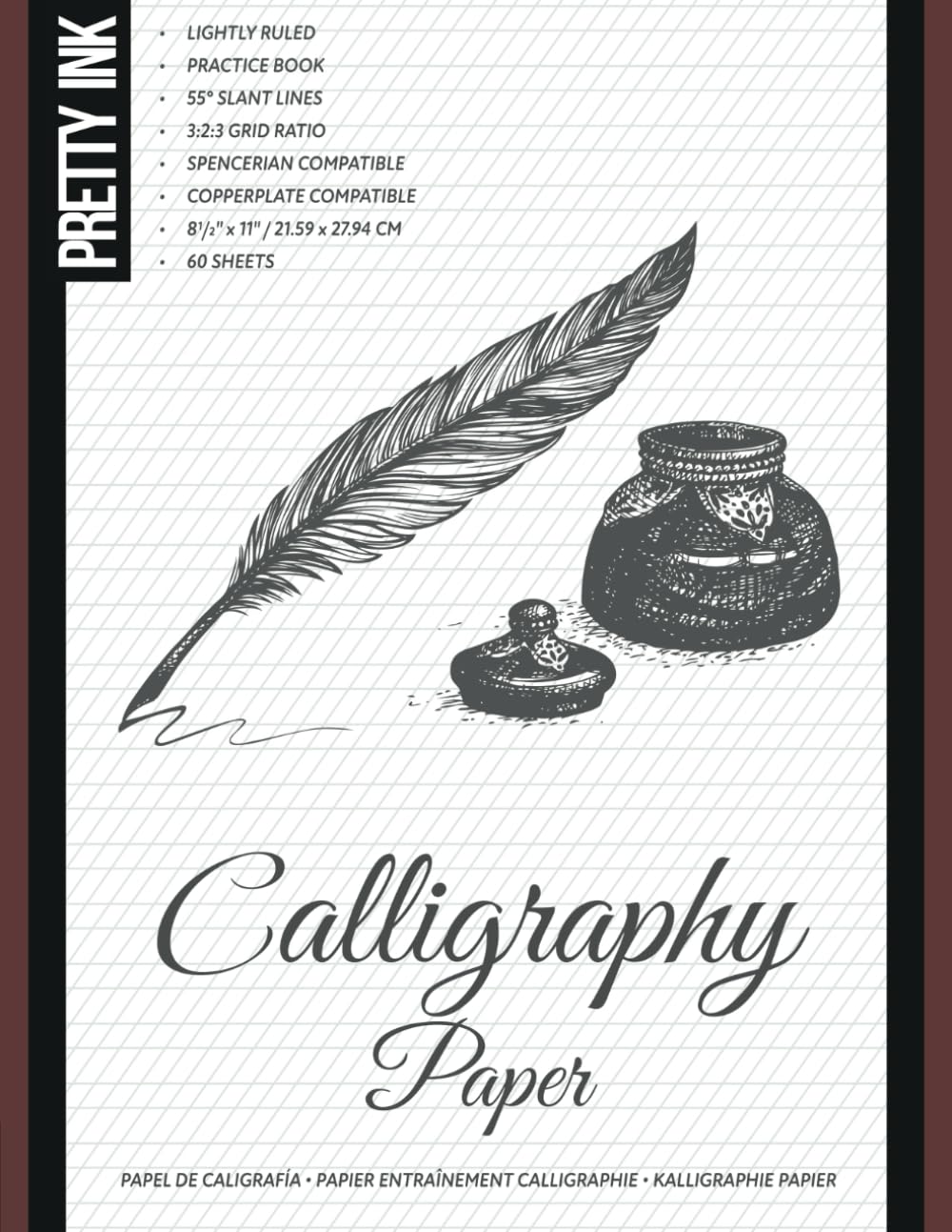
- Focused Practice for Spencerian and Copperplate Calligraphy: Intended for developing traditional pointed-pen lettering techniques, consistent handwriting slant, and controlled letter proportions.
- Useful for Learning Elegant Connected Letterforms: Provides a calligraphy-oriented practice format for working on cursive connections, decorative capitals, and traditional script handwriting.
- Suitable for Developing Consistent Penmanship Techniques: Supports repeated exercises involving letter height, spacing, stroke direction, and the relationship between individual characters.
- Practical Resource for Traditional Lettering Enthusiasts: Relevant to beginners and hobbyists exploring historical calligraphy styles, handwritten correspondence, and decorative penmanship.
- - Versatile for Hand Lettering and Cursive Practice: Can support exercises involving individual letters, complete words, and longer writing passages, depending on the interior page layout.
This Calligraphy Paper Is Better Suited to Traditional Lettering Than General Handwriting
The Spencerian Copperplate Calligraphy Paper is aimed at people who want to practice traditional pointed-pen lettering, cursive handwriting, and decorative script. Its focus on Spencerian and Copperplate makes it particularly relevant to writers who are interested in consistent letter proportions, controlled slant, and the characteristic thin and thick strokes of classical calligraphy. For anyone researching the best paper for calligraphy, this is a more specialized choice than an ordinary lined notebook.
The most important distinction is the intended writing style. Copperplate and Spencerian calligraphy both involve connected letterforms and controlled pen movements, but they have different proportions, stroke characteristics, and historical conventions. The traditional Spencerian and Copperplate calligraphy practice requires attention to these differences rather than treating every decorative cursive alphabet as interchangeable.
The product's title identifies it as calligraphy paper for lettering practice, although its exact interior layout and paper specifications could not be independently confirmed. That matters because printed guidelines, surface smoothness, and ink resistance all influence how useful a practice book will be. Buyers should inspect the interior preview before assuming it contains a particular ruling angle or guideline ratio.
For beginners who already know which script they want to learn, a focused practice resource can be useful. It encourages repeated work on individual letterforms and connected words instead of switching constantly between unrelated lettering styles. The main benefit is having a dedicated place to develop consistency through regular exercises.
The Right Guidelines and Paper Surface Make a Bigger Difference Than Most Beginners Expect
One of the first challenges in traditional pointed-pen calligraphy is maintaining consistent letter slant. In Copperplate, the main writing slant is commonly taught at approximately 55 degrees from the horizontal baseline, although individual teaching systems can vary. The consistent slant control for Copperplate lettering is important because uneven angles become noticeable when several letters are connected.
Consider someone practicing the word invitation for a wedding stationery project. The individual letters may be recognizable, but the word can look inconsistent if some stems lean more heavily than others. Using appropriate slant references helps the writer identify these differences before transferring the lettering onto finished paper.
Spencerian handwriting introduces another set of considerations. Traditional Spencerian letterforms are generally more delicate and rely heavily on smooth movement, consistent proportions, and carefully controlled shading. The traditional Spencerian penmanship practice for beginners requires learning the movement of the script rather than simply copying the appearance of decorative letters.
For example, someone learning Spencerian may initially produce letters that resemble ordinary cursive handwriting. The difference becomes more apparent when the writer begins controlling letter proportions, connecting strokes, and the placement of shaded elements. Repeated exercises help develop these distinctions.
The relationship between the baseline, x-height, ascender line, and descender line is another important part of calligraphy practice. These references determine how different letters occupy the writing space. Without consistent proportions, complete words can appear uneven even when the individual strokes are carefully formed.
For example, lowercase letters such as a, e, and o occupy the main writing area, while letters such as h and l extend upward. Letters such as g and y extend below the baseline. The proper letter height and spacing guidelines help writers maintain consistent proportions across different character combinations.
However, Copperplate and Spencerian do not necessarily use identical proportions. A guideline arrangement suitable for one script may require adjustment for another. This is why the exact interior ruling of a calligraphy practice book matters when choosing paper for a specific lettering technique.
The available product information does not establish whether this particular book includes printed slant lines or a specific x-height ratio. Users who need those features should confirm them through the product preview. If the pages are blank or use unsuitable ruling, separate guideline templates may be necessary.
Another important skill is controlling the difference between thin and thick strokes. Pointed-pen calligraphy uses a flexible metal nib that opens under pressure, allowing more ink to reach the paper. The controlled pointed-pen pressure for elegant lettering is essential for producing consistent shaded strokes.
Imagine someone practicing a lowercase letter n with a flexible nib. The upward movement should generally remain light, while the shaded downward movement requires carefully controlled pressure. Applying too much force can cause the nib to catch on the paper or release excessive ink.
Beginners often assume that stronger pressure automatically produces better calligraphy. In practice, excessive pressure can damage the nib, interrupt the stroke, or create irregular ink deposits. Smooth movements and gradual pressure changes are more useful than forcing the pen against the writing surface.
Paper texture becomes particularly important when using pointed metal nibs. Rough surfaces can catch the nib tines, making delicate hairlines difficult to produce. The smooth writing paper for pointed-pen calligraphy should allow the nib to move without repeatedly snagging on exposed fibers.
For example, someone practicing Copperplate on rough sketchbook paper may notice that the nib catches during upward strokes. This can cause ink splatters or irregular lines. Switching to smoother, ink-compatible paper can improve control without requiring a different writing technique.
However, smoothness alone does not guarantee suitable ink performance. Some smooth papers absorb liquid ink quickly, causing feathering around the edges of letters. Others resist absorption but require longer drying times.
The ink resistance requirements for calligraphy practice paper should therefore be evaluated with the intended pen and ink. A sheet that works well with a pencil or gel pen may behave differently when used with a flexible dip nib and liquid calligraphy ink.
Before beginning an extensive practice session, it is sensible to test several strokes in an inconspicuous area. Draw a thin hairline, followed by a controlled shaded downstroke, then inspect the edges. If the ink spreads excessively or passes through the sheet, a different paper may be more appropriate.
This is particularly important because the paper weight and surface treatment of this specific product remain unverified. Buyers should not assume that it has the same ink-handling characteristics as specialist pointed-pen paper. A protective sheet beneath the active page can also help prevent bleed-through from affecting subsequent pages.
Another useful practice method is separating basic strokes from complete letters. Beginners sometimes attempt to write full words before developing consistent movements. The repeated basic stroke exercises for calligraphy improvement help establish control over pressure, direction, and rhythm.
For example, someone learning Copperplate could dedicate one session to oval shapes and another to compound curves. These movements appear repeatedly in lowercase letterforms. Practicing them individually makes it easier to recognize problems before they become part of longer words.
Spencerian practice can also benefit from repeated movement exercises. Smooth ovals, connecting strokes, and controlled arm movement are important parts of traditional penmanship training. These exercises help develop consistency across longer writing passages.
The foundational handwriting movements for Spencerian script are particularly relevant to writers who are accustomed to ordinary ballpoint pens. A flexible pointed nib requires different pressure and movement habits. Learning these movements gradually can reduce frustration during early practice sessions.
Letter spacing is another area where dedicated practice becomes useful. Connected scripts require careful attention to the visual gaps between characters. Equal physical distances do not always produce equal visual spacing because letters have different shapes.
Consider someone writing a handwritten invitation. The word may contain rounded letters, narrow stems, and extended flourishes. If the spacing is inconsistent, the finished lettering can appear crowded in some areas and excessively open in others.
The consistent word spacing for decorative script writing develops through repeated practice and visual comparison. Writers can improve by practicing the same word several times and adjusting only the spacing. This makes it easier to understand which changes improve the overall appearance.
Another useful technique is practicing with a limited selection of words. Instead of writing completely different phrases every time, a student can repeat words containing challenging letter combinations. This allows progress to be measured more clearly.
For example, someone struggling with the connection between o and v could practice several words containing that combination. Repetition helps identify whether the problem comes from stroke direction, spacing, or pen pressure. The targeted calligraphy exercises for difficult letter connections can be more productive than filling pages without a specific objective.
Practice paper is also useful when preparing professional stationery projects. Wedding invitations, place cards, certificates, and handwritten correspondence often require consistent lettering across several pieces. Practicing the design before writing on expensive final paper helps reduce waste.
Imagine someone preparing 40 handwritten place cards for a formal event. If the lettering style changes halfway through the project, the finished cards may look inconsistent. The traditional calligraphy practice for personalized stationery helps establish a repeatable writing style before production begins.
However, practice paper should not automatically be used for finished artwork. Professional stationery may require specific paper weight, surface finish, and archival properties. The exact specifications of this product have not been confirmed, so its suitability for finished commissions remains uncertain.
The writing instrument also influences the paper requirements. A traditional pointed nib may require a smoother and more ink-resistant surface than a pencil or fine felt-tip pen. Writers who use fountain pens should also consider whether their ink produces feathering or bleed-through.
For example, a broad fountain pen nib may deposit more liquid than a fine nib, increasing the chance of spreading on absorbent paper. Testing the actual pen and ink combination is more reliable than assuming that every product labeled calligraphy paper will perform identically.
Another practical consideration is the difference between Copperplate and ordinary cursive handwriting. Copperplate uses deliberate shaded strokes and carefully structured letterforms, while everyday cursive generally prioritizes writing speed and readability. The specialized practice requirements for Copperplate calligraphy make a focused resource more useful than generic handwriting paper for certain learners.
Spencerian also requires more than simply writing at a consistent angle. Traditional instruction emphasizes movement, rhythm, and carefully controlled letter proportions. Beginners may benefit from combining practice paper with a reliable instructional guide.
This is one limitation of practice-only products. Printed guidelines can help with alignment, but they do not automatically teach correct nib positioning, pressure control, or stroke order. Without instruction, a student may repeat the same mistakes across several pages.
Another limitation is that the exact page count and binding format of this product could not be verified. These details matter when evaluating value and writing comfort. A bound workbook may be less convenient near the inner margins, while loose sheets provide greater flexibility for positioning the paper.
The practical paper selection for long calligraphy sessions should account for both writing performance and comfort. A flat, stable writing surface helps maintain consistent movements. Users should also take regular breaks when practicing with unfamiliar pen grips or pressure techniques.
Why We Ranked This Spencerian Copperplate Calligraphy Paper Sixth
We placed the Spencerian Copperplate Calligraphy Paper at number six among our seven selections because it addresses a relatively specialized area of Western calligraphy. Its focus on traditional pointed-pen lettering makes it relevant to people learning Copperplate and Spencerian scripts. However, its narrower application and the lack of verified paper specifications limit how confidently it can be recommended for general calligraphy use.
Our first-ranked NUOBESTY Xuan Rice Paper focuses on traditional Chinese brush calligraphy and ink painting. That product serves a different artistic tradition and provides a confirmed 50-sheet practice supply. The specialized Spencerian and Copperplate lettering paper is more relevant to Western pointed-pen techniques than East Asian brush writing.
Our second-ranked beginner calligraphy workbook offers a more general introduction to lettering practice. That may be preferable for someone who has not yet selected a particular calligraphy style. The Spencerian Copperplate product is better suited to learners who already know which scripts they want to practice.
Our third-ranked Calligraphy Paper Variety Pack provides several advertised practice layouts. This offers greater flexibility for exploring different lettering arrangements. The sixth-ranked product concentrates on traditional script practice rather than presenting itself as a general variety collection.
Our fourth-ranked Practical Calligraphy Workbook for Beginners also includes instructional material covering pointed-pen and brush techniques. That broader educational approach may be more useful for complete beginners. The focused practice format for classical pointed-pen scripts is more appropriate for learners who already understand the basic tools.
Our fifth-ranked Holly Maxwell Calligraphy Practice Pad emphasizes slanted guidelines and repeated handwriting exercises. That makes it useful for developing consistent letter angles across different cursive styles. The Spencerian Copperplate product is more specifically associated with two traditional scripts.
One of the strongest reasons to consider this paper is its relevance to classical calligraphy. Copperplate and Spencerian require controlled proportions, consistent slant, and deliberate pen movements. A dedicated practice resource can help students concentrate on these requirements rather than switching between unrelated lettering styles.
The traditional pointed-pen lettering practice for advanced beginners can also support preparation for decorative stationery projects. Writers interested in invitations, certificates, and formal correspondence may appreciate a resource focused on elegant connected scripts.
There are disadvantages to consider, particularly the lack of confirmed paper weight, ink resistance, and interior ruling specifications. These details are important when using flexible metal nibs and liquid ink. Buyers should inspect the product preview before assuming it provides the correct guidelines for their chosen script.
The product may also be less useful for people practicing modern brush lettering, broad-edge Italic, or Chinese brush calligraphy. Different techniques require different paper characteristics and writing references. This narrower application contributed to its sixth-place ranking.
Nevertheless, the dedicated calligraphy practice for Spencerian and Copperplate remains valuable for writers interested in these traditional styles. Repeated exercises can help develop consistent letter proportions, smoother connections, and better pressure control.
The ranking therefore reflects the product's specialized purpose and limited verified specifications rather than a demonstrated weakness in its writing performance. Direct testing would be necessary to compare its ink handling, surface smoothness, and durability with other calligraphy papers.
Overall, we believe the Spencerian Copperplate Calligraphy Paper deserves its sixth-place position among the best paper for calligraphy options within this comparison. Although more versatile practice books and specialized brush papers may suit a broader audience, this product is relevant to writers developing traditional pointed-pen lettering skills. For calligraphy enthusiasts who want to concentrate on Copperplate, Spencerian, and elegant connected handwriting, it remains a worthwhile option to consider.

- Heavyweight 140gsm Paper With Smooth Writing Surface: Provides substantial, smooth-finish practice sheets designed for calligraphy pens and markers, helping support controlled lettering without excessive paper texture.
- Twenty-Five Italic-Ruled Sheets for Broad-Edge Calligraphy: Includes printed proportion and alignment guides suitable for practicing Italic letterforms, consistent spacing, and traditional broad-edge writing techniques.
- Twenty-Five Copperplate-Ruled Sheets for Pointed-Pen Lettering: Features guidelines for practicing slanted letterforms, controlled proportions, and the connected handwriting associated with Copperplate calligraphy.
- Large Landscape Format for Comfortable Lettering Practice: Measures 11 by 8.5 inches, providing generous horizontal space for individual strokes, complete alphabets, and longer decorative writing exercises.
- - Versatile Practice Pad for Different Calligraphy Styles: Supports Italic, Copperplate, modern calligraphy, and brush lettering, making it useful for beginners exploring several writing techniques.
This Calligraphy Paper Pad Gets the Important Details Right, Especially the Paper Weight
The Peter Pauper Press Studio Series Calligraphy Paper Pad is designed for people who want a proper writing surface for practicing Italic, Copperplate, and modern calligraphy. It contains 50 heavyweight sheets, divided equally between two printed guideline formats. For anyone researching the best paper for calligraphy, this pad is worth considering because it combines a smooth writing surface with practical guides for developing letter proportions and consistent handwriting.
Each sheet uses 140gsm paper, which is noticeably heavier than ordinary 80gsm office paper. The pad measures 11 by 8.5 inches, providing a landscape writing surface with enough horizontal space for practicing individual strokes, complete alphabets, and longer words. The heavyweight 140gsm calligraphy practice paper is particularly useful for writers who want a more substantial surface than conventional notebook paper.
One of the strongest features is the division between Italic and Copperplate guidelines. The pad includes 25 sheets ruled for Italic lettering and another 25 sheets designed for Copperplate practice. This allows users to work on two different calligraphy techniques without purchasing separate practice pads.
The manufacturer also describes the paper as having a super-smooth finish suitable for pens and calligraphy markers. Surface texture matters because rough paper can interrupt fine strokes and cause certain nibs to catch on exposed fibers. The smooth writing surface for controlled calligraphy strokes is therefore an important feature for people developing consistent lettering techniques.
The Italic and Copperplate Guidelines Make Practice More Structured
The most practical feature of this Studio Series pad is its combination of two different ruling styles. Italic and Copperplate calligraphy have different letter structures, writing angles, and pen requirements. Providing separate guidelines helps learners practice each technique using more appropriate visual references.
The 25 Italic-ruled sheets are particularly useful for broad-edge calligraphy. Italic lettering commonly uses a broad nib held at a consistent angle to create variations between thick and thin strokes. The printed Italic calligraphy guidelines for letter proportions help writers maintain consistent height and alignment while developing these movements.
Consider someone learning to write formal invitations with an Italic calligraphy pen. Their first attempts may contain letters of inconsistent height, particularly when moving between lowercase characters and capitals. Practicing against printed guidelines makes these differences easier to identify.
For example, lowercase letters such as a, e, and o generally occupy the main x-height area, while letters such as h and l extend upward. Maintaining consistent proportions helps complete words appear more balanced. The guidelines provide references that are difficult to maintain when practicing on completely blank paper.
The 25 Copperplate-ruled sheets support a different writing technique. Copperplate calligraphy typically uses a flexible pointed nib that produces fine upward strokes and heavier shaded downward strokes. The Copperplate practice paper with slanted lettering guides helps writers maintain a consistent writing angle while practicing these contrasting movements.
Imagine someone learning Copperplate for wedding stationery. The writer may form attractive individual letters but struggle to keep their slant consistent across an entire name. Printed guidelines provide a reference that makes irregular angles easier to recognize before writing on expensive invitation paper.
Another important aspect of Copperplate is pressure control. Flexible pointed nibs open under pressure, allowing additional ink to reach the paper. Applying too much pressure can produce irregular shaded strokes, while insufficient pressure may prevent the intended contrast from developing.
The structured pointed-pen calligraphy practice for beginners is useful when learning these movements. Students can repeat basic strokes before progressing to individual letters and connected words. This makes it easier to concentrate on one technique at a time.
Paper smoothness becomes particularly important when using flexible metal nibs. A rough surface can catch the nib during delicate upward movements, producing interrupted lines or unwanted ink splatters. The Studio Series pad's smooth finish is intended to accommodate calligraphy pens, although performance still depends on the specific nib and ink.
For example, someone using a flexible dip nib may notice that the nib catches when writing on ordinary textured sketchbook paper. A smoother writing surface can reduce this problem and allow more controlled movements. The smooth calligraphy paper for delicate hairline strokes is particularly relevant when practicing pointed-pen lettering.
The 140gsm paper weight is another practical advantage. Standard office paper commonly weighs around 80gsm, making the Studio Series sheets approximately 75 percent heavier by grammage. This additional paper substance can help support repeated pen movements and reduce the delicate feel associated with thinner practice sheets.
However, paper weight alone does not determine ink resistance. Surface sizing, fiber composition, and coating also influence feathering and bleed-through. The manufacturer describes the paper as suitable for calligraphy pens and markers, but users should still test heavily flowing inks before beginning important work.
Consider someone using a broad calligraphy marker to practice large capital letters. The marker may deposit more ink during slow downward strokes than during quick movements. The heavyweight paper for broad-edge lettering practice provides a substantial surface, although highly saturated markers can still behave differently depending on their formulation.
Testing is straightforward. Draw several light strokes followed by heavier lines, then examine the edges for feathering and the reverse side for bleed-through. This helps determine whether the paper is appropriate for the intended writing instrument.
The landscape format is another useful feature. Measuring 11 inches wide and 8.5 inches high, each sheet provides generous horizontal space for connected words and repeated lettering exercises. This can be more convenient than a narrow notebook when practicing longer phrases.
For example, someone learning Italic lettering may want to repeat the same word several times across one line. The large landscape calligraphy paper for repeated exercises allows several attempts to be compared without immediately moving onto another page. This makes differences in letter spacing and proportions easier to observe.
The pad also supports modern calligraphy and brush lettering, according to the manufacturer. These techniques often use flexible brush pens rather than traditional broad-edge or pointed metal nibs. The smooth paper finish can be useful for practicing pressure transitions, although the printed guidelines may not match every modern lettering style.
Consider someone learning brush lettering with a flexible felt-tip pen. Downward movements generally require more pressure, while upward movements use lighter pressure. The smooth practice sheets for modern brush lettering can help students develop these movements without the additional distraction of a heavily textured surface.
However, brush pen tips can wear prematurely on unsuitable paper. Users should check whether their particular marker performs comfortably on the surface before completing several pages. A smooth finish is beneficial, but individual pen materials and ink formulations still matter.
The 50-sheet quantity provides enough paper for several structured practice sessions. A beginner could dedicate five Italic sheets to basic strokes, another five to lowercase letters, and additional sheets to complete words. The same approach could then be repeated with the Copperplate section.
For example, someone practicing twice per week and using two sheets per session would have approximately 12 weeks of material, with two sheets remaining. The fifty-sheet calligraphy practice pad for regular learning therefore provides a useful supply without requiring a particularly large paper collection.
One advantage of separate practice sheets is the ability to compare results. Writers can place an early exercise beside a later attempt to evaluate improvements in slant, spacing, and stroke consistency. This can be more informative than simply filling pages without reviewing the work.
The guidelines also help when practicing complete alphabets. Letterforms need consistent proportions, especially when uppercase and lowercase characters appear together. Using the same ruling system throughout an exercise helps establish a more uniform appearance.
For example, someone preparing a handwritten certificate may need several decorative capital letters alongside smaller text. Practicing these combinations first can reveal whether the proportions work together. The guided lettering paper for decorative handwriting projects helps reduce mistakes before transferring the design onto final stationery.
Another important consideration is ink drying time. Smooth paper can keep liquid ink near the surface longer than highly absorbent paper. Writers should allow sufficient drying time before stacking completed sheets or placing their hands over freshly written text.
Left-handed calligraphers may need to pay particular attention to this. Certain writing positions cause the hand to move across recently completed strokes. Allowing additional drying time can help prevent smudging.
The pad is also useful for experimenting with different calligraphy tools. Broad-edge fountain pens, selected calligraphy markers, and compatible pointed nibs can produce different results on the same paper. Comparing these results helps users understand which instruments are most comfortable for their preferred lettering style.
There are limitations worth considering. The 50-sheet quantity is smaller than the 120-page practice books included elsewhere in our comparison. Someone practicing every day may consume the available sheets relatively quickly.
Another limitation is the fixed allocation between Italic and Copperplate. A writer interested exclusively in Copperplate receives only 25 sheets dedicated to that style. The equal division between two calligraphy guideline formats may be less convenient for people who want to concentrate on one technique.
The pad is also primarily intended for Western lettering practice. Traditional Chinese brush calligraphy and Japanese sumi-e generally benefit from different paper characteristics, particularly regarding absorbency and ink diffusion. The Studio Series pad should not be considered a direct replacement for traditional Xuan paper.
Finally, the product is a practice pad rather than a comprehensive instructional workbook. The printed guidelines help establish proportions and slant, but they do not replace detailed lessons on nib positioning, stroke order, and pressure control. Beginners may benefit from using it alongside a dedicated calligraphy instruction book.
Why We Ranked the Studio Series Calligraphy Paper Pad Seventh
We placed the Peter Pauper Press Studio Series Calligraphy Paper Pad at number seven among our seven selections because it offers excellent documented paper specifications but provides a more limited quantity of practice sheets than several alternatives. Its 140gsm smooth-finish paper and separate Italic and Copperplate guidelines are genuine advantages. However, our comparison also considers page quantity, instructional content, and suitability for different calligraphy traditions.
Our first-ranked NUOBESTY Xuan Rice Paper focuses on traditional Chinese brush calligraphy and ink painting. That product provides a specialized surface intended for brush-based techniques. The Studio Series paper for Western calligraphy practice instead emphasizes Italic and Copperplate lettering.
Our second-ranked beginner calligraphy workbook provides guided practice within a larger instructional format. That may be more useful for someone learning basic letter formation without previous experience. The Studio Series pad is particularly suitable for learners who already understand the fundamentals and want dedicated practice paper.
Our third-ranked Calligraphy Paper Variety Pack advertises 120 pages divided between three different layouts. That provides more practice pages and potentially greater layout variety. However, the Studio Series pad has an advantage in its clearly documented 140gsm paper weight and smooth finish.
Our fourth-ranked Practical Calligraphy Workbook for Beginners also includes instructional material covering pointed-pen and brush lettering. Its broader teaching approach may be more suitable for people who want lessons and exercises together. The Studio Series product concentrates on the paper and printed guidelines rather than extensive instruction.
Our fifth-ranked Holly Maxwell Calligraphy Practice Pad provides 120 pages of slanted guidelines. That larger quantity may be preferable for people practicing cursive handwriting frequently. The dedicated Italic and Copperplate ruling system of the Studio Series pad is more specialized toward traditional calligraphy techniques.
Our sixth-ranked Spencerian Copperplate Calligraphy Paper also targets traditional pointed-pen lettering. However, the Studio Series pad provides clearer published technical specifications, including its paper weight, dimensions, and division between ruling styles. These details make it easier to evaluate the product before purchasing.
One of the strongest reasons to consider the Studio Series pad is its heavyweight smooth paper for precision lettering. The 140gsm sheets provide a substantial writing surface, while the smooth finish is intended to accommodate calligraphy pens and markers. This is particularly relevant for writers who want controlled strokes without excessive paper texture.
The two ruling formats are another important advantage. Italic and Copperplate require different approaches to letter formation, and having separate guidelines helps learners practice each style more appropriately. The 25-sheet allocation for each technique provides room for repeated exercises.
There are disadvantages to consider, particularly the smaller overall sheet quantity and the absence of extensive instructional content. Writers who practice only one script may also find the equal division between the two layouts inconvenient. These limitations contributed to its seventh-place ranking.
Nevertheless, its lower position does not indicate inferior paper quality. In fact, the Studio Series pad offers some of the clearest documented paper specifications in this comparison. The combination of 140gsm paper and printed calligraphy guidelines makes it a practical choice for focused Western lettering exercises.
Its landscape dimensions also provide useful space for practicing complete words and longer letter combinations. This is particularly convenient when developing consistent spacing and comparing repeated attempts. The smooth finish adds further appeal for people using compatible calligraphy pens and markers.
Overall, we believe the Peter Pauper Press Studio Series Calligraphy Paper Pad deserves its seventh-place position within our best paper for calligraphy comparison because of its narrower practice focus and smaller sheet quantity. However, its heavyweight 140gsm paper, 25 Italic-ruled sheets, 25 Copperplate-ruled sheets, and generous landscape format make it a strong specialist option. For calligraphy enthusiasts who want smooth, properly guided paper for developing traditional Western lettering techniques, it remains an excellent choice worth considering.