


- 180 GSM paper provides substantial weight for layered pastel artwork.
- 100-sheet quantity gives artists plenty of room for experimentation.
- Neutral colored sheets create useful backgrounds for light and dark pastels.
- 9 x 12 inch format suits studies and finished drawings.
- - Versatile drawing surface works with oil pastels and charcoal.

The neutral paper colors change how you build an oil pastel drawing
The Ctosree Oil Pastel Paper set provides 100 sheets of 180 GSM drawing paper in a 9 x 12 inch format, with neutral colors rather than limiting the artist to ordinary bright white sheets. When comparing the best paper for oil pastels, that combination is interesting because paper color, weight and surface all influence how pastel marks appear and how much layering the sheet can comfortably handle.
Neutral paper gives the artist a middle value before the first pastel touches the surface. Instead of building every shadow from white, darker marks can move downward in value while cream, white and pale pastel colors can be used for highlights.
This can make value studies easier to judge. On a medium neutral sheet, a bright highlight becomes immediately visible rather than disappearing into a white background.
The 180 GSM weight is another useful specification. Heavier paper handles repeated pastel work more confidently, especially when the artist is layering, blending and returning to the same area several times.
The 9 x 12 inch dimensions are practical too. There is enough space for portraits, landscapes, still-life studies and classroom exercises without every drawing requiring a large studio surface.
Oil pastel needs enough surface texture to keep accepting pigment
Oil pastels deposit a soft mixture of pigment, oil and wax-like binders onto the paper. Unlike graphite, where very smooth paper can still produce controlled lines, pastel work often benefits from some surface texture that can physically catch and retain the material.
Artists commonly describe that surface texture as tooth. More tooth gives the pastel additional small high and low points to grip, which can help when building several layers of color.
There is a limit, though. Paper texture affects both coverage and fine detail, so an extremely rough surface may consume pastel quickly and make small controlled marks harder to produce.
This is why the intended drawing style matters. Broad landscapes and expressive layering may benefit from more visible texture, while portraits and detailed illustration often need a balance between tooth and a reasonably controlled surface.
The neutral sheets become particularly useful when working with opaque light colors. Imagine drawing a night landscape on gray paper and adding pale yellow windows, white moonlight and cool highlights over the existing mid-tone surface.
Those light marks can become part of the drawing immediately. The artist does not have to cover large areas of white paper first just to establish a darker overall value.
Heavy blending still requires some care. Too much pressure can flatten the paper tooth, filling the surface with pastel binder and making later layers harder to apply cleanly.
A better approach is often to build color gradually. Use lighter pressure for the early layers, establish the major shapes and values, then increase pressure selectively when stronger opaque coverage is actually needed.
Why we believe this Ctosree paper deserves our number one position
The Ctosree earns our top ranking because the specifications make sense for actual oil pastel practice. The 180 GSM weight provides a more substantial drawing surface, while the neutral colors give artists creative options that standard white sketch paper simply does not provide.
The 100-sheet quantity is a major advantage too. One hundred sheets encourage experimentation without feeling wasteful, which matters because oil pastel technique improves through testing pressure, layering, blending and different color combinations.
An artist can dedicate some sheets to finished drawings and use others for color tests. That is useful when checking how a new pastel behaves over gray, beige or another neutral background before committing to the final artwork.
The 9 x 12 inch size also hits a useful middle ground. It is manageable for students and sketching but large enough to develop a proper composition rather than feeling restricted to tiny studies.
The neutral-color assortment gives the paper another advantage for portrait work. Skin tones, highlights, hair and clothing can be developed around the existing value of the paper instead of beginning every passage against bright white.
There are still limitations to understand. At 180 GSM, this is substantial drawing paper, but artists using extremely aggressive techniques, heavy solvents or unusual mixed-media applications may prefer an even heavier specialized surface.
Oil pastel can also transfer onto facing sheets because the medium does not dry in exactly the same way as conventional paint. Finished artwork should therefore be stored carefully, and glassine or another suitable protective interleaf can help prevent unwanted contact with neighboring work.
The large 100-sheet supply also means storage deserves some thought. Keeping unused paper flat and protected from moisture, dust and bent corners helps preserve the surface for later drawings.
For ordinary oil pastel work, though, the combination is unusually practical. You get enough weight for confident drawing, useful neutral backgrounds, a versatile 9 x 12 inch working area and enough sheets to experiment without treating every piece of paper as precious.
That is why we believe the Ctosree NeutralTone 180 GSM Oil Pastel Paper deserves the number one position in our Best Paper For Oil Pastels ranking. Its 180 GSM weight and neutral colored surfaces, combined with a generous 100-sheet quantity and practical 9 x 12 inch dimensions, make it a strong choice for students and artists who want to layer, blend, practice value control and explore both light and dark pastel marks on something more versatile than ordinary white sketch paper.

- Textured surface provides useful tooth for holding oil pastel layers.
- Professional pastel paper supports blending and repeated color applications.
- Surface texture helps retain pigment during expressive drawing techniques.
- Suitable tooth supports both broad coverage and controlled pastel marks.
- - Dedicated pastel surface offers advantages over ordinary smooth sketch paper.
The textured surface is the part that matters once you start adding more layers
Urban Artist Professional Textured Pastel Paper is built around a textured drawing surface intended to give pastel material something substantial to grip. When comparing the best paper for oil pastels, surface tooth is one of the first things worth examining because it affects how the pastel deposits, how many layers can be developed and how the finished marks actually look.
Oil pastel is a relatively soft medium containing pigment with oily and wax-like binders. When it moves across textured paper, material catches on the raised areas while some of the underlying paper can remain visible in the lower parts of the surface.
That can create a more broken, textured mark when light pressure is used. Increase the pressure and the pastel begins filling more of those small gaps, producing denser and more opaque coverage.
This gives the artist useful control. Paper tooth changes how every pastel stroke behaves, which is why dedicated pastel paper can feel very different from ordinary printer or smooth sketch paper.
The professional textured format is particularly useful for artists who build drawings in stages. Early layers can remain lighter and more open, leaving enough surface texture available for stronger colors later.
Do not flatten all the tooth during the first five minutes
One common oil pastel mistake is beginning with maximum pressure everywhere. Heavy pressure fills the paper texture quickly with pigment and binder, which can make later layers harder to place over the same area.
Starting more lightly gives the artist room to make changes. Colors can be layered gradually, edges can be adjusted and stronger opaque marks can be saved for areas that actually need them.
This matters with portraits. Lighter early layers preserve room for later corrections, so skin tones can be adjusted before highlights, shadows and smaller facial details are pushed toward their final values.
Landscape work benefits from the same approach. A lightly applied blue and gray sky can establish the basic color structure while leaving enough surface available for brighter clouds or sunset colors later.
Texture also changes blending. Rubbing two colors together can push pastel deeper into the surface, but excessive blending may fill the tooth and produce a flatter area that becomes difficult to layer further.
Sometimes leaving part of the paper texture visible gives the drawing more visual variation. Not every section needs to become a completely smooth block of color.
The amount of pressure should therefore change throughout the drawing. Save heavier pressure for deliberate opaque passages, rather than using it automatically for every layer from beginning to end.
Finished oil pastel work also needs careful storage. Because oil pastel remains relatively soft, the artwork can transfer or smudge when another sheet is placed directly against the surface.
Using an appropriate protective interleaf such as glassine can help reduce direct contact during storage. Framed work should also be handled so the pastel surface is not pressed directly against glazing.
Why the Urban Artist takes our number two position
The Urban Artist earns a high ranking because its textured surface directly addresses one of the most important requirements for oil pastel work. Tooth gives the medium something to grip and provides room for building color in several stages.
That makes this paper particularly appealing for artists who enjoy layering. A textured surface supports more deliberate pastel development, rather than encouraging the artist to fill a smooth sheet immediately with one heavy application.
It also works well for expressive drawing. Broken strokes, visible paper texture and layered marks can all become part of the finished image instead of being treated as imperfections that need to disappear.
For example, an artist drawing rough tree bark can use the paper texture to help create irregular marks. The same surface can support softer blended areas elsewhere in the image simply by changing pressure and technique.
The reason we place the Urban Artist at number two rather than number one comes down to overall versatility and quantity. Our top ranked Ctosree provides 100 sheets of 180 GSM paper in a practical 9 x 12 inch format.
The Ctosree also includes neutral colored surfaces. Those mid-tone backgrounds allow artists to develop both light and dark values from the beginning rather than always starting against bright white paper.
That becomes particularly useful for portraits, value studies and dramatic lighting. White and pale pastels immediately become active drawing colors instead of blending into the untouched paper.
The Urban Artist has a more specific strength. Its main advantage is the dedicated textured pastel surface, which can be particularly valuable for artists who prioritize tooth, layering and visible mark-making.
Texture can also have a downside depending on the artist. Someone creating extremely small detailed illustrations may prefer a smoother surface because pronounced tooth can interrupt tiny lines and require more pastel to achieve complete coverage.
A textured sheet may consume soft pastel material faster as well. More surface variation means more pigment can be required when the goal is a completely solid opaque area.
For traditional oil pastel drawing, though, that texture is often exactly what makes the paper useful. It gives the artist more options for controlling coverage, layering and the character of individual marks.
That is why we believe the Urban Artist Professional Textured Oil Pastel Paper deserves the number two position in our Best Paper For Oil Pastels ranking. It falls just behind our first choice in sheet quantity and neutral background versatility, but its dedicated textured surface, useful tooth and ability to support layering, blending and expressive pastel marks make it a strong positive choice for artists who want their paper surface to play an active role in how the oil pastel behaves.

- Heavyweight paper provides a sturdy surface for layered pastel applications.
- Assorted sheet colors create varied backgrounds for oil pastel artwork.
- Toned surfaces make both light and dark colors immediately visible.
- Versatile artist paper supports oil pastel, charcoal, and drawing techniques.
- - Substantial paper construction handles repeated blending better than thin sheets.
The assorted colors give you a useful starting value before drawing anything
The Somime Artists Assorted Heavyweight Paper combines a substantial drawing surface with assorted paper colors, making it particularly interesting for oil pastel artists who do not want every piece to begin on plain white. When comparing the best paper for oil pastels, toned paper can change the entire drawing process because the sheet itself becomes part of the value and color structure.
On white paper, the artist normally needs to establish nearly every dark and middle value manually. A toned sheet already provides an existing value, so the drawing can develop both lighter and darker from that starting point.
That becomes useful immediately with oil pastel. White, cream and pale yellow marks become clearly visible without requiring the surrounding paper to be darkened first.
Dark colors behave differently too. Toned paper lets highlights and shadows develop together, which is useful for portraits, still-life drawings and subjects with strong directional lighting.
The heavyweight construction is another important part of the product. Oil pastel work can involve repeated pressure, blending and several layers, so a more substantial sheet generally feels better suited to that physical process than lightweight everyday paper.
Heavyweight paper helps, but the surface can still become overloaded
Oil pastel does not soak into paper in the same way as watercolor. Pigment and binder remain largely on the surface, and repeated applications gradually fill the available texture of the sheet.
This means even good heavyweight paper has a practical layering limit. Once the surface becomes heavily loaded with oil pastel, additional marks may begin sliding over the existing material rather than gripping the paper underneath.
Starting with moderate pressure helps delay that problem. Lighter first layers preserve more surface for later color, giving the artist additional room for corrections, highlights and stronger final accents.
Imagine building a portrait on warm tan paper. The paper itself can serve as part of the middle-value structure, while darker browns establish shadows and cream or white pastel creates highlights on the forehead, nose and cheekbones.
That reduces the need to cover every square inch of the sheet. Some areas of untouched paper can remain visible and become an intentional part of the finished image.
The same approach works with still life. A gray sheet can provide a neutral base for metallic objects, glass and strong white highlights without requiring a complete background layer before the main subject begins.
Blending still needs restraint. Excessive rubbing can flatten texture and muddy colors, particularly when several soft oil pastel layers have already been applied in the same area.
Instead of blending everything until the surface becomes uniform, leaving some individual strokes visible can preserve color clarity. More controlled blending also keeps the paper surface available for additional marks later.
Finished oil pastel work should be stored carefully because the medium remains relatively soft. Using an appropriate protective interleaf such as glassine can reduce unwanted transfer when several drawings are stored together.
Why the Somime takes our number three position
The Somime earns a high position because heavyweight construction and assorted paper colors are both genuinely useful for oil pastel work. The artist gets a more substantial surface while also gaining alternatives to the standard white background.
The assorted tones are particularly useful for experimentation. Different paper colors can completely change pastel contrast, even when exactly the same oil pastel palette is used.
A pale pastel that looks subtle on white paper can become much stronger on a darker sheet. Likewise, deep colors may interact differently with warm, cool or neutral backgrounds.
This makes the paper useful for students learning color relationships. Drawing the same small subject on two different toned sheets can demonstrate how strongly the background influences perceived color and value.
The heavyweight format also makes sense for repeated practice. Oil pastel artists often use pressure, layering and blending techniques that can feel less comfortable on thin sketch or copy paper.
The reason we place the Somime at number three is that our first two choices provide slightly stronger advantages for dedicated oil pastel work. The Ctosree at number one provides 100 sheets of 180 GSM paper in a practical 9 x 12 inch size, along with neutral colors.
That large 100-sheet quantity gives artists substantial room for practice and experimentation. It becomes easier to test techniques without feeling that every sheet needs to become a finished artwork.
Our number two Urban Artist option emphasizes a professional textured pastel surface. Its strength is the dedicated tooth, which helps catch pastel material and supports artists who deliberately build several layers.
The Somime sits between those two approaches. Its heavyweight assorted paper provides strong overall versatility, but its standout advantage is broader mixed drawing use rather than one highly specialized oil pastel characteristic.
That versatility can actually be useful for mixed-media artists. Someone who works with charcoal as well as oil pastel can use the same paper supply for different dry drawing techniques instead of maintaining separate pads for every medium.
Artists focused exclusively on oil pastel may prefer a paper with more clearly defined pastel-specific tooth. But for experimentation, toned-paper studies and general studio drawing, the Somime remains a very practical surface.
That is why we believe the Somime HeavyTone Assorted Oil Pastel Paper deserves the number three position in our Best Paper For Oil Pastels ranking. It falls behind our first two choices in sheet quantity and specialized pastel surface texture, but its heavyweight construction, assorted background colors and suitability for pastel, charcoal and layered drawing make it a strong positive choice for artists who want sturdy toned paper that can handle more than one type of studio work.

- Dedicated oil pastel paper surface supports layered color applications.
- Pad format keeps unused sheets protected and neatly organized.
- Textured drawing surface helps pastel pigment grip during application.
- Substantial paper construction supports blending and repeated pastel strokes.
- - Artist-focused design suits sketches, studies, and finished pastel artwork.
A dedicated oil pastel pad removes a lot of guessing about the surface
The MEEDEN Oil Pastel Paper Pad is designed specifically around oil pastel work, which immediately gives it an advantage over generic drawing paper that may or may not have enough surface texture for the medium. When comparing the best paper for oil pastels, that matters because paper tooth, thickness and surface behavior directly influence how easily pastel can be layered and blended.
Oil pastel sits largely on the surface rather than behaving like a thin liquid medium that penetrates deeply into the sheet. The paper therefore needs enough texture to catch pigment and binder as the pastel moves across it.
A dedicated pastel surface makes this more predictable. The artist can begin working without wondering whether a smooth multipurpose sketch sheet will stop accepting color after only a couple of layers.
The pad format is useful too. A bound pad keeps unused pastel paper protected, which matters in a studio where loose sheets can quickly collect dust, bent corners and accidental marks.
It also makes the paper easier to transport. Students and artists can keep a collection of working sheets together rather than carrying individual pieces between a portfolio, desk and classroom.
Build the early layers lightly or you can fill the surface too quickly
Oil pastel layering depends partly on how much available tooth remains in the paper. Heavy pressure during the first application can fill much of that texture with pigment and binder before the drawing has properly developed.
That can become frustrating later. A highlight or correction may refuse to grip cleanly because the surface underneath has already been heavily compressed and covered.
Starting with lighter pressure gives the drawing more room to develop. Preserving surface tooth makes later layering much easier, especially when several colors need to interact in the same section.
A landscape provides a good example. An artist can begin a sky with light blue and gray applications, establish the overall value, then gradually introduce stronger orange or pink colors as the composition develops.
If the first blue layer is pressed heavily into the paper, those later colors may slide over the surface instead of integrating naturally with the underlying marks. Less pressure at the beginning provides more options.
Blending should also be deliberate. Oil pastel can be blended with fingers or appropriate tools, but aggressive rubbing can flatten the paper texture and mix several colors into a duller passage.
Sometimes visible strokes are better. Not every pastel area needs completely smooth blending, particularly in foliage, hair, rough fabric or other subjects where individual marks contribute useful surface variation.
Finished drawings require careful storage as well. Oil pastel remains relatively soft, so stacking artwork directly against ordinary paper can cause pigment transfer or smudging.
An appropriate protective interleaf such as glassine can help when finished sheets are stored in a portfolio. The artwork should also avoid unnecessary pressure against other surfaces.
Why the MEEDEN takes our number four position
The MEEDEN earns its place because it is specifically presented as an oil pastel paper pad. That dedicated purpose makes it easier for an artist to choose than ordinary sketch paper where the surface may be optimized for pencil instead.
The pad construction adds practical value. Keeping pastel sheets together makes studio work more organized, particularly for students who regularly move supplies between home, class and another workspace.
The surface is the more important reason for choosing it, though. Oil pastel benefits from enough tooth to hold pigment while still allowing the artist to control edges, blending and detailed marks.
A dedicated pad is useful for practice sessions too. The artist can work through color studies, small compositions and technique tests while keeping the results together for later comparison.
The reason we place the MEEDEN at number four is that the three products above it provide stronger advantages in particular areas. Our number one Ctosree provides 100 sheets of 180 GSM paper in a 9 x 12 inch format, giving artists a large supply for repeated practice.
The Ctosree also provides neutral colored sheets. Those toned backgrounds allow artists to develop highlights and shadows in both directions rather than always beginning against bright white.
Our number two Urban Artist option emphasizes a professional textured pastel surface. That dedicated tooth makes it particularly appealing for artists who intentionally use paper texture as part of their layering technique.
The Somime at number three combines heavyweight construction with assorted sheet colors. Toned heavyweight paper provides more creative starting options, especially for portraits, charcoal studies and mixed dry-media work.
The MEEDEN is more straightforward by comparison. It provides a dedicated oil pastel surface in an organized pad, but it does not offer the same obvious quantity advantage as the Ctosree or the varied background colors available from some higher ranked options.
That simplicity may actually appeal to artists who do not need assorted tones. Someone who prefers a consistent working surface can benefit from having the same paper characteristics from one drawing to the next.
It is also a sensible step up from generic sketchbook paper. Artists who find their current sheets too smooth or too lightweight may appreciate moving to paper intended specifically for the demands of oil pastel.
That is why we believe the MEEDEN Artist Oil Pastel Paper Pad deserves the number four position in our Best Paper For Oil Pastels ranking. It falls behind our higher ranked choices in sheet quantity and varied background color options, but its dedicated pastel surface, convenient pad construction and suitability for layering, blending and repeated drawing make it a positive choice for artists who want a straightforward paper pad designed around oil pastel rather than a general-purpose sketching surface.

- 180 GSM paper provides substantial support for layered pastel applications.
- Dedicated pastel surface offers useful texture for holding pigment.
- Pad construction keeps unused drawing sheets together and protected.
- Heavier paper handles repeated blending better than lightweight sketch sheets.
- - Versatile surface supports oil pastel studies and finished artwork.
The 180 GSM weight is a useful starting point for serious pastel work
This Pastel Paper Pad uses 180 GSM sheets, giving artists a noticeably more substantial drawing surface than ordinary lightweight sketch or printer paper. When comparing the best paper for oil pastels, paper weight is worth paying attention to because oil pastel involves pressure, layering and blending that can make thin sheets feel inadequate fairly quickly.
A heavier sheet provides more physical stability while the artist works. It is less likely to feel flimsy when areas are repeatedly layered or when stronger pressure is used to create dense final passages.
The 180 GSM specification is therefore useful information. It gives the buyer something measurable rather than simply describing the paper as thick or professional without explaining what that means.
For reference, GSM describes the mass of paper in grams per square meter. At 180 GSM this is substantial drawing paper, although it is still lighter than very heavy mixed-media boards and specialized rigid pastel surfaces.
The pad format also keeps the sheets organized. That is useful for students and studio artists who want unused paper protected until they are ready to begin another drawing.
Oil pastel needs tooth, and heavy pressure can use it up quickly
Oil pastel works differently from graphite because the colored material builds on the surface of the paper. Pigment mixed with oily and wax-like binders catches against the paper texture and gradually fills it as additional layers are applied.
That surface texture is commonly called tooth. Enough tooth helps the paper accept multiple applications rather than becoming completely slick after the first heavy layer.
This is why pressure control matters. Light early layers preserve the paper surface longer, leaving more texture available when the artist wants to introduce additional colors later.
Imagine drawing a sunset. A light orange base can establish the general warmth, followed by reds, purples and darker values as the sky develops.
If the orange is pressed heavily into every part of the sheet at the beginning, later colors have less exposed paper texture to grip. They may begin moving over the existing pastel rather than interacting with the paper underneath.
The same issue appears in portrait work. Skin tones often need several subtle adjustments, and preserving the tooth during early layers provides more freedom to correct temperature and value before stronger highlights are added.
Blending also affects the surface. Heavy blending can flatten tooth and mix colors excessively, so rubbing every transition until it becomes perfectly smooth is not always the best technique.
Some visible strokes can make an oil pastel drawing more interesting while preserving color separation. Smooth blending can then be reserved for areas where a softer transition genuinely helps the subject.
Finished artwork should be protected carefully because oil pastel remains relatively soft. An appropriate interleaf such as glassine can help reduce unwanted pigment transfer when drawings are stored together.
Why this 180 GSM pad takes our number five position
This paper earns its place because 180 GSM is a practical weight for oil pastel drawing. It gives artists a more substantial working surface without requiring them to move immediately into expensive heavyweight boards.
The dedicated pastel pad format is another advantage. A consistent pad makes repeated practice more predictable, because the artist can learn how the same surface reacts to different pressures, colors and layering techniques.
That consistency is useful for students. If every practice drawing is made on a completely different paper, it becomes harder to tell whether a change in the result came from improved technique or simply from a different surface.
The reason we place this pad at number five is that our four higher ranked products offer stronger additional advantages. The Ctosree at number one combines the same 180 GSM weight with 100 sheets, neutral colors and a practical 9 x 12 inch format.
That large quantity and toned-paper selection make the Ctosree more versatile for repeated oil pastel studies. Artists can experiment with highlights and dark values on neutral backgrounds rather than always beginning with the same paper color.
The Urban Artist at number two emphasizes a professional textured pastel surface. That gives it a stronger proposition for artists specifically looking for pronounced tooth and layered mark-making.
The Somime at number three combines heavyweight construction with assorted colors, while the MEEDEN at number four is specifically positioned as an oil pastel paper pad. Those products provide clearer specialized reasons for their higher placement.
This 180 GSM pad is more straightforward. Its strongest advantage is dependable paper weight and simplicity, rather than unusual colors, a very large sheet count or another distinctive feature.
That can still be exactly what some artists want. A consistent pastel pad is easier to understand than buying a highly specialized surface before knowing what kind of texture or paper color works best with your drawing style.
It is also a sensible option for technique practice. Layering, scumbling, controlled blending and pressure experiments can all be developed on a substantial sheet without immediately using premium specialist paper for every exercise.
That is why we believe the Studio 180 GSM Oil Pastel Paper Pad deserves the number five position in our Best Paper For Oil Pastels ranking. It falls behind our higher ranked choices in sheet variety and specialized surface features, but its 180 GSM construction, dedicated pastel format and ability to support repeated layering and blending make it a positive choice for students and artists who want dependable heavyweight paper for regular oil pastel practice and finished drawings.
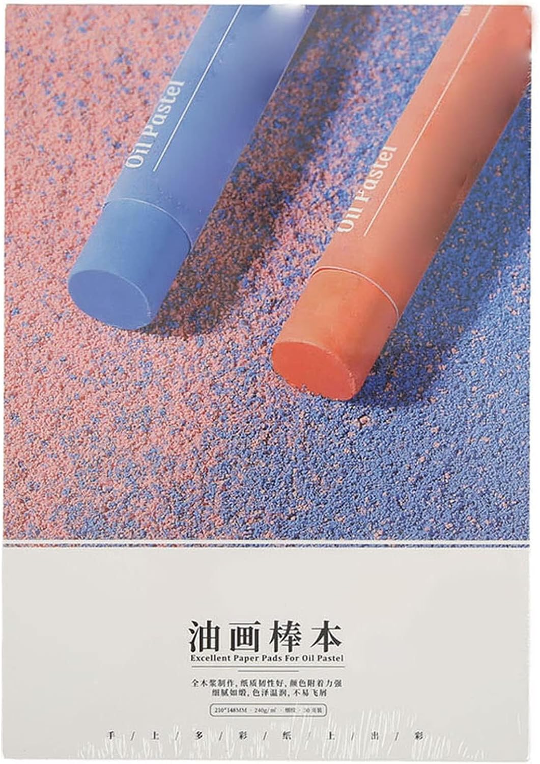
- Compact 21 x 14.8 cm format supports portable pastel sketching.
- Sketchbook construction keeps oil pastel studies together and organized.
- Drawing surface accommodates sketching, pastel work, and art practice.
- Portable size fits easily inside art bags and backpacks.
- - Bound format protects unused sheets better than loose drawing paper.
The compact A5 size is actually useful when you want to practice more often
This drawing sketchbook uses an approximately 21 x 14.8 cm format, essentially the familiar A5 size, giving artists a compact surface for drawing, sketching and portable art practice. When comparing the best paper for oil pastels, size is not the first specification most people consider, but it can determine how frequently the paper actually gets used.
A large pastel pad is excellent when there is a dedicated table available. It becomes less convenient when the artist wants to sketch during travel, carry supplies to class or work outside the studio.
The smaller format is easier to put inside a backpack or art bag with a compact selection of oil pastels. That makes short studies more practical because setting up does not require a large working area.
For beginners, this can be particularly useful. A smaller page encourages quick oil pastel studies, where the goal is testing color, pressure or composition rather than producing a finished piece every time.
The bound sketchbook format also keeps those experiments together. Instead of accumulating individual loose sheets, the artist can look back through earlier drawings and see how technique has changed over time.
Oil pastel can fill a small page surprisingly quickly
Oil pastel deposits a substantial amount of material compared with pencil. The pigment and binder remain largely on the surface, so repeated strokes gradually fill whatever texture or tooth the paper provides.
On a compact A5 sheet, that can happen quickly because the artist is often working at a smaller scale. A few broad strokes may cover a significant percentage of the entire drawing area.
Pressure control therefore matters. Light early applications leave room for additional pastel layers, while pressing heavily from the beginning can make later corrections more difficult.
Imagine making a small landscape study. Light blue can establish the sky, muted green can place the land and a darker value can define the basic structure before stronger colors are introduced.
If every initial mark is applied with maximum pressure, the available paper texture fills early. Adding a pale highlight or changing the sky color later can become harder because the new pastel is interacting mostly with the existing oily layer rather than the paper.
Small sketchbook work is also a good place to practice color combinations. Artists can dedicate one page to warm and cool contrasts, another to skin tones and another to different blending methods.
The bound format makes comparison easy. A sketchbook creates a useful record of technique experiments, especially when the date, pastel brand or colors used are written beside each study.
Finished oil pastel pages still require care because the medium remains soft. Closing a sketchbook can place one sheet directly against another, potentially causing pigment transfer if heavily applied pastel is left unprotected.
Using a suitable protective interleaf such as glassine between completed oil pastel pages can help reduce direct contact. Avoid pressing the closed sketchbook under heavy books when thick pastel applications are inside.
Why this A5 sketchbook takes our number six position
This sketchbook earns its place because portability has genuine value for artists. The 21 x 14.8 cm size is easy to transport and provides enough space for studies, small drawings and color experiments without requiring a full studio setup.
The bound construction is another useful feature. Keeping practice drawings together makes progress easier to review, which can be more useful for students than having dozens of loose sheets stored in different places.
The compact size also reduces the amount of pastel required to complete an exercise. That makes it practical for quick composition studies before committing to a larger sheet of more expensive specialist pastel paper.
The reason we place this product at number six is that the five options above it provide stronger characteristics specifically for oil pastel. Our number one Ctosree offers 100 sheets of 180 GSM paper in neutral colors and a larger 9 x 12 inch working area.
Those neutral backgrounds provide much more freedom for value studies. Light pastel colors become visible immediately while darker colors can be developed in the opposite direction.
The Urban Artist at number two emphasizes a professional textured surface with useful tooth for layering. The Somime at number three combines heavyweight construction with assorted colors, providing another strong option for artists who want toned surfaces.
The MEEDEN at number four is specifically presented as an oil pastel paper pad. Our number five option provides a clearly stated 180 GSM paper weight, which gives artists more direct information about the physical substance of the drawing surface.
This A5 sketchbook is more general-purpose by comparison. Its main advantage is portability rather than specialized pastel performance, so artists focused on heavy layering or finished exhibition work may prefer one of the dedicated pastel papers above it.
The smaller page can also feel restrictive for broad expressive oil pastel techniques. Large gestures and expansive landscapes naturally benefit from having more physical room for the hand and pastel stick to move.
For practice, travel and small studies, though, compactness becomes an advantage rather than a limitation. An artist can carry the sketchbook regularly and work whenever a short drawing opportunity appears.
That is why we believe the A5 Artist Oil Pastel Drawing Sketchbook deserves the number six position in our Best Paper For Oil Pastels ranking. It falls behind our higher ranked choices in specialized pastel texture and larger working space, but its portable 21 x 14.8 cm format, organized bound construction and usefulness for color studies, technique practice and small oil pastel sketches make it a positive choice for students and artists who want a convenient surface they can actually carry with them.

- Dedicated oil pastel surface supports controlled layering and blending techniques.
- Textured paper helps soft pastel material grip during application.
- Convenient pad format keeps unused drawing sheets clean and organized.
- Substantial drawing surface handles repeated pastel strokes and pressure.
- - Artist-focused paper works for practice studies and finished artwork.
A dedicated pastel pad is still much better than grabbing random paper
The MEEDEN Oil Pastel Paper Pad is designed specifically for pastel artwork, giving artists a purpose-built drawing surface rather than asking them to adapt ordinary printer paper or a lightweight notebook. When comparing the best paper for oil pastels, that specialization matters because oil pastel depends heavily on the texture and strength of the surface underneath it.
Oil pastel contains pigment combined with oily and wax-like binders, so much of the material remains on the surface of the sheet. The paper needs enough texture to catch that material while still allowing the artist to move the pastel smoothly across the page.
Generic smooth paper can become filled quickly. Once the available surface texture is covered with a heavy layer of pastel, later colors may struggle to grip properly.
A dedicated pastel paper gives the artist a better starting point. The right surface makes controlled layering much easier, particularly when a drawing requires several colors to occupy the same area.
The pad format is useful as well. Unused sheets remain together instead of getting scattered around a studio where dust, bent corners and accidental pastel marks can damage them before they are used.
Oil pastel rewards lighter early layers more than people expect
One of the easiest mistakes with oil pastel is pressing too hard too early. Strong pressure creates satisfying opaque color immediately, but it also pushes material into the paper texture and reduces the amount of tooth available for subsequent layers.
Starting more lightly provides additional options. The artist can establish basic shapes and values first, then decide which areas actually need dense coverage.
This is especially useful when working with several colors. Light pressure preserves room for later color adjustments, which means mistakes are easier to correct before the drawing becomes heavily loaded with pastel.
Consider a portrait where several colors are being used in the skin. A light warm base can be established first, then cooler shadows, reds and pale highlights can be introduced gradually.
If the first skin color is heavily pressed into the paper, later adjustments may become more difficult. The new pastel is interacting primarily with an existing oily layer instead of the paper surface.
The same idea applies to landscapes. Light initial marks can establish the sky, distant hills and foreground before the artist commits to stronger opaque passages.
Blending should also be selective. Too much rubbing can flatten the paper texture, and repeatedly mixing several colors together can create muddy areas where the individual pigments lose clarity.
Sometimes leaving visible pastel strokes produces a stronger result. Texture can work particularly well in foliage, clouds, hair, stone and other subjects where completely smooth color is not necessary.
Storage matters after the drawing is finished. Oil pastel remains relatively soft, so an appropriate protective interleaf such as glassine can help prevent pigment from transferring onto another sheet during storage.
Why this MEEDEN takes our number seven position
This MEEDEN earns its place because it provides a dedicated paper surface for oil pastel work. Artists can use it for practice, color studies and finished drawings without relying on paper primarily intended for writing or basic pencil sketching.
The pad construction is practical too. A consistent pad helps artists understand one surface properly, because pressure and layering experiments can be repeated without the paper changing from one drawing to another.
That consistency is useful for students. If a technique works on one sheet, it can be tested again under similar conditions rather than wondering whether a different paper caused the change.
The reason we place this product at number seven is the strength of the six alternatives above it. Our number one Ctosree combines 180 GSM construction with 100 sheets, a 9 x 12 inch size and neutral colored paper.
That gives artists substantial quantity as well as different starting values for highlights and shadows. It is particularly useful for experimentation because one package provides enough sheets for repeated studies.
The Urban Artist at number two emphasizes a professional textured pastel surface. That stronger focus on tooth makes it especially interesting for artists who deliberately build multiple layers and want the paper texture involved in the finished appearance.
The Somime at number three combines heavyweight paper with assorted colors. The other MEEDEN pad at number four offers another dedicated oil pastel option, while our number five choice provides a clearly stated 180 GSM weight.
The A5 sketchbook at number six adds portability. Its approximately 21 x 14.8 cm format makes it convenient for travel, classes and quick oil pastel studies away from a full studio setup.
This MEEDEN remains a straightforward specialist option. It lacks some of the distinctive extras found above it, such as a very large sheet quantity, assorted toned backgrounds or an especially portable sketchbook format.
That simplicity is not necessarily a problem. An artist who wants a conventional dedicated oil pastel pad may have no need for multiple paper colors or unusual formats.
It also provides a sensible alternative to ordinary sketch paper. Moving to a surface intended for pastel can make it easier to understand how tooth, pressure and layering interact before spending more on highly specialized artist surfaces.
That is why we believe the MEEDEN Studio Oil Pastel Paper Pad deserves the number seven position in our Best Paper For Oil Pastels ranking. It falls behind our higher ranked choices in sheet variety and distinctive surface options, but its dedicated pastel paper, organized pad construction and suitability for layering, blending and repeated technique practice make it a positive final choice for artists who simply want a consistent surface designed for regular oil pastel drawing.